When decorating your home, one of the more subtle but impactful design choices is deciding whether to match your blinds with your wall colour. Should your blinds seamlessly blend into the background or make a bold statement on their own? This decision can significantly influence the overall atmosphere of a room, so it’s worth exploring both sides of the debate.
In this article, we’ll delve into the benefits of matching blinds and walls for a harmonious look and explore the impact of creating contrasts for added visual interest. By the end, you’ll have the insights you need to make an informed choice that suits your personal style and the functionality of your space.
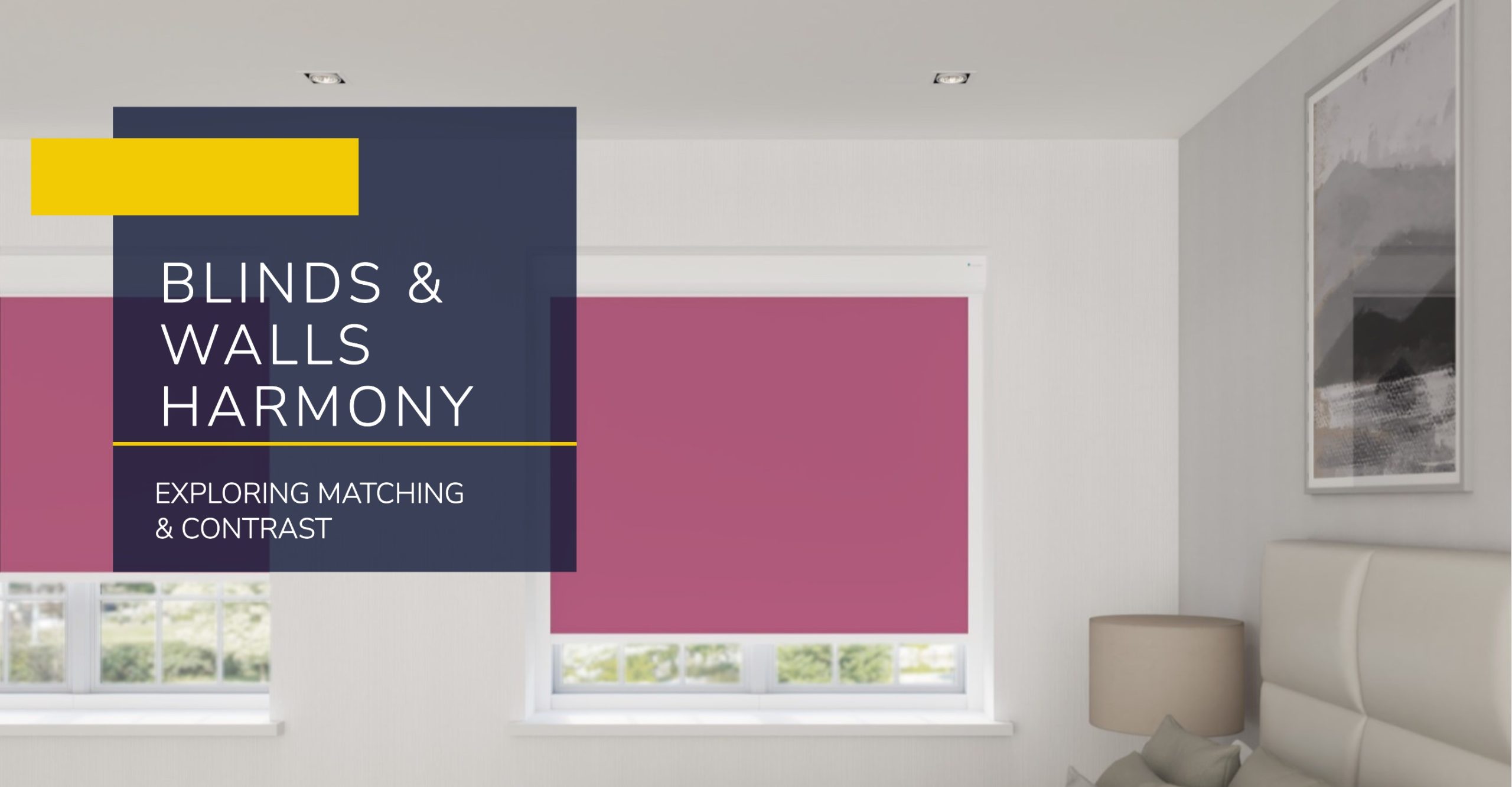
When Should You Match Your Blinds and Wall Colour?

Matching your blinds and wall colour is a popular choice for those who love a cohesive and seamless design. Here are some scenarios where this approach works beautifully:
Classic and Traditional Designs
In traditional interiors, matching blinds with wall colours—especially neutral tones like whites, creams, or greys—is a time-tested approach. This design choice creates a timeless and elegant look that blends beautifully with ornate trims, mouldings, and classic furnishings. By keeping your blinds in the same palette as your walls, you allow statement furniture, artwork, or architectural features to shine.
Whether you’re furnishing a period property or simply love a touch of vintage charm, this method of pairing ensures your blinds don’t compete for attention. It’s an ideal way to maintain a balanced and refined aesthetic, making your space feel both sophisticated and serene.
Highlighting Bold Wall Colours
If you’ve chosen a striking wall colour—think rich blues, fiery reds, or sunny yellows—matching your blinds can amplify the impact of your chosen hue. This approach enhances the cohesiveness of a feature wall or accent wall, allowing the colour to take centre stage without distractions.
This technique is particularly effective in modern and eclectic interiors where vibrant walls are celebrated as the room’s focal point. By pairing blinds in the same colour, you draw attention to the boldness of your choice, creating a unified and dramatic look that is guaranteed to impress
Creating a Seamless Flow
Matching blinds to walls can help achieve a seamless flow, making the room feel continuous and uncluttered. This works exceptionally well in open-plan spaces or rooms where the emphasis is on creating a calming, uninterrupted design.
This approach is also ideal for smaller spaces, as the visual uniformity can prevent the room from feeling busy or cramped. A seamless colour scheme can make the walls appear more expansive and create the illusion of a larger, more open space.
Minimalist and Modern Interiors
For fans of minimalism, matching blinds to neutral walls—such as whites, greys, or beiges—can help achieve that clean, uncluttered aesthetic. This design choice is all about simplicity, allowing the room’s architecture or furnishings to speak for themselves.
This method is particularly suited to Scandinavian or contemporary interiors, where less is more. It’s also a practical choice in homes with large windows, as matching blinds can help them blend into the background and maintain a sleek, modern appearance.
Serene Spaces in Bedrooms and Bathrooms
Bedrooms and bathrooms are often sanctuaries of relaxation, and matching blinds to wall colours can enhance their serene atmosphere. Soft, neutral tones in particular create a soothing effect, helping to reduce visual distractions and encourage relaxation.
This approach also works well in smaller bedrooms or bathrooms, as a matching scheme can visually expand the space, making it feel more open and inviting. By keeping things consistent, you ensure these spaces remain peaceful retreats, free from the jarring effects of mismatched colours.
When Should You Avoid Matching Blinds and Wall Colours?

While matching blinds and walls can create harmony, it’s not always the best choice. In some cases, contrast or variety can elevate the overall design:
Creating Contrasts for Drama
For those who love a dramatic and bold aesthetic, contrasting blinds and walls is an excellent option. Dark blinds against light walls (or vice versa) can add depth and intrigue to your space, creating a high-contrast look that immediately draws the eye.
This technique is especially effective in modern or industrial-style interiors, where bold contrasts play a pivotal role. Imagine crisp white walls paired with sleek black blinds—a timeless combination that exudes style and sophistication.
Balancing Colour for Harmony
Too much of the same colour in a room can feel overwhelming or monotonous. If your walls and blinds are identical in tone, it’s easy to lose a sense of dimension. Instead, choosing blinds in a complementary shade can add interest while maintaining a cohesive look.
For example, if your walls are soft blue, consider blinds in a slightly darker or lighter shade. This subtle difference can create a layered effect, adding depth and visual interest to your space without overpowering it.
Enhancing Small Spaces
While matching blinds and walls can make a room feel seamless, it may also make small spaces feel more enclosed. If you’re working with a compact room, consider using blinds in a contrasting shade to break up the monotony and add definition.
This approach can also help draw attention to the window itself, making it a feature rather than blending into the background. Contrasting colours can give the room character and prevent it from feeling too closed-in.
Avoiding a Bland Look
Neutral walls can look stylish, but if your blinds match exactly, the overall effect may lack personality. Instead, opt for blinds with texture, patterns, or a complementary colour to inject some energy into the design.
For instance, if your walls are beige, consider wooden blinds or textured fabric blinds in a similar yet distinct tone. This adds warmth and character to your space without straying too far from your chosen palette.
Flexibility for Future Redecoration
If you’re prone to changing your wall colours every few years, matching blinds may limit your options. Neutral or contrasting blinds, on the other hand, can adapt to a wide range of colour schemes.
For example, white, grey, or natural wood blinds are incredibly versatile and can complement a variety of wall colours. This ensures that your blinds remain a timeless investment, even as your tastes evolve.
Conclusion: It’s All About Personal Taste
When it comes to matching blinds and wall colours, there’s no right or wrong answer—it all depends on your personal style and the mood you want to create in your home. Whether you opt for harmony or contrast, the choice is yours to make.
At DotcomBlinds, we offer a wide range of made-to-measure blinds to suit any design preference. From sleek modern styles to bold statement pieces, we’ve got you covered. Plus, don’t forget—you can order free samples to see how our blinds work with your wall colours before you buy. Explore our range today and transform your space with the perfect blinds!