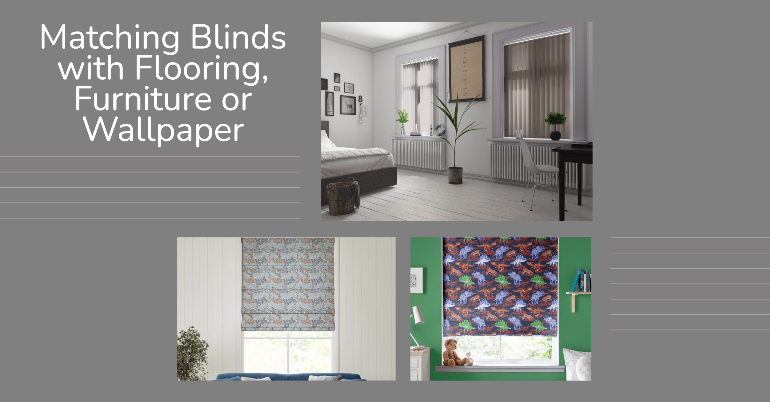
Ever walked into a room and felt like something was just… off? Often, that nagging feeling boils down to the details, and your window treatments play a surprisingly significant role in the overall harmony of your space. Mismatched blinds can stick out like a sore thumb, disrupting the flow and detracting from the aesthetic you’ve carefully cultivated with your flooring, furniture, and wallpaper. But fear not! Achieving that seamless, stylish look is easier than you think. In this guide, we’ll explore practical tips and considerations for perfectly coordinating your blinds with these key elements, ensuring a cohesive design that enhances the mood and beauty of your home. Let’s dive in!
Matching Blinds with Flooring

Understanding the Foundation
Flooring is more than just something you walk on—it’s the visual anchor that sets the tone for your entire interior. Whether you’ve opted for the rich warmth of hardwood, the soft comfort of carpet, or the sleek elegance of tiles, your flooring acts as a base layer that influences every other design choice in the space. Getting your blinds to work in harmony with this foundation can tie the whole room together beautifully, enhancing the overall flow and feel of your home.
Colour Considerations
When it comes to matching blinds with flooring, colour is one of the most powerful tools in your design arsenal. Here’s how to get it right:
Contrast for Impact
Fancy making a statement? Pairing contrasting colours can create a bold, eye-catching aesthetic. Imagine rich, dark walnut floors paired with light linen-textured roller blinds, or deep slate tiles contrasted with crisp white Venetian blinds. The key here is balance—let the contrast draw the eye without becoming overwhelming. This approach works particularly well in modern and minimalist spaces where dramatic flair is welcomed.
Harmony for Flow
If your goal is to create a calming and cohesive space, aim for harmony. Select blinds in similar shades or undertones as your flooring to ensure a smooth visual transition. For instance, a warm beige carpet pairs effortlessly with natural woven blinds in sandy or oatmeal hues. Likewise, oak laminate flooring and light wood Venetian blinds can work together to promote a sense of unity, helping the room feel grounded and thoughtfully curated.
Neutral Territory
You can never go wrong with neutrals. Shades like white, cream, taupe, and grey are incredibly versatile, acting as a stylish bridge between your flooring and the rest of the décor. Neutral blinds are especially handy if you have flooring that features multiple tones—such as patterned tiles or distressed wood—because they won’t clash or compete for attention. Plus, they’re a smart long-term choice if you plan on switching up your interiors down the line.
Material Matters
Blinds don’t just offer visual appeal—they bring texture and practicality into the mix too. Coordinating the material of your blinds with your flooring can elevate your décor from standard to standout.
Texture Play
Texture adds depth and dimension to a room. Consider how the texture of your blinds can either mirror or contrast with your flooring for added interest. Wooden blinds on hardwood floors? That’s a nature-inspired match made in heaven. Fabric Roman blinds over a plush carpet? Cosy and inviting. Metal blinds above glossy tiled flooring? Sleek and contemporary. Play around with combinations to find what works best for your space and style.
Durability and Practicality
Let’s not forget that different rooms come with different demands. In bathrooms or kitchens where tiled floors are common, moisture-resistant blinds like faux wood or PVC roller blinds are a smart pick. In living rooms or bedrooms with carpet or timber flooring, fabric or wooden blinds offer warmth and a more decorative touch. Always match your blind materials not just to the look, but to the lifestyle of the room.
Pattern Considerations (If Applicable)
If your flooring is mostly solid in colour, you have more freedom to introduce patterned blinds—think subtle stripes, botanical prints, or geometric designs. These can inject personality and prevent the room from feeling too flat or uniform. On the flip side, if your flooring already has a strong pattern (like a herringbone parquet or mosaic tile), opt for blinds in solid or lightly textured finishes to avoid visual overload. A balanced mix of pattern and simplicity ensures your design feels curated, not chaotic.
Matching Blinds with Furniture

Creating a Unified Look
Furniture is often the focal point of any room, telling a story about your style and setting the mood of the space. But to achieve a truly cohesive design, your blinds should support and elevate your furniture choices—not compete with them. Think of blinds as the missing piece of the puzzle that can pull your furnishings together into a unified, polished look. Whether you’re coordinating with a striking statement sofa or a set of rustic dining chairs, matching blinds with your furniture helps create a space that feels intentional, inviting, and effortlessly stylish.
Colour Echoing
Choosing the right colour scheme is a brilliant way to link your blinds with your furniture. Here are three ways to do it successfully:
Direct Matches
Going for a direct colour match can be a powerful design move. If you’ve got a standout piece of furniture—a deep navy velvet sofa, for example—choosing blinds in the same or a closely related shade can create a dramatic and luxurious feel. This kind of colour mirroring lends a sense of sophistication and structure, particularly effective in living rooms or dining areas where a touch of drama is welcome. It’s also a smart way to give your standout furniture piece the attention it deserves without overwhelming the space with too many competing colours.
Complementary Colours
For a more dynamic, energetic feel, why not consider complementary colours? These are colours that sit opposite each other on the colour wheel—think teal and orange, or blue and mustard. Using this principle, you might pair rust-coloured Roman blinds with a forest green armchair, or coral blinds with navy furniture. The result is a vibrant yet balanced scheme that adds visual interest while still feeling curated. This is a fun technique for homeowners who love bold style and creative flair.
Accent Colour Pull
Another clever approach is to pull an accent colour from your furniture—perhaps from a patterned cushion, an upholstered dining chair, or even a piece of wall art—and use that as inspiration for your blinds. Let’s say your neutral-toned sofa features a scatter of cushions in burnt orange and ochre; why not pick a roller blind in a similar warm hue? It’s a subtle nod that ties the whole room together without being too matchy-matchy.
Style Alignment
Beyond colour, it’s important to consider how the style of your blinds matches your furniture aesthetic. The goal is to ensure your window dressings enhance the personality of the room rather than clash with it.
Modern Minimalism
If your furniture style is clean-lined, contemporary, or Scandinavian-inspired, opt for sleek and understated blinds to match. Think minimalist roller blinds, elegant vertical blinds, or day and night blinds with soft transitions. These styles complement the pared-back nature of modern interiors while maintaining a fresh, uncluttered vibe. Neutral colours and subtle textures work brilliantly here.
Traditional Elegance
For homes decorated with more traditional or vintage-inspired furniture—like carved wood tables, tufted sofas, or antique sideboards—your blinds can lean into that sense of timeless charm. Roman blinds in rich fabrics like velvet, damask, or linen add warmth and character. Alternatively, classic wooden Venetian blinds bring a touch of refined elegance, especially when matched to timber furniture pieces. These options exude sophistication while providing practical light control.
Bohemian Vibes
If your interior leans towards the boho side of life—full of mixed patterns, layered textiles, and collected treasures—embrace that creativity with your blinds too. Choose natural materials like bamboo, woven wood, or patterned fabric blinds to echo the free-spirited energy of your space. Roman blinds in earthy prints or roller blinds with botanical designs can reinforce your relaxed and eclectic décor without looking chaotic.
Scale and Proportion
Finally, don’t forget to consider scale and proportion. The size and bulk of your blinds should be in balance with your furniture. For instance, if your room features dainty or slimline furniture—like a light-framed coffee table or minimalist shelving—avoid heavy, oversized blinds that could overpower the space. Conversely, in a room with substantial furniture like a large corner sofa or chunky dining table, you can get away with bolder blind choices, such as wide cassette blinds or double roller blinds. Proportional balance ensures the room feels harmonious, not visually top-heavy.
Matching Blinds with Wallpaper

The Power of the Backdrop
Wallpaper is more than just a decorative choice—it’s a powerful backdrop that can completely transform a room’s atmosphere. From bold botanical prints to subtle textures or classic damasks, wallpaper sets the tone for your interior and often acts as a statement piece in itself. Because it draws the eye so easily, choosing the right blinds to pair with your wallpaper is essential. The goal is to complement the wall covering, not compete with it—creating a balanced look that brings out the best in both elements.
Colour Coordination
Getting the colours right is crucial when matching blinds with wallpaper. Whether your wallpaper is bursting with vibrant motifs or quietly elegant, the right blind colour can enhance the space beautifully.
Solid Blinds Against Patterned Wallpaper
If your wallpaper features strong patterns, one of the safest and most stylish options is to go for solid-coloured blinds. This helps ground the room and keeps the visual focus on the wallpaper. A top tip? Pick out a secondary or accent colour from the wallpaper design and use that as the blind colour. For example, if your wallpaper has a floral print in shades of sage green and blush pink, consider blush-toned Roman blinds or soft green roller blinds to create a coordinated, calming palette.
Pattern on Pattern (Use with Caution!)
Mixing patterns can create a dynamic and designer-inspired look, but it needs a thoughtful touch. The key to success is varying the scale of the patterns while keeping the colour palette cohesive. If your wallpaper has large-scale palm leaves, you might pair it with blinds featuring a small, subtle geometric print in similar tones. This adds interest without overwhelming the senses. Try to limit your patterns to two main motifs in a space, and let one clearly take the lead.
Textured Blinds for Added Dimension
If you’re keen to add depth without introducing another print, textured blinds are a fantastic option. Woven wood, linen-look fabric, or subtly embossed roller blinds can enhance a room’s layered aesthetic. They provide a tactile contrast to smooth or printed wallpaper without causing visual clutter. This technique works particularly well in living rooms and bedrooms where you want the space to feel rich and inviting but not busy.
Style Harmony
It’s not just colour and texture that matter—matching the style of your blinds with the theme or era of your wallpaper can elevate the entire room.
Matching the Mood
If your wallpaper has a vintage or classical flair, such as floral or toile patterns, opt for blinds that reflect that traditional charm. Roman blinds in a soft fabric, or wooden Venetian blinds in a warm tone, echo the timeless elegance of the space. For a contemporary wallpaper—like abstract prints or metallic accents—minimalist blinds such as simple rollers or vertical blinds keep the look fresh and current.
Creating Contrast for Emphasis
Sometimes, the best way to let your wallpaper shine is by providing a calm counterpoint. Solid-coloured blinds in a simple design can frame the wallpaper and let it be the star of the show. For instance, against a dramatic mural or bold Art Deco print, crisp white blackout blinds or sleek grey electric roller blinds offer functionality while allowing the pattern behind them to remain centre stage.
Considering the Scale of the Room
Patterned wallpaper and bold blinds can work beautifully—if the room has the scale to support them. In smaller rooms, large patterns on both the blinds and the walls can feel overwhelming and make the space appear cluttered. To keep things airy and well-balanced, limit large prints to either the walls or the window coverings, and choose simpler designs for the other. This approach helps maintain a sense of spaciousness while still showcasing your creative flair.
General Tips for Successful Matching
Getting blinds to harmonise beautifully with your flooring, furniture, or wallpaper doesn’t have to feel like a guessing game. With a little planning, a dash of creativity, and the right mindset, you can pull together a look that feels effortless and polished. Here are some key tips to help ensure your choices look fabulous—and function perfectly too.
Start with the Dominant Element
When deciding how to match your blinds, it’s always a good idea to begin with the element that’s most permanent in the room. In most cases, this will be the flooring. Unlike furniture or wall décor, flooring tends to remain in place for years (sometimes decades), so it forms the foundation of your design decisions. Once you’ve established that anchor, you can build the rest of the space—including your blinds—around it, ensuring a sense of cohesion from the ground up.
If your flooring is neutral and understated, you might choose blinds to echo your furniture or wallpaper. But if your floor has strong tones or patterns—like dark wood or bold tiles—it’s smart to use that as your starting point.
Consider the Room’s Function and Light
While style is crucial, practicality should never be overlooked. Each room in your home has its own function and lighting needs, and your blinds should reflect that.
- In bedrooms, privacy and light-blocking are essential, so consider blackout blinds that complement your existing décor.
- For bathrooms or kitchens, moisture resistance is key—look for faux wood, aluminium, or waterproof roller blinds.
- In living rooms or home offices, light control is a must. Day and night blinds or vertical blinds can help manage glare while adding a modern touch.
- Don’t forget insulation: thermal blinds can boost comfort and energy efficiency, especially in rooms with large windows.
Match your blinds with your room’s function just as thoughtfully as you match them with its style.
Don’t Be Afraid to Experiment (But Have a Plan)
Matching doesn’t always mean playing it safe. There’s plenty of room for creativity and personal flair, especially when it comes to mixing colours, textures, and patterns. Perhaps you love the idea of patterned blinds in a neutral room, or want to contrast modern furniture with soft, traditional blinds. Go for it!
That said, it helps to have a cohesive vision. Create a mood board, sketch out your ideas, or collect inspiration online. Your creativity will shine brightest when there’s a clear plan behind it. By tying your choices back to a central theme or palette, you can be bold and beautifully coordinated.
Use Samples
This is a golden rule: always get samples. What looks perfect on a screen may appear completely different in natural light or against your existing furnishings. Samples allow you to compare colours and textures in your actual space and see how they behave at different times of day.
At DotcomBlinds, free fabric and material samples are available across most blind ranges—so take advantage of this! Lay them next to your flooring, against your wallpaper, or on your furniture to see which combinations feel just right. It’s a simple step that can save you from costly mismatches down the line.
Consider Professional Advice
Feeling overwhelmed by options? If you’re tackling a particularly complex design scheme—or simply want an expert opinion—don’t hesitate to reach out for professional advice. Whether it’s a local interior designer or a blind specialist, their trained eye can offer insights that bring everything together seamlessly.
DotcomBlinds also offers helpful resources and customer support to guide you through your selection. Our team understands the ins and outs of matching blinds with various interior elements and is happy to help you find the perfect style for your space.
Ready to Shop Blinds?
Now that you’re equipped with all the tips and tricks to match your blinds with flooring, furniture, and wallpaper, it’s time to put your ideas into action! Whether you’re aiming for seamless harmony or bold contrast, DotcomBlinds has everything you need to bring your vision to life.
We offer one of the UK’s most comprehensive selections of made-to-measure blinds, crafted with care right here in our in-house UK factory. Our range includes:
- Roller Blinds
- Roman Blinds
- Vertical Blinds
- Wooden and Faux Wood Venetian Blinds
- Electric and Smart Blinds
- Cassette Blinds
- Blackout Blinds
- Day & Night Blinds
- Thermal Blinds
- Designer and Wide Blinds
…and many more options to suit every style, every room, and every budget.
Not sure which colour, material or texture will work best in your space? We’ve got you covered—DotcomBlinds offers free samples across most of our product lines. Simply order online and we’ll post them straight to your door, so you can match and compare in the comfort of your own home.
With high-quality products, passionate UK-based staff, and a website designed to make shopping easy, DotcomBlinds takes the stress out of choosing the perfect window dressings. So why wait?
Explore our full range today at www.dotcomblinds.com and start transforming your space with confidence.