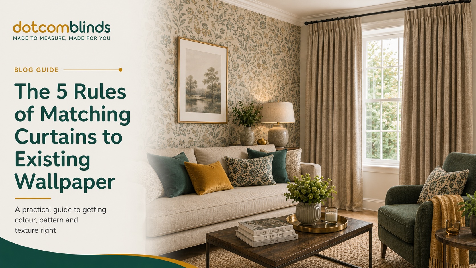
Choosing curtains for a room that already has wallpaper can feel surprisingly difficult. The wallpaper may be bold, textured, patterned or highly specific in colour, and once it is on the wall, it becomes one of the most dominant design features in the space. The wrong curtains can make the room feel too busy, too dark or visually disconnected. The right curtains, however, can make the wallpaper look more considered, more balanced and more expensive.
The key is to stop thinking of curtains and wallpaper as two separate choices. They need to work as one scheme. Wallpaper usually sets the rules of the room because it covers a large surface and often contains the main colours, pattern style and overall mood. Curtains then need to play one of three roles: they can support the wallpaper, soften it or provide a controlled contrast.
This is especially important with made-to-measure curtains, where the finished result is designed specifically for your window. Because curtains take up a large visual area when closed, small differences in colour, texture, pattern scale and fabric weight can have a big impact on the finished room. A curtain fabric that looks subtle as a sample can feel much stronger once it is repeated across a full-width pair of curtains.
In this guide, we will explain the five practical rules for matching curtains to existing wallpaper. These rules cover visual hierarchy, pattern scale, texture, colour temperature, curtain heading style and the final sample test. Follow them and you will be able to choose curtains that complement your wallpaper rather than compete with it.
Before making your final decision, it is always worth ordering free fabric samples and viewing them against your wallpaper in your own room. Natural daylight, evening lighting and nearby furniture can all change how a curtain fabric looks, so testing the fabric at home is the safest way to choose with confidence.
Expert Summary: Matching Curtains to Existing Wallpaper
When choosing curtains for a room that already has wallpaper, the wallpaper should usually lead the design scheme. Curtains should then be selected to support, soften or balance the wallpaper rather than compete with it. The most reliable approach is to assess visual hierarchy, pattern scale, texture, undertone, curtain heading style and lighting before ordering.
If the wallpaper is bold, patterned, dark or highly decorative, plain or textured curtains are usually the safest choice. If the wallpaper is subtle, neutral or plain, curtains can introduce more pattern, colour or fabric interest. A close colour match is not enough on its own; the curtain fabric also needs to suit the wallpaper’s undertone, texture and overall visual weight.
Fabric samples should always be tested against the existing wallpaper in the actual room before ordering made-to-measure curtains. Natural daylight, evening lighting, curtain fullness and heading type can all change how the final curtains look once installed.
Quick Expert Rule
The busier the wallpaper, the calmer the curtains should usually be. The plainer the wallpaper, the more freedom you have to use curtain pattern, texture or stronger colour.
Table of Contents
- Rule 1: Decide the Visual Hierarchy Before Choosing Curtain Fabric
- Rule 2: Balance the Pattern Scale
- Rule 3: Use Texture When the Wallpaper Is Plain or Neutral
- Rule 4: Match the Undertone, Not Just the Colour
- Rule 5: Consider Header Type, Fullness and Drapery Volume
- Quick Reference: What Curtains Go With Different Wallpaper Styles?
- Common Curtain and Wallpaper Matching Mistakes to Avoid
- The Lighting and Sample Test Before You Order
- Final Verdict: Let the Wallpaper Lead, Then Choose Curtains That Balance It
Rule 1: Decide the Visual Hierarchy Before Choosing Curtain Fabric
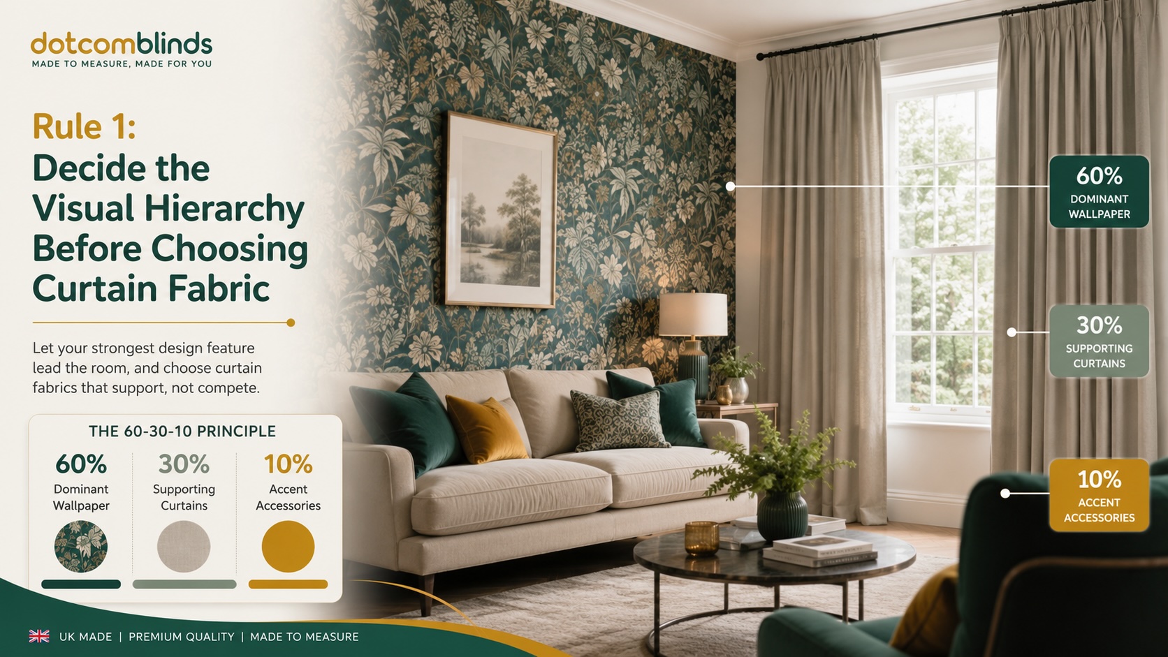
When matching curtains to existing wallpaper, the first decision is not the curtain colour. It is the visual hierarchy of the room.
In simple terms, one element should lead and the other should support. If the wallpaper is bold, patterned, dark, metallic or heavily textured, it has already taken the lead. In that case, the curtains should usually play a balancing role rather than competing for attention. If the wallpaper is plain, subtle or close to a painted wall effect, the curtains have more room to introduce pattern, contrast or a stronger colour.
This is where many rooms go wrong. A customer may choose a curtain fabric they love on its own, only to find that it fights against the wallpaper once installed. With made-to-measure curtains, this matters because the fabric is not a small decorative accessory. When closed, curtains can cover a large part of the wall and become one of the biggest visual surfaces in the room.
Use the 60-30-10 Rule
A useful way to think about visual hierarchy is the 60-30-10 rule. It is a simple interior design principle that helps you control how much visual weight each part of the room should carry.
In a wallpapered room:
- The 60% is usually the dominant wall colour, wallpaper or overall room backdrop.
- The 30% is the secondary colour or texture, often curtains, upholstery, rugs or larger furniture.
- The 10% is the accent colour, used in smaller details such as cushions, lamps, artwork or decorative accessories.
If your wallpaper already has a strong pattern or colour, your curtains will usually work best in the 30% layer. They should support the wallpaper by repeating one of its quieter colours, softening the contrast or adding texture without adding too much extra visual noise.
For example, if you have a large botanical wallpaper with a cream background, green leaves and small terracotta details, the safest curtain choice is usually not terracotta. That colour may be better reserved for cushions or accessories. A cream, warm neutral or muted green curtain will usually feel more balanced because it supports the main wallpaper colours without making the room feel too busy.
Identify the Ground Colour, Not Just the Accent Colour
When choosing curtain fabric, look carefully at the wallpaper and separate the colours into three groups:
- Ground colour: the background colour of the wallpaper.
- Main pattern colour: the dominant colour used in the design.
- Accent colour: the smaller highlight colour used in details.
The ground colour is usually the safest colour to repeat in your curtains. It creates flow and helps the room feel calm. The main pattern colour can also work, especially if you want a richer or more coordinated look. The accent colour should be used with more caution because it can become overpowering when repeated across a large pair of curtains.
A small amount of navy, ochre, pink or rust in the wallpaper may look elegant as a detail. But when that same colour becomes full-height curtains, it can suddenly dominate the room. This is why ordering fabric samples and viewing them beside the wallpaper is so important.
If Your Wallpaper Is Patterned, Keep the Curtains Plain or Textured
As a general rule, patterned wallpaper works best with plain or softly textured curtains. This does not mean the curtains need to be boring. A plain fabric can still add depth through weave, weight, lining, heading style and how it falls.
For a busy wallpaper, a plain curtain fabric gives the eye somewhere to rest. It also makes the wallpaper look more intentional because it frames the pattern rather than competing with it.
Use this rule as a starting point:
- If your wallpaper is large and botanical, choose plain curtains in the wallpaper’s ground colour or a muted natural tone.
- If your wallpaper is small and busy, choose simple curtains with minimal pattern and a calm, steady colour.
- If your wallpaper is dark and dramatic, consider curtains one or two tones lighter to stop the room feeling too heavy.
- If your wallpaper is neutral and subtle, you can be more confident using patterned or designer curtains.
- If your wallpaper is metallic or reflective, choose a softer matte curtain fabric to balance the shine.
The aim is not to remove personality from the room. It is to decide where the personality should sit. If the wallpaper is already doing the talking, the curtains should help it sound better.
Rule 2: Balance the Pattern Scale
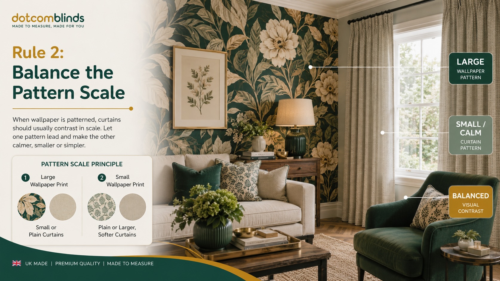
Pairing patterned curtains with patterned wallpaper can work, but it needs to be handled carefully. The mistake is not using two patterns. The mistake is using two patterns that are too similar in scale, strength or rhythm.
When wallpaper and curtains both have patterns of a similar size, the eye has no clear place to rest. The result can feel busy, restless or visually “noisy”, even if the colours technically match. This is especially noticeable around windows because curtains sit directly beside or in front of the wallpaper, so the two surfaces are seen together.
The safest approach is to let one pattern dominate and make the other noticeably quieter, smaller, larger or simpler.
Large Patterns Need Smaller or Calmer Companions
If your wallpaper has a large-scale pattern, such as oversized florals, big leaves, damask designs or bold abstract shapes, your curtains should usually be plain, textured or much smaller in pattern scale.
Large wallpaper already makes a strong statement. Adding equally large patterned curtains can make the room feel heavy and over-designed. Instead, choose curtains that pick up one colour from the wallpaper and repeat it in a simpler way.
For example, a large botanical wallpaper with deep green leaves may work beautifully with plain sage, olive, cream or warm neutral curtains. A dramatic damask wallpaper may look more refined with solid velvet, linen-look fabric or a subtle woven texture rather than another formal pattern.
The goal is to create contrast in scale, not conflict in style.
Small Busy Wallpaper Needs a Visual Resting Point
Small-scale wallpaper can be just as challenging as large wallpaper, particularly if the pattern repeats tightly across the wall. Fine florals, small geometrics, ditsy prints and detailed heritage patterns can create a lot of movement.
In these rooms, the curtains should usually calm the space. A plain curtain fabric in the wallpaper’s background colour is often the safest option. A soft texture can also work well because it adds depth without introducing another competing design.
Avoid pairing small wallpaper patterns with small curtain patterns unless there is a very clear contrast in colour, shape or structure. For example, small floral wallpaper with a fine floral curtain can look cluttered. A small geometric wallpaper with a fine stripe can feel too sharp or visually busy.
Mix Organic and Geometric Patterns Carefully
One useful way to combine patterns is to contrast their type. If the wallpaper is organic and flowing, the curtain pattern can be more structured. If the wallpaper is geometric, the curtain fabric can be softer and more natural.
For example:
- A soft floral wallpaper may work with a subtle stripe.
- A geometric wallpaper may work with a plain linen-look curtain or a gentle organic motif.
- A traditional damask wallpaper may work with a textured plain fabric.
- A modern abstract wallpaper may work with a simple woven curtain in a related colour.
The contrast should feel deliberate, not accidental. Pattern mixing works best when there is a shared colour link and a clear difference in scale.
Be Careful With Identical Pattern Matching
Matching curtains and wallpaper in the exact same design can create a classic, high-end interior look, particularly in traditional or English country-style rooms. However, it is one of the hardest looks to get right.
For it to work properly, the wallpaper and curtain fabric usually need to come from the same design house, with colours, scale and print quality intended to coordinate. Even then, the result can feel intense in smaller rooms or spaces with limited natural light.
For most homes, a coordinated contrast is safer than a full match. Instead of trying to repeat the exact wallpaper pattern, choose one of the wallpaper colours and express it through a plain, textured or more restrained curtain fabric. This keeps the room connected without making it feel overly staged.
Quick Rule: Vary the Scale
If you want to use patterned curtains with patterned wallpaper, use this simple rule:
- If the wallpaper pattern is large, choose curtains that are plain, textured or small-scale.
- If the wallpaper pattern is small, choose curtains that are plain, softly textured or much larger and calmer in design.
- If the wallpaper is geometric, soften it with texture, plain fabric or an organic pattern.
- If the wallpaper is floral or botanical, balance it with plain fabric, subtle stripes or a simple woven finish.
- If the wallpaper is already bold, avoid adding another bold curtain pattern unless the room is large and the colour palette is tightly controlled.
Pattern can add character, but scale is what keeps the scheme under control.
Rule 3: Use Texture When the Wallpaper Is Plain or Neutral
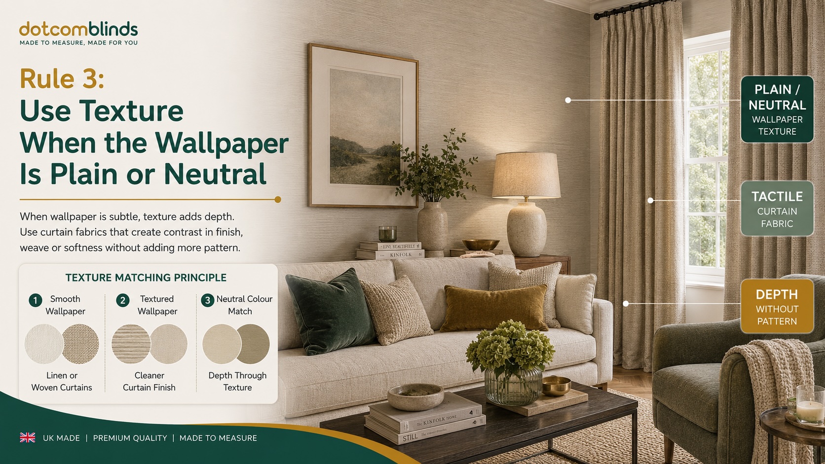
When the existing wallpaper is plain, neutral or softly textured, the curtain choice becomes less about avoiding clashes and more about preventing the room from looking flat. This is especially important with wallpapers such as grasscloth, linen-effect, faux silk, plaster-effect, soft metallics or subtle tonal designs.
A neutral wallpaper can look elegant on its own, but if the curtains are too similar in colour and too similar in surface finish, the room can lose depth. Instead of looking calm and considered, it can feel unfinished. The solution is to use texture deliberately.
Texture allows you to stay within a controlled colour palette while still adding contrast, warmth and visual interest.
Exact Colour Matching Needs Texture
Matching the curtain colour closely to the wallpaper can work very well, particularly in bedrooms, living rooms and calm neutral schemes. However, when the colour is almost identical, the fabric needs to bring something different to the room.
That difference might come from:
- a heavier weave
- a soft linen-look finish
- a subtle slub texture
- a velvet surface
- a matte finish against a slight wallpaper sheen
- deeper folds created by the curtain heading
- the extra weight of lined or blackout curtains
For example, cream curtains against cream wallpaper can look bland if both surfaces are smooth and flat. But cream curtains in a softly woven or linen-look fabric can add depth while keeping the room light and restful.
The same applies to grey, beige, taupe, ivory and stone-coloured schemes. The colour can remain subtle, but the texture should do some of the design work.
Pair Smooth Wallpaper With More Tactile Curtains
If your wallpaper has a smooth or lightly printed surface, you can usually afford to make the curtains more tactile. This is where woven, brushed, linen-look or velvet-style fabrics can be useful.
A smooth matte wallpaper, for example, can look more inviting when paired with curtains that have a visible fabric grain. A minimal plaster-effect wallpaper can feel warmer with curtains that have a soft woven texture. A plain neutral wallpaper in a bedroom can be given more comfort and depth with heavier, lined curtains.
This approach works particularly well when you want the room to feel calm but not plain. You are not adding another pattern. You are adding another layer.
Pair Textured Wallpaper With Cleaner Curtain Fabrics
If the wallpaper already has a strong texture, such as grasscloth, fabric-effect wallpaper, raised vinyl, bead detail or metallic texture, the curtain fabric should be chosen more carefully.
In this case, too much texture on both surfaces can make the room feel visually heavy. A textured grasscloth wallpaper, for example, may look better with a cleaner curtain fabric that has a softer, more controlled finish. A metallic or faux silk wallpaper may work well with matte curtains because the fabric helps balance the light reflection.
The aim is to create contrast between the wall and the window treatment without making either one feel disconnected.
Use Velvet Carefully With Wallpaper
Velvet-style curtains can work beautifully with wallpaper because they add depth, softness and light variation. They are especially effective with plain, tonal or understated wallpaper.
However, velvet can feel quite rich visually, especially in darker colours. Against bold wallpaper, dark velvet curtains can make a room feel dramatic, but they can also make it feel smaller and heavier. In a compact room, it is often safer to use velvet in a softened colour, such as warm beige, muted green, soft grey or dusky pink, rather than a very dark shade.
Velvet is strongest when it is used as a deliberate contrast: soft against structured wallpaper, matte depth against subtle shine, or plain richness against a calm neutral wall.
Quick Rule: Let Texture Add the Interest
Use texture when you want the curtain and wallpaper to feel connected without adding more pattern.
- If your wallpaper is plain and smooth, choose curtains with a visible weave, linen-look texture or soft surface interest.
- If your wallpaper is neutral and understated, use curtain texture to make the room feel warmer and more layered.
- If your wallpaper is grasscloth or heavily textured, choose cleaner curtain fabric so the room does not become too busy.
- If your wallpaper has a slight sheen, consider matte curtains to balance the light reflection.
- If your wallpaper is plain and dark, use textured curtains to stop the colour scheme feeling heavy or flat.
Texture is often the safest way to make curtains and wallpaper work together. It adds depth without adding clutter, which is exactly what many wallpapered rooms need.
Rule 4: Match the Undertone, Not Just the Colour
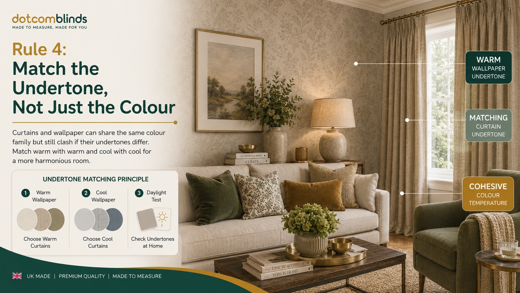
One of the most common mistakes when matching curtains to wallpaper is choosing the right colour family but the wrong undertone. This is why a grey curtain can look wrong against grey wallpaper, or a cream curtain can suddenly make wallpaper look yellow, dull or cold.
Colour names are not precise enough. “Grey”, “beige”, “green” or “blue” can each sit in very different temperature families. Some colours feel warm, soft and earthy. Others feel cool, crisp and clean. When the curtain and wallpaper come from different temperature families, the scheme can look slightly off, even if the colours appear similar on screen.
This matters even more with made-to-measure curtains because the fabric will be seen across a large area. A small undertone mismatch in a sample can become much more obvious once the curtains are full-length and fully dressed.
Understand Warm and Cool Undertones
A warm undertone usually has hints of yellow, red, brown, orange or gold. These colours tend to feel softer, cosier and more traditional. A cool undertone usually has hints of blue, silver, violet or crisp green. These colours tend to feel fresher, cleaner and more contemporary.
Warm wallpaper colours often include:
- cream
- ivory
- beige
- taupe
- warm grey
- terracotta
- rust
- ochre
- warm gold
- olive
- clay pink
Cool wallpaper colours often include:
- pure white
- silver
- blue-grey
- slate grey
- charcoal
- navy
- crisp blue
- teal
- emerald
- cool pink
- lilac
The safest rule is simple: warm wallpapers usually need warm curtain fabrics, while cool wallpapers usually need cool curtain fabrics.
Why Grey Curtains Often Go Wrong
Grey is one of the hardest curtain colours to match because it can lean warm or cool. A warm grey may have taupe, beige or brown undertones. A cool grey may have blue, silver or charcoal undertones.
If your wallpaper is a warm taupe-grey and you choose curtains with a blue-grey undertone, the curtains may make the wallpaper look muddy or dated. If your wallpaper is a cool silver-grey and you choose warm greige curtains, the curtains may look slightly beige or dull by comparison.
The same problem happens with whites and creams. A warm ivory curtain can look yellow beside a crisp white and silver wallpaper. A cool white curtain can look stark beside a soft cream wallpaper.
Match the Mood of the Wallpaper
Undertone is not only about colour accuracy. It also affects the mood of the room.
A warm wallpaper scheme usually feels more natural, relaxed and cocooning. It works well with curtain fabrics in oatmeal, warm beige, soft brown, muted terracotta, moss green, warm ivory or gentle gold.
A cool wallpaper scheme often feels cleaner, sharper or more modern. It tends to work better with curtain fabrics in cool grey, off-white, navy, charcoal, soft blue, silver, teal or dusky pink.
For example, if your wallpaper has warm botanical tones, such as olive leaves, cream background and terracotta detail, a cool silver-grey curtain is unlikely to feel connected. A warm neutral, moss green or muted clay shade will usually sit better in the room.
By contrast, if your wallpaper has a silver geometric pattern on a crisp white background, warm beige curtains may soften the room, but they may also look accidental unless beige appears elsewhere in the scheme. A cooler white, grey, navy or blue-toned curtain would usually be more natural.
Use the Daylight Test
The most reliable way to check undertone is to view the curtain fabric beside the wallpaper in natural daylight. Screens, artificial lighting and product images can all distort colour, especially with neutrals.
Use this simple test:
- Hold or pin the curtain sample vertically beside the wallpaper.
- Place a sheet of plain white paper nearby as a neutral reference point.
- Look at the wallpaper and curtain together in daylight.
- Ask whether one looks more yellow, blue, pink, green or grey than expected.
- Repeat the test in the evening with your usual room lighting.
If the curtain sample makes the wallpaper look dull, dirty, overly yellow or unexpectedly cold, the undertones are probably not aligned.
Consider Existing Furniture and Flooring
Curtains and wallpaper do not exist in isolation. Flooring, sofas, beds, rugs and wooden furniture can all influence whether a warm or cool fabric feels right.
For example, a room with oak flooring, cream wallpaper and brass lighting will usually suit warmer curtain tones. A room with grey flooring, chrome details and crisp white wallpaper will often suit cooler curtain tones.
This does not mean every element needs to match exactly. In fact, rooms usually look better when colours are layered rather than repeated too perfectly. But the undertones should feel intentional.
Quick Rule: Stay in the Same Temperature Family
Use colour temperature as a final check before ordering:
- If your wallpaper is cream, beige, taupe or warm grey, choose curtains with warm undertones.
- If your wallpaper is silver, slate, white or blue-grey, choose curtains with cool undertones.
- If your wallpaper includes gold, terracotta, rust or olive, avoid icy greys unless there is a clear design reason.
- If your wallpaper includes navy, silver, teal or crisp blue, avoid yellow creams unless they are repeated elsewhere in the room.
- If two colours look similar online but wrong together at home, the issue is often undertone rather than colour.
Getting the undertone right is one of the simplest ways to make curtains and wallpaper feel professionally coordinated. It is also one of the best reasons to test fabric samples against the actual wallpaper before placing a made-to-measure order.
Rule 5: Consider Header Type, Fullness and Drapery Volume
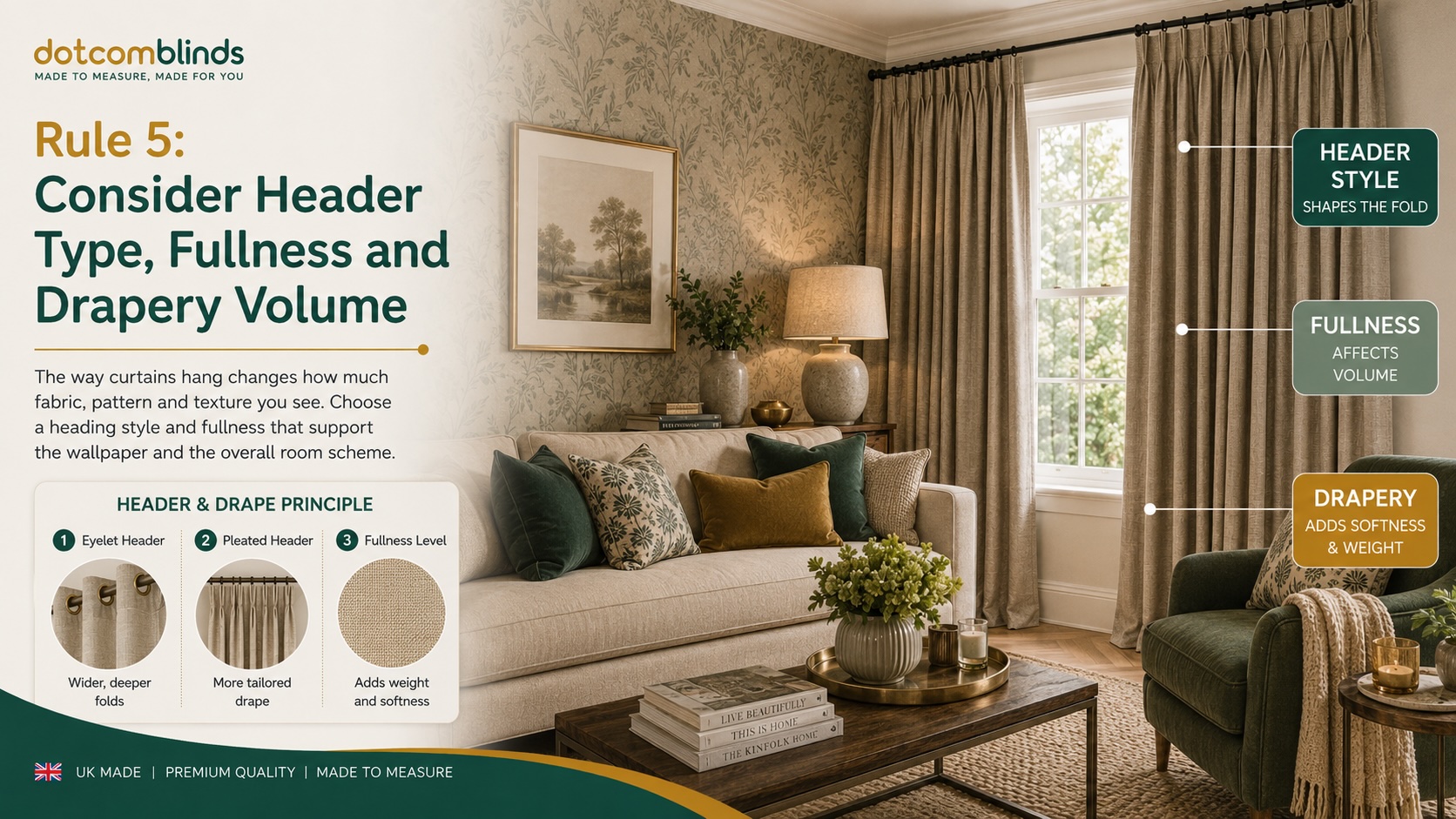
Curtain fabric does not hang flat once it is installed. It folds, gathers, curves and casts shadows. This means the same curtain colour or pattern can look very different depending on the heading style, fullness and how much fabric is used across the window.
This is especially important when matching curtains to wallpaper because the curtain is seen directly against, beside or close to the wall covering. A fabric that looks bold as a flat sample may appear softer once it is folded. Equally, a subtle pattern can become more noticeable when it is repeated across a large pair of full-length curtains.
The heading style is therefore not just a practical detail. It affects how the curtain interacts with the wallpaper.
Eyelet Curtains Create Larger, Deeper Folds
Eyelet curtains create wide, even folds because the curtain pole passes directly through metal eyelets at the top of the fabric. This gives the curtains a clean, modern appearance with a more structured wave-like fall.
This can work particularly well when the wallpaper is small-scale, busy or detailed. The deeper folds create shadow and movement, which can soften the appearance of the curtain fabric. If the curtains are plain, the folds add texture and depth without adding another pattern.
Eyelet curtains are often a good choice when:
- the wallpaper has a small or repeated pattern
- the room has a modern or simple style
- you want the curtains to feel unfussy
- the fabric is plain or lightly textured
- you want natural folds to break up the visual surface
However, eyelet curtains may not be the best choice if you want a very formal or traditional finish. They also expose the curtain pole, so the pole colour and style need to work with the wallpaper and wider room scheme.
Pencil Pleat Curtains Give a Softer, More Traditional Look
Pencil pleat curtains create smaller, tighter gathers across the top of the curtain. The look is softer and more traditional than eyelets, making this heading style a natural fit for bedrooms, living rooms, cottages, period properties and classic wallpaper designs.
Because pencil pleats create a more gathered top, they can make plain or textured fabrics feel more decorative. This is useful when the wallpaper is large-scale or dramatic and the curtains need to support the scheme without becoming too stark.
Pencil pleat curtains are often a good choice when:
- the wallpaper is floral, damask, heritage-inspired or traditional
- the curtains are plain, textured or softly coloured
- you want a warmer, more relaxed look
- the room has a classic rather than ultra-modern feel
- you want the curtain heading to add detail without using pattern
For large-scale wallpaper, pencil pleats can help the curtains feel elegant and understated. The heading adds detail, but the main curtain fabric can remain calm.
Pinch Pleat Curtains Work Well With Refined Schemes
Pinch pleat curtains have a more tailored, structured finish. The pleats are sewn into the heading, creating neat folds that hang in a controlled way. This makes them especially useful in rooms where the wallpaper is already highly decorative and the curtains need to look deliberate and polished.
A pinch pleat heading can make a plain fabric look more expensive because the shape of the curtain does some of the visual work. This is useful if you want to avoid adding more pattern but still want the curtains to feel finished.
Pinch pleat curtains are often a good choice when:
- the wallpaper has a dramatic or premium look
- the room is more formal or carefully styled
- the curtain fabric is plain, velvet, linen-look or subtly textured
- you want a neater, more tailored window treatment
- the wallpaper pattern is large and needs a calm frame
This heading style can work particularly well with bold wallpaper because it gives the window area a sense of structure. The curtain does not have to compete with the wallpaper; it simply frames it cleanly.
Fullness Changes the Strength of the Curtain Colour
Fullness refers to how much fabric is used compared with the width of the window or track. Fuller curtains create more folds, more shadow and more movement. This can make the curtain colour look richer and more varied because the fabric catches light differently across each fold.
In a wallpapered room, fullness matters because it changes how dominant the curtains feel. A very full curtain in a strong colour will usually have more visual weight than a simpler, less gathered curtain in the same fabric. This can be beautiful in a larger room, but it may feel heavy in a smaller space or next to dark wallpaper.
As a general guide:
- More fullness makes curtains look softer, richer and more traditional.
- Less fullness makes curtains look cleaner, flatter and more modern.
- Strong colours become more noticeable with extra fabric.
- Patterns become more repeated and more dominant with extra fabric.
- Textured plains usually benefit from fullness because the folds show the texture better.
If your wallpaper is already bold, avoid adding unnecessary visual weight through very heavy fabric, strong colour and excessive fullness all at once. Choose one source of impact, then keep the other elements controlled.
Curtain Length Also Affects the Balance
Curtain drop can change how much visual space the fabric occupies. Full-length curtains create a more elegant, finished look, but they also cover more wall area. This means the colour and texture need to work especially well with the wallpaper.
Shorter curtains may feel lighter and more casual, but in many rooms they can look less refined, particularly beside decorative wallpaper. For living rooms, bedrooms and dining rooms, full-length curtains are often the stronger choice because they create a cleaner vertical line and help frame the window properly.
When matching curtains to wallpaper, think about how much of the wall the curtains will visually occupy when closed. A bold fabric may feel manageable as a sample, but much stronger as full-height curtains across a wide window.
Quick Rule: Let the Heading Support the Wallpaper Style
Use the curtain heading to reinforce the overall mood of the room:
- If your wallpaper is busy or small-scale, consider eyelet curtains or a simple heading that creates wider folds and visual calm.
- If your wallpaper is traditional, floral or heritage-inspired, pencil pleat curtains usually feel natural and balanced.
- If your wallpaper is large-scale or dramatic, pinch pleat curtains in a plain or textured fabric can create a more refined frame.
- If your wallpaper is plain or neutral, the heading style can add shape and character without needing a patterned fabric.
- If your curtain fabric is strong in colour or pattern, be careful with excessive fullness because the finished curtains will have more visual weight.
The best curtain choice is not only about colour and pattern. It is also about how the fabric hangs. Once the wallpaper is already in place, the right heading style can make the curtains feel like part of the room rather than an afterthought.
Quick Reference: What Curtains Go With Different Wallpaper Styles?
Once you understand the five rules, the curtain choice becomes much easier. Start by identifying what your wallpaper is already doing in the room. Is it bold, subtle, dark, textured, metallic, traditional or modern? Then choose curtains that either calm it, repeat one of its quieter colours or add contrast in a controlled way.
Use the guide below as a practical starting point.
| Existing Wallpaper Style | Best Curtain Choice | Avoid |
|---|---|---|
| Bold floral wallpaper | Plain curtains in the wallpaper’s ground colour, or a muted shade taken from the leaves, stems or background. | Another floral pattern in a similar scale, especially if the room is small. |
| Dark feature wall wallpaper | Curtains one or two tones lighter than the wallpaper to soften the room and prevent it feeling too enclosed. | Very dark, heavy curtains unless the room is large, bright and intentionally dramatic. |
| Neutral grasscloth or woven wallpaper | Clean plain curtains, soft velvet or a smoother fabric that contrasts with the wallpaper texture. | Overly rough or heavily textured curtains that make the scheme feel visually heavy. |
| Metallic wallpaper | Matte, softly textured curtains that balance shine and reduce glare. | High-sheen curtain fabrics that compete with the reflective wallpaper finish. |
| Small geometric wallpaper | Plain curtains, a wider-scale soft pattern or a fabric with subtle surface texture. | Fine stripes, tiny checks or small repeating patterns that create visual noise. |
| Large damask wallpaper | Solid velvet, linen-look curtains, warm neutrals or structured plain fabrics. | Another large formal pattern unless the whole room is intentionally maximalist. |
| Plain or subtle wallpaper | Patterned curtains, designer curtains, textured plains or a stronger colour contrast. | Flat plain curtains in an almost identical finish, unless the texture or heading adds enough interest. |
| Heritage or country-style wallpaper | Pencil pleat curtains, warm neutrals, muted greens, soft florals or understated woven fabrics. | Ultra-modern glossy fabrics that feel disconnected from the wallpaper style. |
| Modern abstract wallpaper | Simple eyelet curtains, plain fabrics, clean textures or one controlled accent colour from the design. | Traditional curtain patterns that fight against the contemporary wallpaper style. |
The table should be used as a shortcut, not a replacement for sampling. Wallpaper and curtain fabric can change significantly depending on the room’s natural light, the direction the window faces and the type of bulbs used in the evening.
As a general rule, the busier the wallpaper, the calmer the curtain should be. The plainer the wallpaper, the more freedom you have to introduce curtain pattern, texture or a stronger colour.
Common Curtain and Wallpaper Matching Mistakes to Avoid
Matching curtains to wallpaper is not about finding the closest colour and hoping it works. Most mistakes happen because one part of the scheme is judged in isolation rather than as part of the full room. A curtain fabric may look attractive on its own, but it still needs to work with the wallpaper, flooring, furniture, lighting and window size.
Here are the most common mistakes to avoid before ordering made-to-measure curtains.
Mistake 1: Matching the Accent Colour Too Strongly
It is tempting to choose curtains in the brightest or most noticeable colour from the wallpaper. For example, if the wallpaper has a small amount of mustard, navy, pink or rust, that colour may feel like the obvious curtain choice.
The problem is scale. A colour that looks elegant as a small accent in wallpaper can feel much stronger when used across full-length curtains. What worked as a detail can quickly become the dominant colour in the room.
A safer approach is to use the wallpaper’s ground colour or one of its softer secondary colours for the curtains. Keep the strongest accent colour for smaller accessories such as cushions, lampshades, artwork or decorative trims.
Mistake 2: Choosing Two Patterns of Similar Strength
Pattern mixing works best when there is a clear difference between the two designs. If the wallpaper and curtains are both bold, both detailed or both similar in scale, the room can feel too busy.
This is especially risky when the window sits directly beside the wallpapered wall. The eye sees both surfaces together, so any clash becomes more obvious.
If the wallpaper is already patterned, start with plain or textured curtains. Only introduce patterned curtains if the wallpaper is subtle enough to allow it, or if the curtain pattern is clearly different in scale and style.
Mistake 3: Ignoring the Curtain Heading
Many people choose the fabric first and only think about the heading style later. That can be a mistake because the heading affects how the fabric looks once hung.
Eyelet curtains create wider, deeper folds, which can soften a strong colour or gently break up a plain fabric. Pencil pleat curtains create a softer, more traditional gather, which can work well with classic wallpaper. Pinch pleat curtains feel more tailored and structured, which can help frame dramatic wallpaper cleanly.
The heading should suit both the fabric and the wallpaper style. A fabric that looks right as a flat sample may feel quite different once it is gathered, pleated or folded.
Mistake 4: Forgetting How Much Wall Area Curtains Cover
Curtains are often chosen from a small sample, but the finished product may cover a large area of the wall when closed. This changes the impact of the colour, pattern and texture.
A dark fabric may look rich and elegant as a sample, but feel heavy across a wide window. A bold pattern may look charming in a small piece, but overwhelming once repeated across two full curtain panels. A very pale fabric may look subtle in daylight but disappear against pale wallpaper if there is not enough texture or contrast.
Before choosing, imagine the curtain fabric at full scale. The larger the window, the more disciplined the colour and pattern choice needs to be.
Mistake 5: Matching Colours From a Screen
Wallpaper and curtain colours should not be judged from a phone or laptop screen alone. Screens can distort colour temperature, brightness and depth. Product images are useful for narrowing down options, but they cannot replace seeing the fabric beside the wallpaper in the actual room.
This is especially important with neutrals. Cream, ivory, beige, taupe and grey can all shift dramatically depending on lighting and surrounding colours. A fabric that looks warm online may look cooler at home, and a grey that looks soft on screen may appear blue, green or flat in the room.
Use online images to shortlist. Use fabric samples to decide.
Mistake 6: Choosing a Colour That Works by Day But Not at Night
Curtains and wallpaper need to work in both natural and artificial light. A fabric may look perfectly balanced during the day, then appear too dark, too yellow or too cold under evening lighting.
This is common in UK homes, where natural light can vary significantly by room direction and season. Warm LED bulbs can make creams and golds stronger. Cooler bulbs can make grey and blue tones feel sharper. North-facing rooms often make colours look cooler, while south-facing rooms can make warm colours feel more intense.
Always test the curtain fabric beside the wallpaper at different times of day before ordering.
Mistake 7: Making the Whole Scheme Too Safe
The opposite mistake is choosing curtains that are so safe they add nothing to the room. If the wallpaper is very plain and the curtains are almost identical in colour and texture, the scheme can look flat rather than calm.
A subtle room still needs contrast somewhere. That contrast might come from texture, lining, heading style, curtain fullness, a slightly deeper tone or a carefully chosen pattern.
If your wallpaper is plain or neutral, do not be afraid to let the curtains add some depth. The key is to add interest in a controlled way, not to introduce pattern or colour without purpose.
Mistake 8: Ignoring the Rest of the Room
Curtains should not only match the wallpaper. They also need to work with the flooring, sofa, bed, rugs, lamps, wood tones and metal finishes.
For example, warm beige curtains may match cream wallpaper, but if the rest of the room is built around cool greys, chrome and crisp white, they may still feel out of place. Similarly, cool grey curtains may technically sit with silver wallpaper, but they can feel harsh in a room with oak flooring, brass lighting and warm-toned furniture.
Use the wallpaper as the starting point, but make the final decision based on the whole room.
Quick Rule: Check the Full Scheme, Not Just the Fabric
Before ordering, ask these questions:
- Does the curtain fabric support the wallpaper rather than compete with it?
- Is the pattern scale clearly different from the wallpaper pattern?
- Do the undertones feel warm with warm, or cool with cool?
- Does the curtain heading suit the wallpaper style?
- Will the colour still work when the curtains are fully closed?
- Have you checked the fabric in daylight and evening light?
- Does the curtain choice connect with the flooring and furniture as well as the wallpaper?
Avoiding these mistakes will make the final result feel more deliberate. The curtains do not need to match the wallpaper perfectly. They need to make the whole room feel balanced, comfortable and visually resolved.
The Lighting and Sample Test Before You Order
Even when the colour, pattern, texture and heading style all seem right, there is one final step that should not be skipped: testing the curtain fabric against the wallpaper in the actual room.
Wallpaper and curtain fabric can look very different depending on the direction of the room, the time of day and the type of artificial lighting used in the evening. This is particularly important with made-to-measure curtains because once the fabric is made to your window size, the decision has a much larger visual impact than it does as a small sample.
A careful sample test helps you avoid the most common final-stage problems: colours that look colder than expected, warm neutrals that appear too yellow, dark fabrics that make the room feel smaller, or patterns that look calm up close but too busy from across the room.
Why Natural Light Changes the Look of Curtains and Wallpaper
The same curtain fabric can look noticeably different in two rooms, even within the same home. A north-facing room often receives cooler, softer light, which can make greys, blues and whites feel sharper. A south-facing room usually receives warmer, stronger light, which can make creams, golds, terracotta shades and warm neutrals look more intense.
East-facing and west-facing rooms can also change throughout the day. A curtain fabric may look gentle in the morning but much deeper by late afternoon, or balanced in daylight but too warm once the lights are switched on.
This is why fabric samples should be judged vertically beside the wallpaper, not flat on a table. Curtains hang upright, catch shadows and sit close to the wall, so the sample needs to be tested in the same position as the finished curtain.
Use the 10am, 3pm and 8pm Test
A simple way to test curtain fabric properly is to check it at three different times of day.
At 10am, look at the fabric in morning daylight. This helps you understand how the curtain colour behaves in softer natural light.
At 3pm, check it again when the room is likely to feel brighter or more settled in daylight. This is useful for seeing whether the colour becomes too strong, too flat or too cool.
At 8pm, look at the fabric with your usual room lighting switched on. This is often the most revealing stage because artificial lighting can change the relationship between the wallpaper and the curtain fabric completely.
The fabric does not need to look identical at every time of day. It simply needs to look right at the times when you use the room most.
Pin the Sample Beside the Wallpaper
Do not hold the sample in your hand for a few seconds and make the decision immediately. Pin it, tape it lightly or position it vertically beside the wallpaper, close to where the curtains will actually hang.
Then stand back and look at the full wall and window area together.
Check:
- whether the curtain colour feels connected to the wallpaper
- whether the fabric is too light, too dark or too strong
- whether the undertones still work in natural and evening light
- whether the texture adds enough interest
- whether the fabric supports the wallpaper rather than competing with it
If you are comparing several samples, place them beside the wallpaper one at a time as well as together. Too many samples viewed at once can make the decision harder because each colour affects how the others appear.
View the Sample From Across the Room
Curtain fabric is often judged too closely. However, curtains are not usually experienced from a few centimetres away. They are seen from across the room, especially when closed.
After checking the sample close up, step back and view it from the main seating position, the doorway and the opposite side of the room. This gives a more realistic sense of how the finished curtains will affect the space.
A fabric that looks slightly textured up close may read as plain from a distance, which can be useful beside busy wallpaper. A subtle pattern may become more visible when repeated across a wider area. A dark colour may look elegant close up but too heavy when imagined at full curtain size.
Test Against the Rest of the Room Too
The wallpaper is the main reference point, but it should not be the only one. Curtain fabric also needs to sit comfortably with flooring, sofas, beds, rugs, cushions, lamps and furniture finishes.
Once the fabric works against the wallpaper, check it against the other key surfaces in the room. This is especially important if the wallpaper uses one colour family and the furniture uses another.
For example, a curtain fabric may match the wallpaper well but clash with the sofa. Or it may look good beside the wallpaper in daylight but feel too dark next to the flooring when the curtains are closed.
The best curtain choice is the one that makes the whole room feel resolved, not just the wall.
Final Rule: Sample First, Then Measure and Order
Once you have chosen the fabric, you can move on to measuring and customising your curtains with more confidence. At this stage, consider the heading style, lining option, curtain drop and how much of the wall the curtains will cover when closed.
The process should be:
- Choose a shortlist of curtain fabrics based on colour, pattern, texture and undertone.
- Order fabric samples.
- Test the samples beside the wallpaper in daylight and evening light.
- Check the best sample against the wider room.
- Measure carefully before placing your made-to-measure curtain order.
This final test is simple, but it can prevent an expensive mismatch. Wallpaper sets the visual rules of the room, and curtains have the power to either support those rules or disrupt them. By testing fabric samples properly, you can choose made-to-measure curtains that look considered, balanced and genuinely suited to your home.
Final Verdict: Let the Wallpaper Lead, Then Choose Curtains That Balance It
Matching curtains to existing wallpaper is not about finding a perfect colour match. In most rooms, that approach is too narrow. A curtain fabric can match one colour in the wallpaper and still look wrong if the pattern scale, undertone, texture, heading style or overall visual weight does not work.
A better approach is to treat the wallpaper as the starting point for the whole scheme. Once the wallpaper is in place, it usually sets the dominant mood of the room. The curtains should then be chosen to support that mood, soften it or add a controlled contrast.
If the wallpaper is bold, the curtains should usually be calmer. If the wallpaper is plain, the curtains can introduce more character. If the wallpaper is textured, the curtains should create contrast without making the room feel heavy. If the wallpaper has warm undertones, the curtain fabric should usually stay warm. If the wallpaper is cool and crisp, the curtains should normally follow that same temperature.
The safest formula is simple:
- Patterned wallpaper usually works best with plain or textured curtains.
- Plain wallpaper gives you more freedom to use patterned or designer curtains.
- Dark wallpaper often needs curtains that soften the scheme rather than deepen it further.
- Neutral wallpaper usually needs texture, not just another flat neutral.
- Strong accent colours are often better used in accessories than across full curtain panels.
The curtain heading also matters. Eyelet curtains can feel clean and modern, pencil pleat curtains can soften traditional schemes, and pinch pleat curtains can give a more tailored finish. The right heading can make a simple fabric look more considered, which is especially useful when the wallpaper is already doing most of the decorative work.
Before ordering, always test fabric samples against the wallpaper in the actual room. Look at them in daylight, in the evening and from across the room. This final step is the best way to check whether the curtain colour, texture and overall weight feel right at full scale.
When chosen well, curtains do not just sit beside wallpaper. They complete it. The right made-to-measure curtains can frame the window, balance the wall design and make the whole room feel more intentional, comfortable and finished.