Order Tracking
 0800 1422417

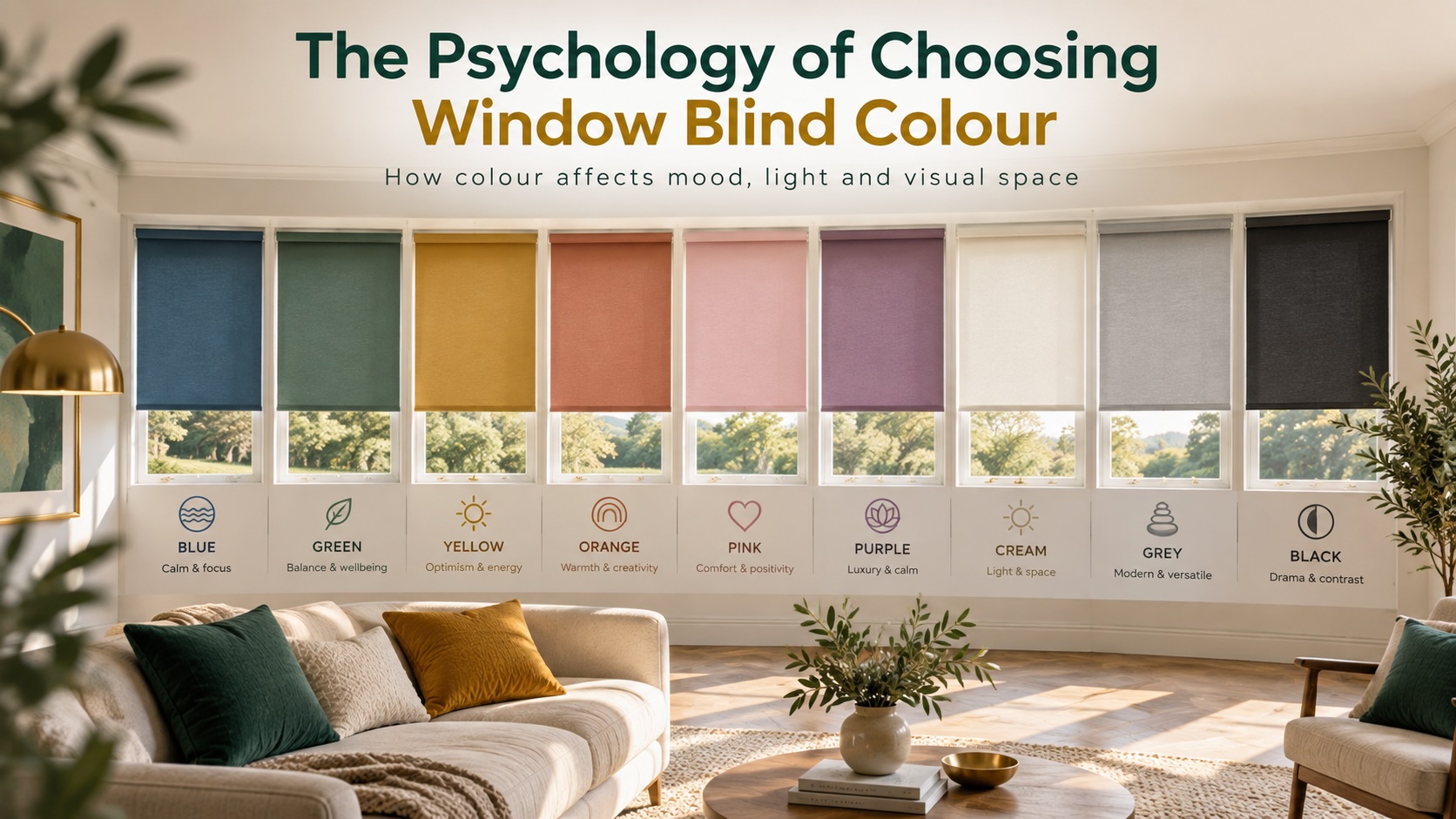
Choosing a blind colour is often treated as a decorating decision: match the walls, coordinate with the furniture, or choose a neutral that will “go with everything”.
But colour can influence much more than whether a room looks coordinated.
Research in colour psychology, environmental psychology and visual perception suggests that colour can affect how people interpret a space, including whether it feels calmer, brighter, warmer, more stimulating or more visually enclosed. These effects are not absolute, and they are shaped by factors such as lightness, saturation, contrast, daylight, culture and personal preference.
That is particularly relevant to window blinds.
Unlike a painted wall, a blind sits directly in front of one of the room’s main light sources. Its colour can therefore change in appearance throughout the day and can influence how strongly the window draws attention when the blind is lowered.
A pale blue blind, for example, does not automatically make a room “calm”, just as a red blind does not automatically make it feel energetic. The effect depends on the exact shade, how saturated it is, the surrounding colours, the amount of daylight and how much of the blind is visible.
As Elliot and Maier noted in their influential review of colour psychology, colour can affect emotion, cognition and behaviour, but these effects are highly dependent on context. More recent systematic research by Jonauskaite and Mohr has reinforced the idea that colour-emotion associations are measurable, while also showing that lightness, saturation and colour temperature can matter just as much as the basic colour name.
This guide takes that evidence-led approach.
Rather than simply asking which blind colour “matches” a room, we will look at how different colour characteristics can influence:
- Perceived calmness and stimulation
- Visual warmth and coolness
- Brightness and spaciousness
- Attention and visual weight
- How prominent the window feels
- How colour changes under different daylight conditions
- Why personal and cultural differences still matter
The aim is not to tell you that one colour is psychologically “best”.
It is to help you choose a blind colour based on the effect you want the window and the wider room to create.
Table of Contents
Use the sections below to explore the psychology of blind colour, how light and contrast change perception, and how to choose colours for different rooms.
1. Understanding Colour Psychology
2. Light, Space & Perception
3. Warm & Cool Colours
4. The Psychology of Individual Colours
- Blue Blinds: Calm, Distance and Low Arousal
- Green Blinds: Nature, Balance and Restorative Associations
- Red Blinds: Attention, Energy and High Arousal
- Yellow Blinds: Brightness, Positivity and Stimulation
- Orange Blinds: Warmth and Sociability
- Pink Blinds: Positive Affect Without the Same Arousal as Red
- Purple Blinds: Luxury, Creativity and Power Associations
- White and Cream Blinds: Brightness, Neutrality and Visual Expansion
- Grey Blinds: Calm Neutrality or Emotional Flatness?
- Black Blinds: Drama, Contrast and High Visual Weight
5. Saturation, Contrast & Visual Attention
6. Choosing Blind Colour by Room
7. Daylight, Preference & Individual Differences
Quick Answer: Does Blind Colour Really Affect How a Room Feels?
Yes, but not in the simple way that many colour guides suggest.
Research in colour psychology shows that colour can influence emotional associations, perceived atmosphere, attention and arousal, but the effect depends on much more than the basic colour name.
The most important variables are:
- Hue: whether the colour is blue, green, red, yellow and so on
- Lightness: how light or dark the colour is
- Saturation: how muted or vivid the colour appears
- Contrast: how strongly the blind stands out from surrounding walls and furnishings
- Lighting: both natural daylight and artificial light
- Context: the room, its purpose and the other colours present
- Personal and cultural associations
A major review by Elliot and Maier concluded that colour can influence psychological functioning, but also stressed that colour effects are highly dependent on context.
More recent research by Jonauskaite and Mohr, reviewing more than a century of colour-emotion studies, found consistent associations between certain colours and emotional meanings. However, their work also showed that factors such as lightness and saturation strongly influence those associations.
What This Means for Window Blinds
A pale, muted blue blind may contribute to a quieter visual atmosphere.
A highly saturated electric blue blind may feel much more stimulating.
Likewise, a pale yellow blind and a strong mustard blind belong to the same broad colour family but can create very different impressions.
That is why choosing blind colour should not begin with:
“Which colour is calming?”
A better question is:
“Do I want this window to feel lighter, quieter, warmer, more energetic, more dramatic or less visually prominent?”
From there, you can choose the combination of hue, lightness and saturation that best supports that effect.
The Key Principle
Blind colour can influence how a room is perceived, but the relationship is probabilistic rather than universal.
Colour psychology can guide the decision, but it should be used alongside:
- The amount of daylight
- Room orientation
- Existing interior colours
- The size of the blind
- Personal preference
The most effective blind colour is therefore not simply the one associated with the “right” emotion, but the one whose hue, lightness, saturation and contrast work together in the actual room.
What Does Colour Psychology Actually Mean?
Colour psychology is the study of how colour can influence perception, emotion, cognition and behaviour.
It is often simplified into statements such as “blue is calming” or “red is energising”, but the research is more nuanced than that.
A colour does not produce the same psychological response in every person or every setting.
Colour Works Through Associations and Context
People develop associations with colours through a combination of:
- Biology
- Culture
- Personal experience
- Learned meaning
- Environment
- Current context
This means the same colour can suggest different things depending on where and how it appears.
For example, red can be associated with:
- Energy
- Urgency
- Attraction
- Danger
- Importance
Which interpretation becomes dominant depends on the situation.
What the Research Suggests
The work of Andrew Elliot and Markus Maier has been particularly influential in modern colour psychology.
Their research and reviews suggest that colour can influence:
- Attention
- Motivation
- Emotional response
- Performance
- Social judgement
However, they also emphasise that colour effects depend heavily on context.
This is important for interiors because a blind is never seen in isolation.
Its psychological effect will be influenced by:
- Wall colour
- Furniture
- Flooring
- Natural light
- Artificial light
- Room function
- The size of the window
- Whether the blind is fully lowered or partially raised
Colour Associations Are Real, but Not Universal Rules
A large systematic review by Jonauskaite and Mohr found recurring relationships between colours and emotional associations across many studies and countries.
For example, some colours were consistently associated more often with:
- Positive or negative emotion
- Higher or lower arousal
- Power
- Calmness
- Warmth or coolness
But the same review also showed that there is substantial variation.
Colour psychology therefore works better as a way of understanding probabilities and tendencies, rather than predicting exactly how an individual will feel.
Why This Matters When Choosing Blinds
If you choose a blind purely because a colour chart says “green is calming”, you are ignoring several variables that may matter just as much.
A vivid emerald green blind and a pale sage blind may both be green, but they can create very different visual experiences.
The psychological effect is influenced by:
colour family + lightness + saturation + contrast + environment
That is the foundation for choosing blind colour scientifically rather than simply following decorating conventions.
Why Hue Alone Does Not Explain Colour Psychology
When people talk about colour, they usually focus on hue: blue, green, red, yellow and so on.
But hue is only one part of the visual signal.
Research into colour and emotion shows that lightness and saturation can significantly change how a colour is perceived, which means two blinds from the same colour family may create very different psychological impressions.
Hue: The Basic Colour Family
Hue is the colour category itself.
Examples include:
- Blue
- Green
- Red
- Yellow
- Orange
- Purple
Hue can influence broad associations, but it does not fully explain the emotional effect.
Lightness: How Light or Dark the Colour Is
Lightness refers to how close a colour appears to white or black.
For example:
- Pale blue has high lightness
- Navy has low lightness
- Soft sage is lighter than forest green
- Blush pink is lighter than burgundy
Research by Jonauskaite and Mohr found that lightness plays an important role in colour-emotion associations.
Lighter colours are often associated with more positive and less visually heavy impressions, while darker colours can feel more serious, intense or enclosing.
For blinds, this can affect how dominant the window feels when the blind is lowered.
Saturation: How Vivid or Muted the Colour Is
Saturation describes the intensity of the colour.
Compare:
- Pale blue with electric blue
- Sage with emerald
- Dusty pink with hot pink
- Soft ochre with vivid yellow
Highly saturated colours tend to attract more attention and can feel more stimulating.
Muted colours usually create a quieter visual effect.
This is why saying “blue is calming” is too simplistic.
A pale, desaturated blue may feel calm and unobtrusive, while a vivid cobalt blind can become one of the strongest visual elements in the room.
The Three Variables Work Together
A better way to think about colour is:
Hue + Lightness + Saturation
| Blind Colour | Likely Visual Effect |
|---|---|
| Pale Muted Blue | Quiet, soft and relatively low in visual weight |
| Deep Navy | Stronger, more enclosed and more formal |
| Bright Cobalt | Energetic, high-contrast and attention-grabbing |
| Soft Sage | Natural, restrained and visually calm |
| Vivid Emerald | Rich, dramatic and more visually stimulating |
Two blinds can belong to the same colour family but create very different impressions because of differences in lightness and saturation.
The colours may belong to the same family, but the psychological impression can be very different.
Practical Takeaway
When choosing a blind, do not ask only:
“Which colour should I choose?”
Also ask:
- How light or dark should it be?
- How vivid or muted should it be?
- How much attention should the blind attract?
In many interiors, lightness and saturation can matter just as much as the colour name itself.
Why Window Blinds Are Psychologically Different From Wall Colour
Window blinds are unusual in colour psychology because they do not behave like a static painted surface.
A wall colour is relatively stable. A blind sits directly in front of one of the room’s main light sources, so its appearance can change significantly depending on daylight, position and whether the blind is raised or lowered.
The Blind Sits in Front of the Light Source
This matters because colour perception is strongly influenced by illumination.
Research into colour perception, including work reviewed by Witzel and Gegenfurtner, shows that perceived colour is affected by the lighting environment rather than being determined by surface colour alone.
A blind may therefore appear:
- Lighter when strongly backlit
- Darker when the room is dim
- Warmer in late afternoon light
- Cooler under some artificial lighting
- More saturated when surrounded by neutral colours
This means a fabric sample viewed away from the window may not look exactly the same once installed.
The Visible Area Changes Throughout the Day
A blind can occupy very different proportions of the visual field depending on how it is being used.
When fully raised, the colour may have little influence on the room.
When fully lowered, it can become one of the largest coloured surfaces in the space.
That makes blinds psychologically different from smaller decorative objects such as:
- Cushions
- Lamps
- Artwork
- Accessories
The same colour can feel far more dominant when spread across an entire window.
Blind Colour and Daylight Work Together
The blind does not only contribute its own colour.
It also changes how the window itself is perceived.
A pale blind can create a softer transition between the bright window and the room.
A dark blind can create a much stronger contrast, particularly when surrounded by pale walls.
A coloured blind may also influence the character of light reflected back into the room, depending on the fabric and lighting conditions.
Raised and Lowered Positions Create Different Environments
The psychological effect of a blind can therefore change within the same room.
For example:
Blind raised:
The eye is drawn towards the brighter exterior view.
Blind partially lowered:
The colour becomes more noticeable while daylight is still present.
Blind fully lowered:
The blind becomes a large interior surface and its colour, lightness and saturation have much greater visual influence.
Contrast With the Window Is Important
Windows naturally attract attention because they are usually among the brightest parts of a room.
When a blind is lowered, its colour can either preserve that visual emphasis or reduce it.
A high-contrast blind may make the window feel more prominent.
A blind with similar lightness to the surrounding walls may allow the window area to feel more integrated into the room.
Why This Matters When Choosing Blind Colour
Blind colour should therefore be assessed in more than one state.
Consider how it looks:
- With the blind raised
- Partially lowered
- Fully lowered
- In strong daylight
- On an overcast day
- Under artificial lighting
The practical lesson is that blind colour is part of a changing light environment, not simply another fixed interior colour.
That is why the psychology of choosing a blind cannot be understood by looking at colour alone.
Colour Perception Changes With Light
The colour of a blind is never experienced in isolation. It is seen under changing light conditions, which means the same fabric can appear noticeably different throughout the day.
Research into colour constancy and object colour perception, including work reviewed by Witzel and Gegenfurtner, shows that the visual system tries to maintain a stable sense of colour even as illumination changes. But that process is not perfect.
In practice, the perceived colour of a blind can shift depending on the light falling on it.
Daylight Changes Throughout the Day
Natural daylight varies in intensity and colour.
As a result, a blind may appear:
- Cooler in some morning conditions
- Brighter around midday
- Warmer in late afternoon light
- Greyer or more muted on an overcast day
This is one reason fabric samples can look different once installed.
Artificial Lighting Changes Colour Too
The type of artificial light in the room also affects how blind colour is perceived.
A warm light source can make colours such as:
- Beige
- Cream
- Terracotta
- Warm green
feel richer or more golden.
Cooler lighting can make some colours appear:
- Crisper
- Bluer
- Greyer
- Less warm than they did in daylight
Backlighting Matters
Blinds are often viewed with daylight behind them.
This is different from viewing a painted wall, where light usually falls onto the surface from the front.
Depending on the fabric, backlighting can affect:
- Apparent lightness
- Contrast
- Saturation
- Visibility of texture
- Overall colour intensity
A fabric that appears deep and muted in a sample book may look lighter when installed across a bright window.
Room Orientation Also Changes the Result
Window direction affects the character of the daylight entering the room.
This means the same blind colour may not create the same impression in:
- A north-facing room
- A south-facing room
- An east-facing room
- A west-facing room
The exact effect will also depend on season, weather, glazing and surrounding buildings.
Why This Matters for Colour Psychology
If a blind colour becomes brighter, darker, warmer or cooler under different lighting conditions, its psychological effect can change too.
A muted green that feels calm in soft daylight may appear much stronger under intense sun.
A warm beige that feels inviting in daylight may become more yellow under warm artificial lighting.
Practical Takeaway
Never judge a blind colour from a sample in one lighting condition.
Where possible, view the fabric:
- In the actual room
- Against the window
- In morning light
- In afternoon light
- On an overcast day
- Under the room’s normal artificial lighting
The colour you are choosing is not just the fabric itself. It is the fabric as it appears under the changing light conditions of the room.
Why Light Blind Colours Tend to Feel More Open
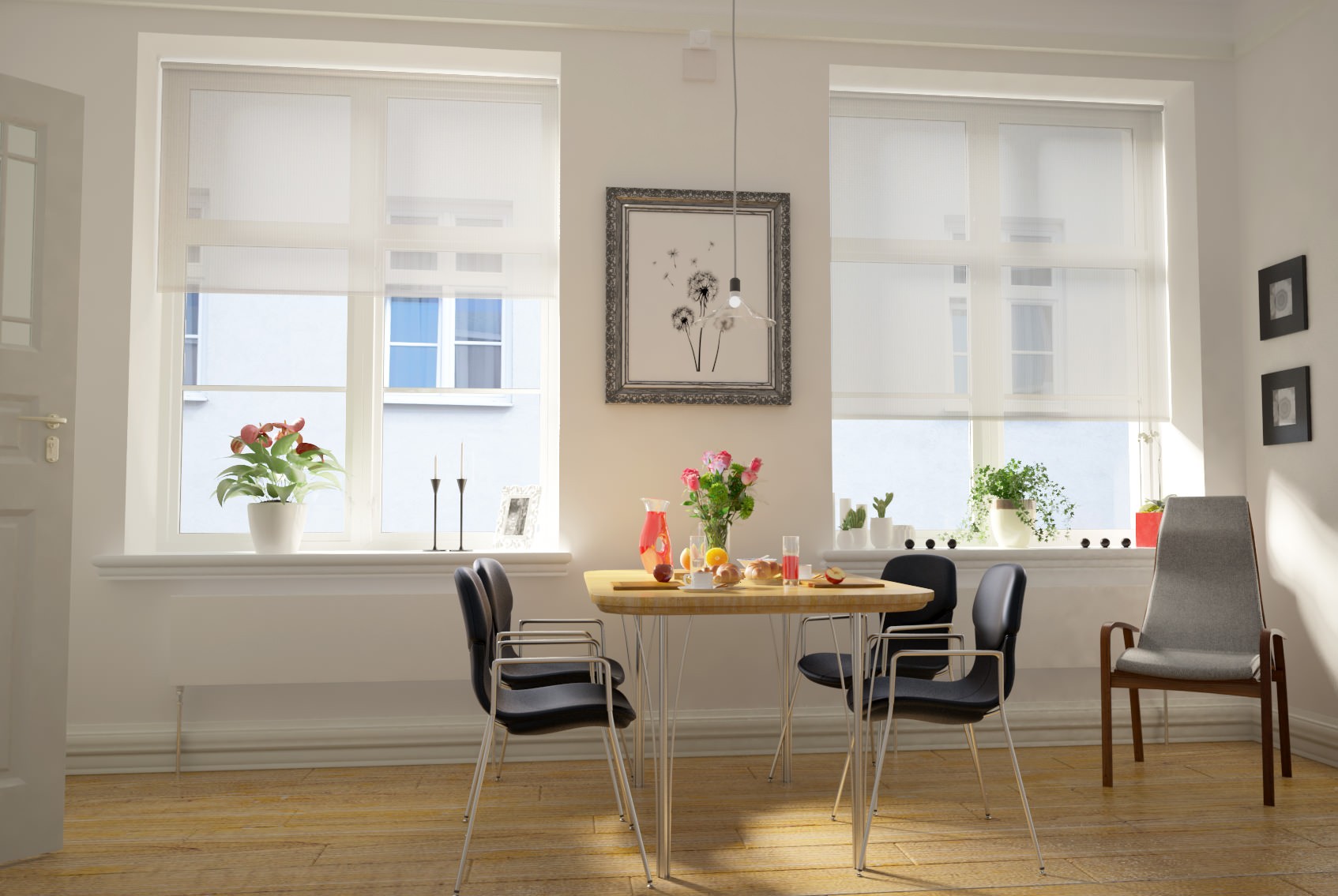
Light-coloured blinds are often described as making a room feel larger or more open, but the more accurate explanation is that they can reduce visual weight and contrast, particularly around the window.
Research into colour-emotion associations, including the systematic review by Jonauskaite and Mohr, found that lighter colours are generally associated with more positive and less heavy emotional meanings than darker colours.
That does not mean a pale blind physically increases the size of a room. Instead, it can change how the space is perceived.
Light Colours Reflect More Visible Light
Pale blinds generally reflect more visible light than darker ones.
This can help the window area feel:
- Brighter
- Softer
- Less visually dense
- More integrated with surrounding pale walls
The effect can be especially noticeable when the blind is fully lowered and becomes a large surface within the room.
Lower Contrast Can Make the Window Feel Less Dominant
A light blind against a light wall creates relatively little contrast.
That can reduce the visual boundary between:
- The blind
- The window recess
- The surrounding wall
When those elements feel more continuous, the window area can appear less visually fragmented.
This is one reason pale blinds are often successful in smaller or darker rooms.
Lightness Affects Visual Weight
Darker colours generally appear visually heavier than lighter ones.
A pale cream or soft grey blind may therefore feel less dominant than:
- Charcoal
- Navy
- Deep green
- Black
even when both blinds are exactly the same size.
This matters because a fully lowered blind can occupy a substantial part of the visual field.
The Effect Depends on Contrast
A light blind will not always make a window feel understated.
For example, a bright white blind against a dark navy wall may create very strong contrast and attract considerable attention.
The perception of openness therefore depends on both:
blind lightness + surrounding colour
Light Does Not Automatically Mean Warm
Lightness and colour temperature are separate.
A pale blind could be:
- Warm cream
- Cool grey
- Soft blue
- Pale green
- Blush pink
All have relatively high lightness, but they may create different emotional associations.
Practical Takeaway
Light blind colours tend to feel more open because they often create:
higher brightness + lower visual weight + softer contrast + greater continuity with pale surroundings
This is more accurate than simply saying that “light blinds make a room look bigger”.
They can influence perceived spaciousness, but the effect depends on the room’s lighting, wall colour and the amount of contrast at the window.
Why Dark Blind Colours Feel Heavier and More Enclosed
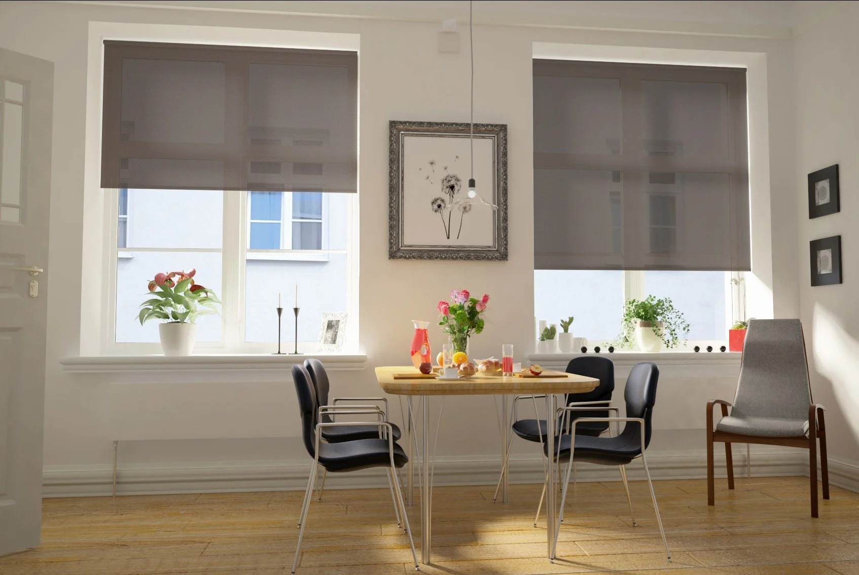
Dark blind colours tend to create a stronger visual presence because they usually have lower lightness, higher contrast and greater visual weight than pale colours.
When a dark blind is fully lowered, it can become one of the most dominant surfaces in the room.
Dark Colours Create Stronger Boundaries
A charcoal, navy or black blind against pale walls creates a clear edge around the window.
That stronger contrast can make the window feel:
- More defined
- More dramatic
- More visually important
- More enclosed when the blind is lowered
This is one reason dark blinds can work particularly well in interiors that aim for a cocooning or high-contrast atmosphere.
Lower Lightness Can Feel More Substantial
Research into colour-emotion associations, including the systematic review by Jonauskaite and Mohr, suggests that darker colours are more often associated with heavier, more serious or lower-valence emotional meanings than lighter colours.
In interiors, this can translate into a sense of:
- Depth
- Formality
- Weight
- Enclosure
That does not mean dark blinds are psychologically negative. The same visual qualities can also be interpreted as sophisticated, controlled or luxurious.
Dark Blinds Can Reduce the Sense of Openness
When a dark blind covers a large window, the visual transition from the interior to the outside becomes much stronger.
The window can stop feeling like a bright opening and instead behave more like a dark interior surface.
This can make the room feel:
- More intimate
- More contained
- More evening-like
- Less visually open
The effect is strongest when the blind covers a large area.
Contrast Matters More Than Darkness Alone
A dark blind against dark walls may feel relatively integrated.
The same blind against white walls may become a strong focal point.
So the psychological effect depends on:
blind darkness + surrounding colour + window size + light level
Dark Does Not Always Mean Small
A common decorating rule says that dark colours make rooms feel smaller.
That is too simplistic.
Dark blinds can make the window feel more enclosed or visually heavy, but they can also create:
- Depth
- Strong architectural definition
- A sense of luxury
- Deliberate contrast
The final effect depends on the whole room.
Practical Takeaway
Dark blind colours tend to feel heavier because they create:
lower lightness + stronger boundaries + greater visual contrast + more visual weight
They are a good choice when you want the window to feel more deliberate, dramatic or cocooning.
They are less suitable where the aim is to make the blind disappear into a light, open interior.
Can Blind Colour Make a Room Feel Bigger or Smaller?
Blind colour cannot change the physical dimensions of a room, but it can influence perceived spaciousness.
The main factors are usually:
- Lightness
- Contrast
- Visual continuity
- Window prominence
- Overall room brightness
Why Lighter Blinds Can Feel More Expansive
A light blind can create a softer visual transition between the window and surrounding walls, especially when the colours are similar.
This can reduce the number of strong visual boundaries in the room.
The result may feel:
- More open
- Less visually interrupted
- Brighter
- Less enclosed
This is one reason pale blinds are often effective in compact rooms.
Why Darker Blinds Can Feel More Enclosing
A dark blind can create a stronger edge around the window, particularly against pale walls.
When fully lowered, it may behave more like a large dark surface than a light opening.
That can make the room feel:
- More contained
- More intimate
- More dramatic
- Visually heavier
This does not necessarily mean smaller in a negative sense. In some interiors, that sense of enclosure is exactly what creates a comfortable or luxurious atmosphere.
Contrast Is Often More Important Than Colour Alone
A white blind against white walls may visually recede.
A white blind against charcoal walls may become highly prominent.
Likewise, a dark green blind against similarly dark walls may feel more integrated than the same blind against pale cream.
So perceived spaciousness depends not simply on whether the blind is light or dark, but on how much it contrasts with the rest of the room.
Window Size Matters Too
The larger the blind, the greater its potential visual influence.
A dark blind covering a large picture window can affect the perceived balance of the room far more than the same colour used on a small window.
When the blind is fully lowered, consider how much of the visual field it occupies.
Raised and Lowered Positions Can Change the Effect
A room may feel very different depending on whether the blind is:
- Fully raised
- Partially lowered
- Fully closed
A dark blind may have very little impact when raised, but become dominant when lowered.
A pale blind may maintain a lighter visual effect in both positions.
Practical Takeaway
If you want a room to feel more open, a useful starting point is:
lighter blind + lower contrast + good daylight + visual continuity
If you want the room to feel more intimate or defined:
darker blind + stronger contrast + greater visual weight
The key is to think in terms of perceived space, not the idea that one colour automatically makes a room bigger or smaller.
What Are Warm and Cool Colours Psychologically?
Warm and cool colours are not literally warmer or cooler in temperature. They are perceptual categories that describe the way certain colours are commonly experienced and associated.
In colour psychology, this distinction matters because warm and cool colours often differ in arousal, attention and emotional tone.
Warm Colours
Warm colours usually include:
- Red
- Orange
- Yellow
- Terracotta
- Rust
- Warm beige
- Some warm browns
These colours are often associated with:
- Energy
- Activity
- Warmth
- Sociability
- Stimulation
- Closeness
Research into colour-emotion associations, including work by Jonauskaite and Mohr, suggests that warmer colours are often linked with more activating or higher-arousal emotions than many cooler colours.
That does not mean every warm colour feels energetic. A muted terracotta blind may feel soft and grounded, while a vivid orange blind can feel much more stimulating.
Cool Colours
Cool colours usually include:
- Blue
- Green
- Blue-green
- Some cool greys
- Teal
These colours are often associated with:
- Calmness
- Distance
- Restfulness
- Freshness
- Lower arousal
- Natural environments
Blue and green in particular are frequently linked with lower-arousal positive emotional associations.
Again, saturation matters.
A pale blue-grey blind may feel quiet and restrained, while a highly saturated turquoise blind can still be visually energetic.
Colour Temperature Is an Association
When we describe a colour as warm or cool, we are talking about perception rather than the actual temperature of the room.
A red blind does not make the air warmer.
A blue blind does not lower the room temperature.
What can change is the perceived atmosphere.
A room dominated by warmer colours may feel more intimate or cosy.
A room dominated by cooler colours may feel fresher or more spacious.
Warm and Cool Colours Can Change Spatial Perception
Warm colours are often perceived as visually advancing, meaning they can appear more prominent or closer.
Cool colours are often perceived as visually receding, which can make them feel less dominant.
For blinds, this can influence how strongly the window attracts attention.
A warm burnt-orange blind may become a focal point.
A muted blue-grey blind may sit more quietly within the room.
Practical Takeaway
Think of warm and cool colours as broad psychological tendencies:
Warm colours: more active, intimate and visually prominent
Cool colours: more restful, restrained and visually distant
But always consider lightness and saturation as well.
A muted warm colour may feel calmer than a highly saturated cool colour, so colour temperature should never be used on its own when choosing a blind.
Do Warm-Coloured Blinds Make a Room Feel Warmer?
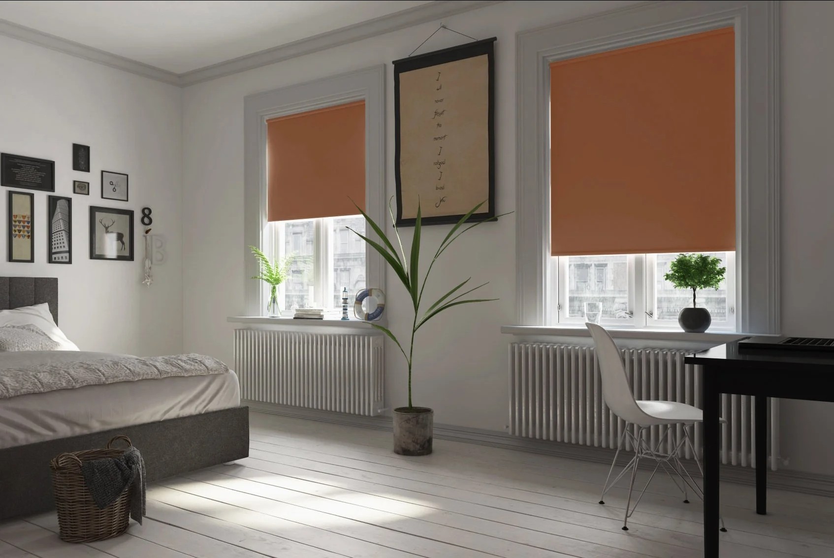
Warm-coloured blinds can make a room feel psychologically warmer, but they do not materially increase the room’s temperature.
The effect is perceptual rather than physical.
Why Warm Colours Can Change the Atmosphere
Colours such as:
- Red
- Orange
- Terracotta
- Ochre
- Warm beige
- Rust
are commonly associated with warmth, energy and closeness.
Research in environmental colour and colour-emotion psychology suggests that these associations can influence how a space is experienced, particularly when the colour occupies a large visual area.
A lowered blind can do exactly that.
Perceived Warmth Is Not Thermal Performance
It is important to separate two different ideas:
Psychological warmth
How warm, cosy or inviting a room feels visually.
Thermal performance
How much heat the blind actually helps retain or exclude.
A warm orange blind may make a room feel cosier, but its colour alone does not provide insulation.
Thermal performance depends on factors such as:
- Fabric construction
- Lining
- Blind type
- Fit
- Glazing
- Air gaps
Saturation Changes the Effect
A muted warm blind and a vivid warm blind can feel very different.
For example:
- Soft terracotta may feel grounded and comfortable
- Warm beige may feel subtle and inviting
- Bright orange may feel much more energetic
- Strong red may become dominant and stimulating
So the feeling of warmth depends not just on hue, but on lightness and saturation as well.
Warm Colours Can Feel More Intimate
Warm colours are often described as visually advancing.
This means they can appear more prominent within the room and may contribute to a stronger sense of enclosure or intimacy.
That can work well where the aim is to create:
- A cosy bedroom
- A welcoming living room
- A warmer-feeling dining space
- A more intimate atmosphere
Daylight Can Strengthen or Weaken the Effect
The same warm blind may look different depending on the light.
Late afternoon sun can intensify warm tones, while cooler daylight may make them appear more restrained.
Artificial lighting can also shift the balance, especially with cream, beige, yellow and terracotta shades.
Practical Takeaway
Warm-coloured blinds can influence perceived warmth and intimacy, but not actual room temperature.
If the goal is to create a warmer visual atmosphere, consider:
warm hue + moderate saturation + suitable lighting + coordinated surrounding colours
If actual insulation is the priority, blind colour should be considered separately from the blind’s thermal specification.
Do Cool-Coloured Blinds Make a Room Feel Calmer?
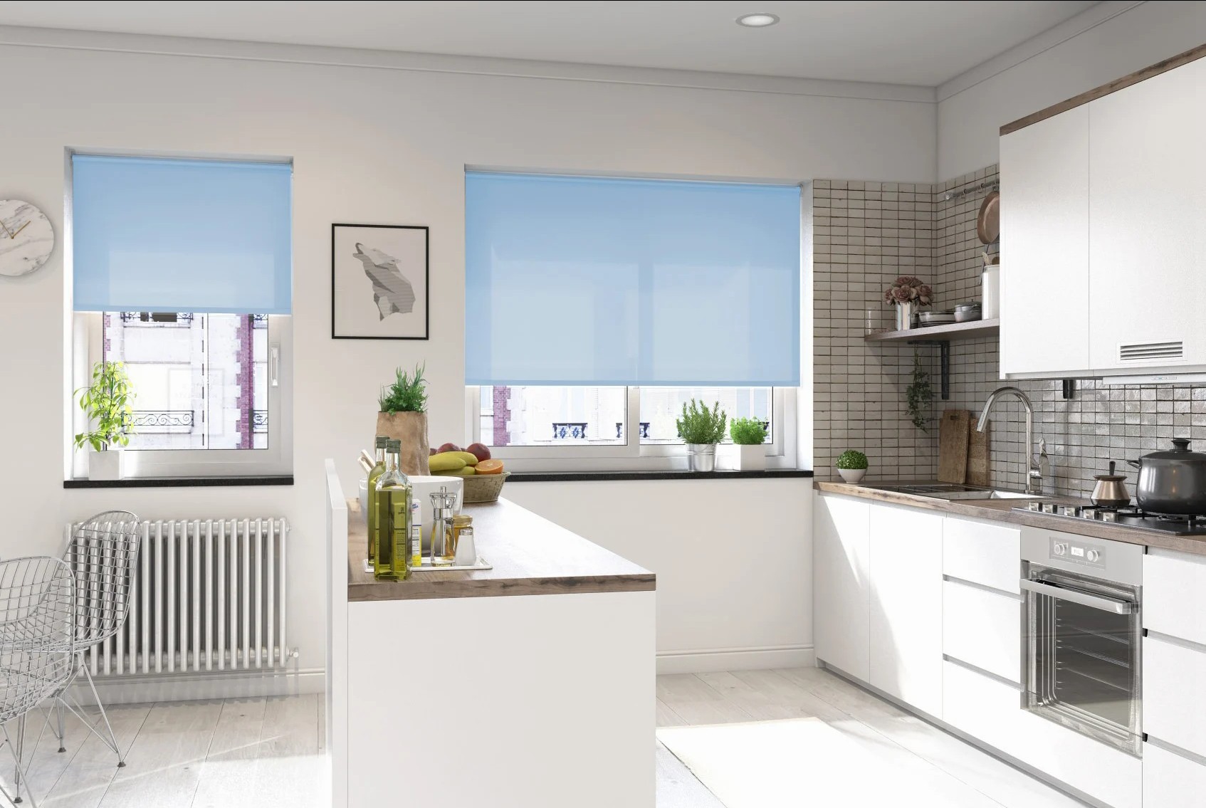
Cool-coloured blinds can contribute to a quieter, lower-arousal visual atmosphere, but the effect is not automatic.
Research on colour-emotion associations, including the work of Jonauskaite and Mohr, suggests that colours such as blue and green are commonly linked with lower-arousal positive emotions. In practice, that can make them useful where the aim is to create a calmer or more restrained room.
Which Colours Are Usually Considered Cool?
Typical cool colours include:
- Blue
- Green
- Blue-green
- Teal
- Some cooler greys
These colours are often associated with:
- Calmness
- Freshness
- Distance
- Restfulness
- Natural environments
Blue and Green Are Not Always Calm
The exact shade matters.
For example:
- Pale blue can feel soft and quiet
- Navy can feel more formal and weighty
- Sage can feel restrained and natural
- Emerald can feel rich and dramatic
- Bright turquoise can feel lively and energetic
This is why hue alone does not determine the psychological effect.
Saturation Matters
A muted cool colour generally produces less visual stimulation than a highly saturated one.
Compare:
Muted sage
Quiet, natural and understated
Vivid emerald
Stronger, richer and more attention-grabbing
Both are green, but the visual and emotional effect can be very different.
Cool Colours Can Feel More Visually Distant
Cool colours are often described as receding.
In interiors, this can make them feel less visually dominant than stronger warm colours.
For blinds, this may help the window feel:
- Less intrusive
- More integrated
- More spacious
- Visually calmer
The effect is strongest where contrast with surrounding walls is also low.
Why Cool Colours Often Work Well in Bedrooms and Offices
Rooms where lower visual stimulation is desirable may benefit from cooler, more muted blind colours.
For example:
- Bedrooms
- Home offices
- Reading areas
- Calm living spaces
That does not mean blue or green are automatically the best choices. Personal preference and the rest of the room still matter.
Practical Takeaway
Cool-coloured blinds can support a calmer visual atmosphere when they are:
muted + lower in saturation + reasonably light + not excessively contrasting
The strongest scientific interpretation is not that “blue makes people calm”, but that certain cool colours are more commonly associated with lower-arousal, positive emotional states.
Blue Blinds: Calm, Distance and Low Arousal
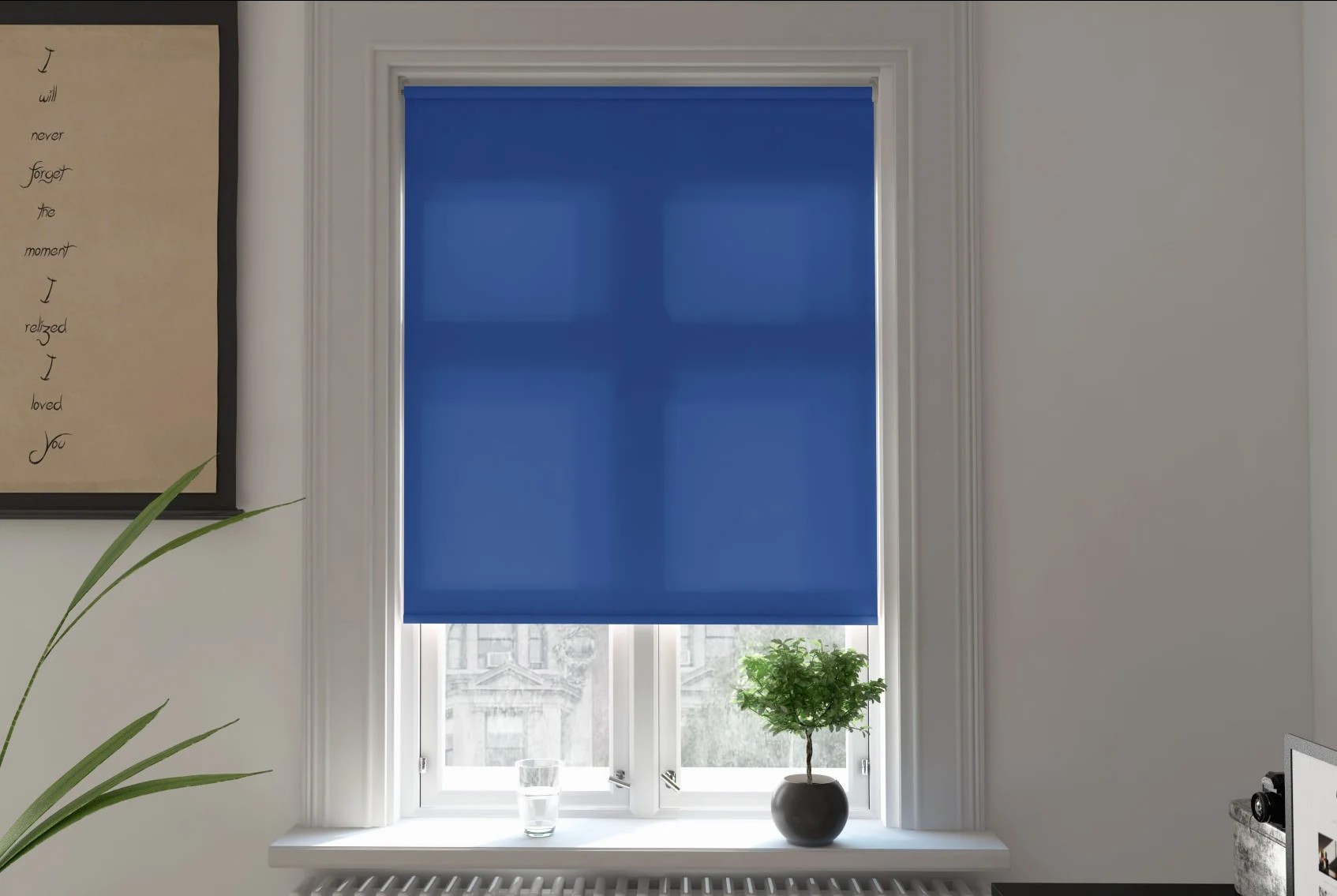
Blue is one of the colours most consistently associated with calmness, coolness and lower-arousal emotional states.
Research synthesised by Jonauskaite and Mohr found that blue is commonly linked with positive, lower-arousal emotions. This helps explain why blue is often perceived as suitable for rooms where a quieter atmosphere is desired.
However, not every blue blind will create the same effect.
Pale Blue vs Deep Blue
Lightness changes the impression considerably.
A pale blue blind may feel:
- Soft
- Airy
- Quiet
- Visually light
- Less dominant
A deep navy blind may feel:
- More formal
- More enclosed
- More substantial
- Stronger in visual weight
Both are blue, but their psychological character is very different.
Saturation Changes the Level of Stimulation
A muted blue-grey is usually much less visually stimulating than a vivid cobalt or electric blue.
Compare:
Muted blue-grey
Restrained, low contrast and visually calm
Bright cobalt
More energetic, noticeable and attention-grabbing
This is why the statement “blue is calming” is incomplete without considering saturation.
Blue Can Feel Visually Receding
Cool colours are often perceived as more visually distant than warm colours.
For blinds, this can help blue feel less dominant, particularly when:
- The shade is pale
- Saturation is low
- The surrounding walls are also cool or neutral
- Contrast is limited
This can support a greater sense of openness around the window.
Where Blue Blinds Can Work Well
Blue may be particularly appropriate where the desired atmosphere is:
- Calm
- Restful
- Controlled
- Fresh
- Less visually stimulating
That can make it a useful starting point for:
- Bedrooms
- Home offices
- Reading rooms
- Living rooms
- Rooms with strong daylight
Watch the Room’s Natural Light
Blue can shift noticeably depending on daylight.
In cooler or north-facing light, some blues may appear:
- Greyer
- Colder
- More subdued
In stronger sunlight, they may appear:
- Brighter
- More saturated
- More vivid
The fabric should therefore be viewed in the actual room before making a final decision.
Practical Takeaway
Blue blinds are most likely to support a calmer atmosphere when they are:
cool + muted + relatively low in saturation + not excessively dark
If you want more drama, navy or saturated blue can still work, but the psychological effect moves away from softness and towards strength, depth and visual emphasis.
Green Blinds: Nature, Balance and Restorative Associations
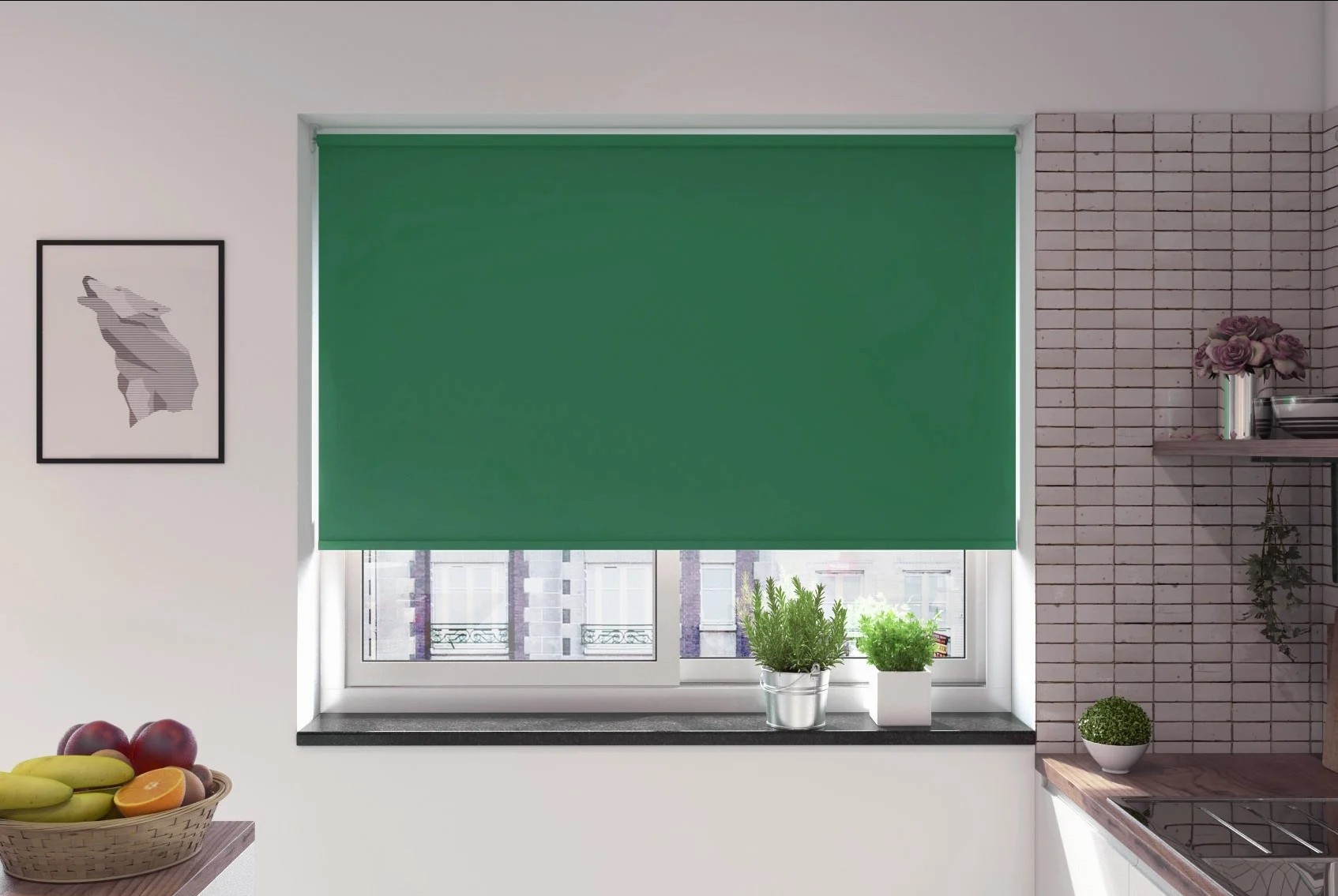
Green is commonly associated with nature, balance and lower-arousal positive emotion, which makes it one of the most psychologically interesting blind colours.
Research synthesised by Jonauskaite and Mohr found that green is frequently linked with positive emotional associations, while broader environmental psychology research has long examined the restorative effects associated with natural environments.
That does not mean green itself automatically produces the same effects as being in nature, but the association is strong enough to influence how green interiors are perceived.
Why Green Feels Connected to Nature
Green is strongly associated with:
- Plants
- Landscapes
- Growth
- Freshness
- Natural environments
These learned and perceptual associations can make green feel more grounded and less artificial than some other colour families.
For blinds, that can help create a softer relationship between the interior and the view outside, particularly where the window already looks onto greenery.
Muted Greens Usually Feel Calmer
Saturation matters considerably.
Compare:
Soft sage
Muted, quiet and natural
Olive
Earthier, warmer and more grounded
Emerald
Richer, stronger and more dramatic
Lime green
Much brighter, more stimulating and attention-grabbing
All are green, but they do not create the same psychological impression.
Green Can Sit Between Warm and Cool
Green is particularly flexible because different shades can lean in different directions.
A blue-based green can feel:
- Cooler
- Fresher
- More restrained
A yellow-based green can feel:
- Warmer
- Earthier
- More energetic
This makes undertone important when choosing a green blind.
Green and Restorative Associations
Research into environmental psychology has consistently found that exposure to natural environments can support restoration and reduced mental fatigue.
A green blind should not be assumed to reproduce those effects by itself, but nature-linked colours can reinforce a visual connection with natural materials and outdoor views.
This is especially relevant in rooms that already include:
- Timber
- Plants
- Natural fabrics
- Stone
- Earth-toned furnishings
Where Green Blinds Can Work Well
Green can be a strong choice where the desired atmosphere is:
- Calm
- Natural
- Balanced
- Restful
- Grounded
That makes muted greens particularly suitable for:
- Bedrooms
- Living rooms
- Home offices
- Reading spaces
- Rooms with natural materials
Practical Takeaway
Green blinds are most likely to feel calm and restorative when they are:
muted + nature-associated + moderately light + not overly saturated
If you want more impact, deeper greens such as emerald or forest green can still work, but the effect becomes more luxurious, dramatic and visually dominant than quietly restorative.
Red Blinds: Attention, Energy and High Arousal
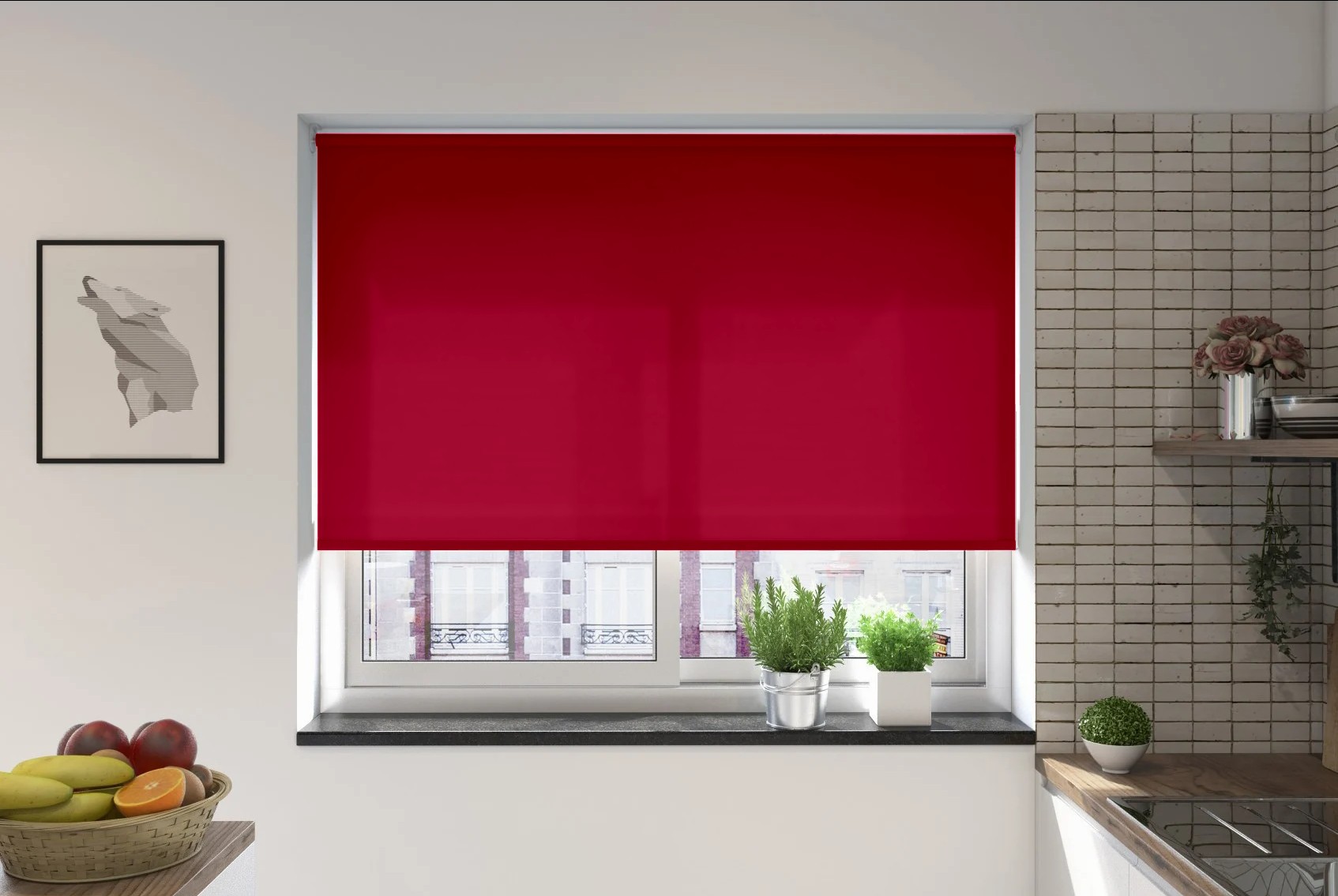
Red is one of the strongest colours psychologically because it is commonly associated with attention, energy and higher arousal.
Research reviewed by Elliot and Maier has shown that red can influence attention, motivation and behaviour, although the effect depends heavily on context. More recent colour-emotion research also links red with stronger, more activating emotional associations than many cooler colours.
For blinds, that means red is rarely a neutral choice.
Red Naturally Attracts Attention
Red is visually prominent, particularly when it contrasts strongly with the surrounding room.
A red blind can therefore make the window a focal point rather than allowing it to recede into the background.
This may work well where the aim is to create:
- Energy
- Drama
- Warmth
- Visual emphasis
- A strong design statement
Saturation Makes a Major Difference
A bright red blind and a muted red blind can feel completely different.
Compare:
Bright scarlet
Energetic, bold and highly attention-grabbing
Deep burgundy
Heavier, richer and more formal
Muted brick red
Warmer, earthier and less stimulating
Soft dusty red
More restrained and easier to integrate
The stronger and more saturated the red, the more dominant it is likely to feel.
Red Can Increase Visual Warmth
Red belongs to the warm end of the colour spectrum and is often associated with heat, intensity and closeness.
A red blind may therefore make a room feel more:
- Intimate
- Energetic
- Enclosed
- Visually warm
This can be effective in spaces where a strong, cosy or dramatic atmosphere is desirable.
Red Is Highly Context-Dependent
This is especially important with red because its associations vary widely.
Depending on the context, red can suggest:
- Excitement
- Passion
- Urgency
- Warning
- Power
- Celebration
That is why the psychological response to red cannot be reduced to a single emotion.
Where Red Blinds Can Work Well
Red may suit rooms where the aim is to create:
- A strong focal point
- A warmer atmosphere
- Greater visual energy
- A more dramatic interior
It may be less suitable where the main goal is low stimulation or visual calm.
Practical Takeaway
Red blinds tend to work best when used deliberately.
If you want strong visual impact:
higher saturation + stronger contrast + deeper or brighter red
If you want warmth without the same level of stimulation:
muted red + softer contrast + earthier undertones
Red is one of the clearest examples of why colour psychology depends not just on hue, but on intensity, context and the size of the coloured surface.
Yellow Blinds: Brightness, Positivity and Stimulation
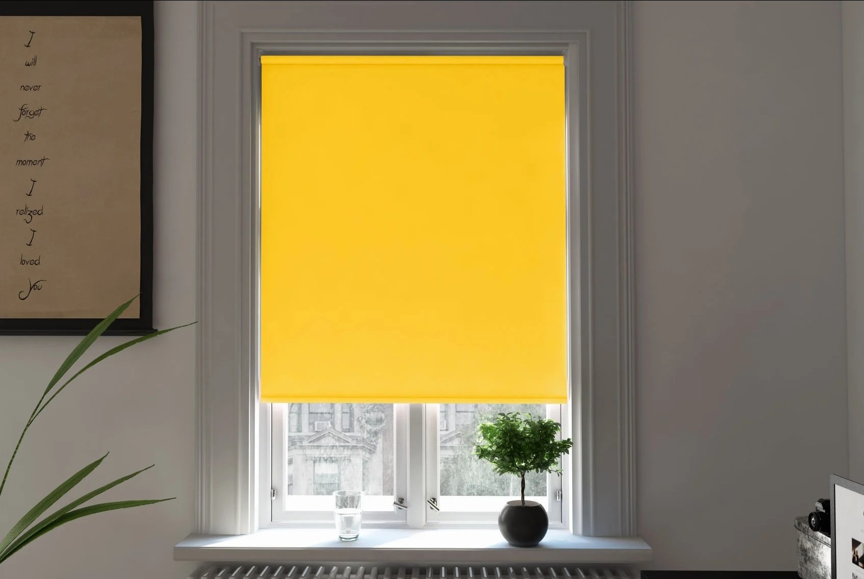
Yellow is commonly associated with brightness, optimism and positive emotion, but it is also one of the more stimulating colour families.
Research reviewed by Jonauskaite and Mohr found recurring associations between yellow and positive, relatively high-arousal emotions. That makes yellow quite different from calmer, lower-arousal colours such as muted blue or green.
For blinds, the exact shade matters enormously.
Why Yellow Feels Bright and Energetic
Yellow is strongly associated with:
- Sunshine
- Daylight
- Warmth
- Cheerfulness
- Energy
- Optimism
Because of these associations, yellow blinds can make a room feel more lively and visually warm.
However, this does not mean yellow will automatically improve mood. Colour psychology research identifies common associations, not guaranteed emotional responses.
Pale Yellow vs Strong Yellow
Lightness and saturation change the effect considerably.
Compare:
Pale butter yellow
Soft, warm and relatively gentle
Muted ochre
Earthy, grounded and more restrained
Mustard yellow
Richer, deeper and visually more substantial
Bright lemon yellow
Energetic, vivid and highly noticeable
Two yellow blinds can therefore create very different psychological impressions.
Saturation Is Especially Important With Yellow
Highly saturated yellow can attract attention very quickly.
In a large area, such as a fully lowered blind, a vivid yellow may feel:
- Energetic
- Cheerful
- Stimulating
- Dominant
A softer or more muted yellow is usually easier to live with over long periods because it retains warmth without creating the same level of visual intensity.
Yellow Can Increase Perceived Warmth
Yellow sits firmly within the warm colour family.
A yellow blind can therefore make a room feel psychologically warmer, particularly when combined with:
- Warm wood
- Cream walls
- Natural textures
- Earth-toned furniture
The effect is perceptual rather than thermal.
Yellow Can Make the Window More Prominent
Yellow often stands out strongly against neutral interiors.
A vivid yellow blind against white, grey or beige walls is likely to become a focal point.
A muted yellow used alongside other warm colours may feel much more integrated.
This is another example of how contrast matters as much as the colour itself.
Where Yellow Blinds Can Work Well
Yellow may suit rooms where the desired atmosphere is:
- Bright
- Positive
- Warm
- Energetic
- Informal
It can work particularly well in:
- Kitchens
- Breakfast rooms
- Playrooms
- Creative spaces
- Rooms with limited visual warmth
For bedrooms or spaces designed around low stimulation, softer yellows are generally easier to use than highly saturated shades.
Practical Takeaway
Yellow blinds are most likely to create a positive, lively atmosphere when they are used deliberately.
For a softer effect:
pale or muted yellow + moderate contrast + warm surroundings
For greater visual energy:
brighter yellow + higher saturation + stronger contrast
Yellow is a good example of why a colour can be associated with positivity while still being relatively stimulating. The final effect depends on lightness, saturation, contrast and context.
Orange Blinds: Warmth and Sociability
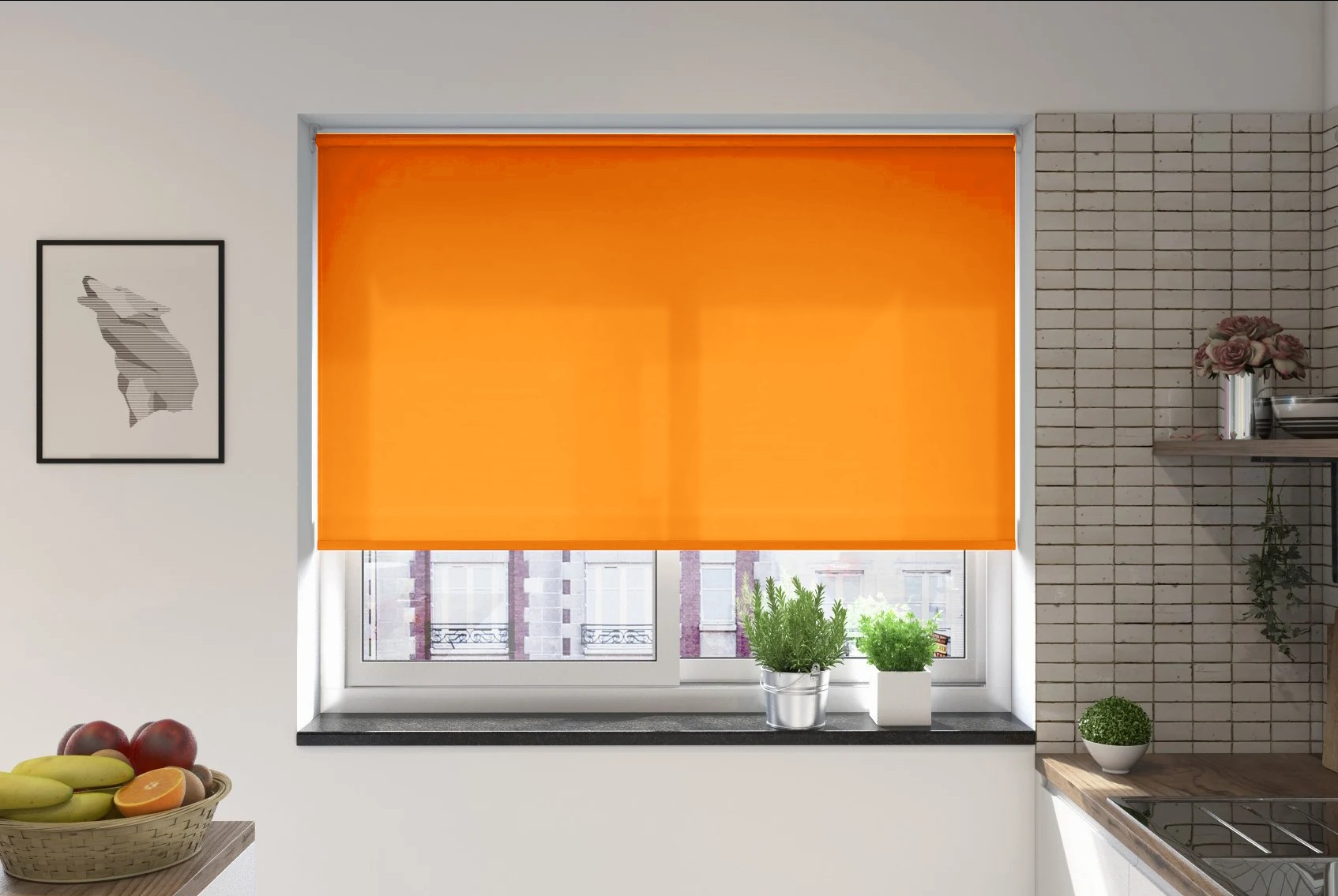
Orange combines some of the visual warmth of red with some of the brightness associated with yellow.
Psychologically, it is often linked with energy, warmth, friendliness and sociability, which can make it useful in rooms intended to feel welcoming rather than quiet or formal.
As with every colour, the exact effect depends on lightness and saturation.
Why Orange Feels Warm
Orange sits firmly within the warm colour family and is commonly associated with:
- Heat
- Sunshine
- Autumn
- Energy
- Informality
- Social activity
These associations can make orange blinds feel more animated and approachable than cooler colours such as blue or grey.
Muted Orange vs Bright Orange
The difference between muted and saturated orange is significant.
Compare:
Soft terracotta
Warm, grounded and relatively calm
Burnt orange
Rich, cosy and more substantial
Peach
Lighter, softer and more delicate
Bright tangerine
Energetic, vivid and highly noticeable
A muted orange can feel warm without becoming overwhelming, while a highly saturated orange is much more likely to dominate the room.
Orange Can Make a Room Feel More Social
Orange is often associated with activity and warmth, which can suit spaces where people gather.
That may make it appropriate for:
- Living rooms
- Dining rooms
- Kitchens
- Family rooms
- Social spaces
The effect is not that orange makes people more sociable in a guaranteed way. It is more accurate to say that orange tends to carry warmer, more activating associations than many cool colours.
Orange Can Feel More Intimate
Like other warm colours, orange can feel visually advancing.
A warm orange blind may therefore make the window feel:
- More prominent
- Closer
- More enclosed
- More visually warm
This can support a cosier atmosphere, particularly when combined with warm wood, beige, cream or natural materials.
Saturation Determines How Stimulating It Feels
A soft peach blind and a vivid orange blind belong to the same broad colour family, but psychologically they behave very differently.
Higher saturation usually means:
- More visual energy
- Greater attention
- Stronger contrast
- More stimulation
Lower saturation tends to create a quieter and more adaptable result.
Practical Takeaway
Orange blinds are most likely to feel warm and welcoming when they are:
muted + earthy + moderately saturated + coordinated with warm surroundings
For a stronger, more energetic effect:
brighter orange + higher saturation + stronger contrast
Orange is therefore a useful choice when you want warmth and personality without the intensity that can come with strong red.
Pink Blinds: Positive Affect Without the Same Arousal as Red
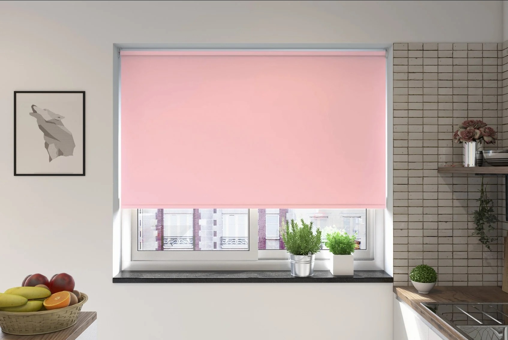
Pink is closely related to red, but it is usually perceived as softer, lighter and less intense.
Research into colour-emotion associations, including the work reviewed by Jonauskaite and Mohr, suggests that pink is often linked with positive emotional meanings. However, because many pinks are lighter and less saturated than strong reds, they generally create less visual arousal.
Why Pink Feels Softer Than Red
The difference is not simply the colour name.
Many pinks combine:
- Lower saturation
- Higher lightness
- Less visual weight
- Softer contrast
This can make them feel more approachable and less demanding than vivid red.
Pale Pink vs Strong Pink
The psychological effect changes considerably depending on shade.
Blush pink
Soft, quiet and understated
Dusty rose
Muted, warmer and more grounded
Coral pink
More energetic and sociable
Hot pink
Highly saturated, playful and attention-grabbing
This is another example of why saturation and lightness often matter as much as hue.
Pink Can Add Warmth Without Heavy Visual Weight
Pink belongs broadly to the warm side of the colour spectrum, so it can make a room feel visually warmer.
Unlike deeper red, however, lighter pinks tend to feel less enclosed or heavy.
That can make them useful where the aim is to create:
- Warmth
- Softness
- Positivity
- Personality
- A lighter visual atmosphere
Pink Is Highly Influenced by Context
Pink carries strong cultural and personal associations, and these vary between people.
Its interpretation can depend on:
- Age
- Culture
- Fashion
- Personal preference
- Surrounding colours
- Saturation
A dusty pink blind paired with natural wood and cream may feel very different from the same colour used with highly contrasting black and white.
Where Pink Blinds Can Work Well
Pink may suit rooms where the desired atmosphere is:
- Warm
- Soft
- Cheerful
- Relaxed
- Expressive
Muted pinks can work well in bedrooms, living rooms and softer neutral interiors, while brighter pinks are more likely to act as a focal point.
Practical Takeaway
Pink blinds are generally less visually intense than strong red because they are often:
lighter + less saturated + lower in visual weight
For a calm effect:
blush or dusty pink + soft contrast + muted surroundings
For a more energetic effect:
brighter pink + higher saturation + stronger contrast
Pink shows particularly clearly that colours within the same family can produce very different psychological impressions depending on lightness and saturation.
Purple Blinds: Luxury, Creativity and Power Associations
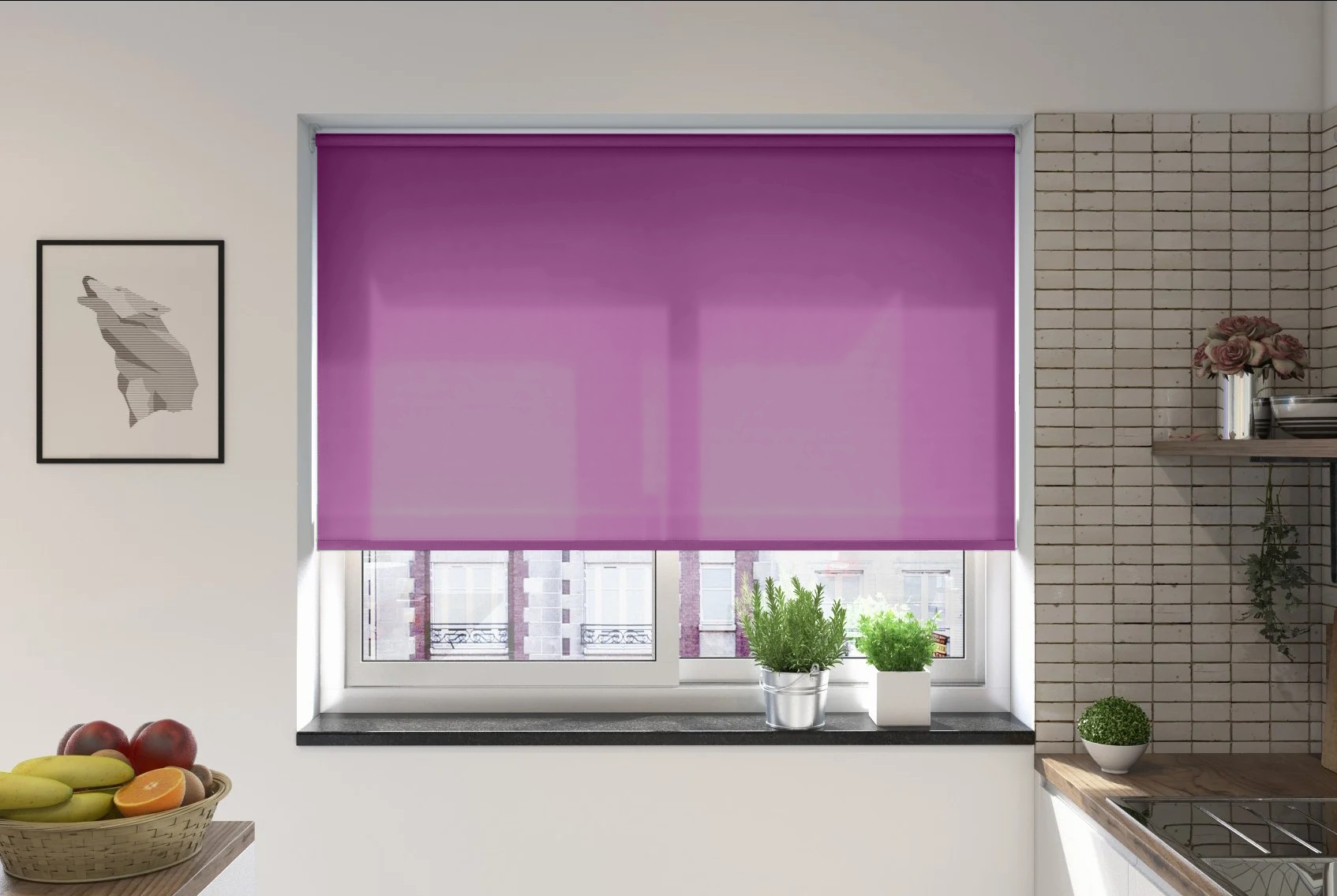
Purple is psychologically distinctive because it combines qualities commonly associated with both warm and cool colours.
Research into colour-emotion associations, including the review by Jonauskaite and Mohr, suggests that purple is often linked with meanings such as power, creativity, individuality and richness.
In interiors, this can make purple feel more expressive and less neutral than many other blind colours.
Why Purple Often Feels Luxurious
Purple has long-standing cultural associations with:
- Status
- Luxury
- Ceremony
- Creativity
- Individuality
These associations can make deeper purple blinds feel more formal or opulent than softer neutrals.
However, this is strongly influenced by shade and context.
Pale Purple vs Deep Purple
Different purples can create very different psychological effects.
Lilac
Light, soft and relatively gentle
Lavender
Cooler, calmer and more delicate
Plum
Richer, warmer and more substantial
Deep aubergine
Dramatic, weighty and luxurious
A pale purple blind may feel soft and understated, while a deep purple can become one of the strongest visual elements in the room.
Purple Can Feel Creative and Expressive
Purple is less common in many neutral interior schemes, so it can feel more individual when used on a blind.
This may suit spaces where the aim is to create:
- Personality
- Creativity
- Drama
- Sophistication
- A less conventional interior
Its relative rarity can also make it feel more distinctive.
Undertone Changes the Effect
Purple can lean towards either blue or red.
A blue-based purple may feel:
- Cooler
- More restrained
- More formal
A red-based purple may feel:
- Warmer
- Richer
- More energetic
This means two purple blinds can produce noticeably different atmospheres even at similar levels of lightness.
Saturation Matters
As with other colours, highly saturated purple is much more visually stimulating than muted purple.
A dusty mauve may feel calm and subtle.
A vivid violet may feel dramatic and attention-grabbing.
Practical Takeaway
Purple blinds can work particularly well when the desired effect is:
richness + individuality + creativity + visual depth
For a softer atmosphere:
lavender or muted mauve + lower saturation + gentle contrast
For a stronger effect:
plum or aubergine + deeper tone + greater contrast
Purple is a good choice when you want the blind to feel more expressive than a neutral, while still retaining a sense of sophistication.
White and Cream Blinds: Brightness, Neutrality and Visual Expansion
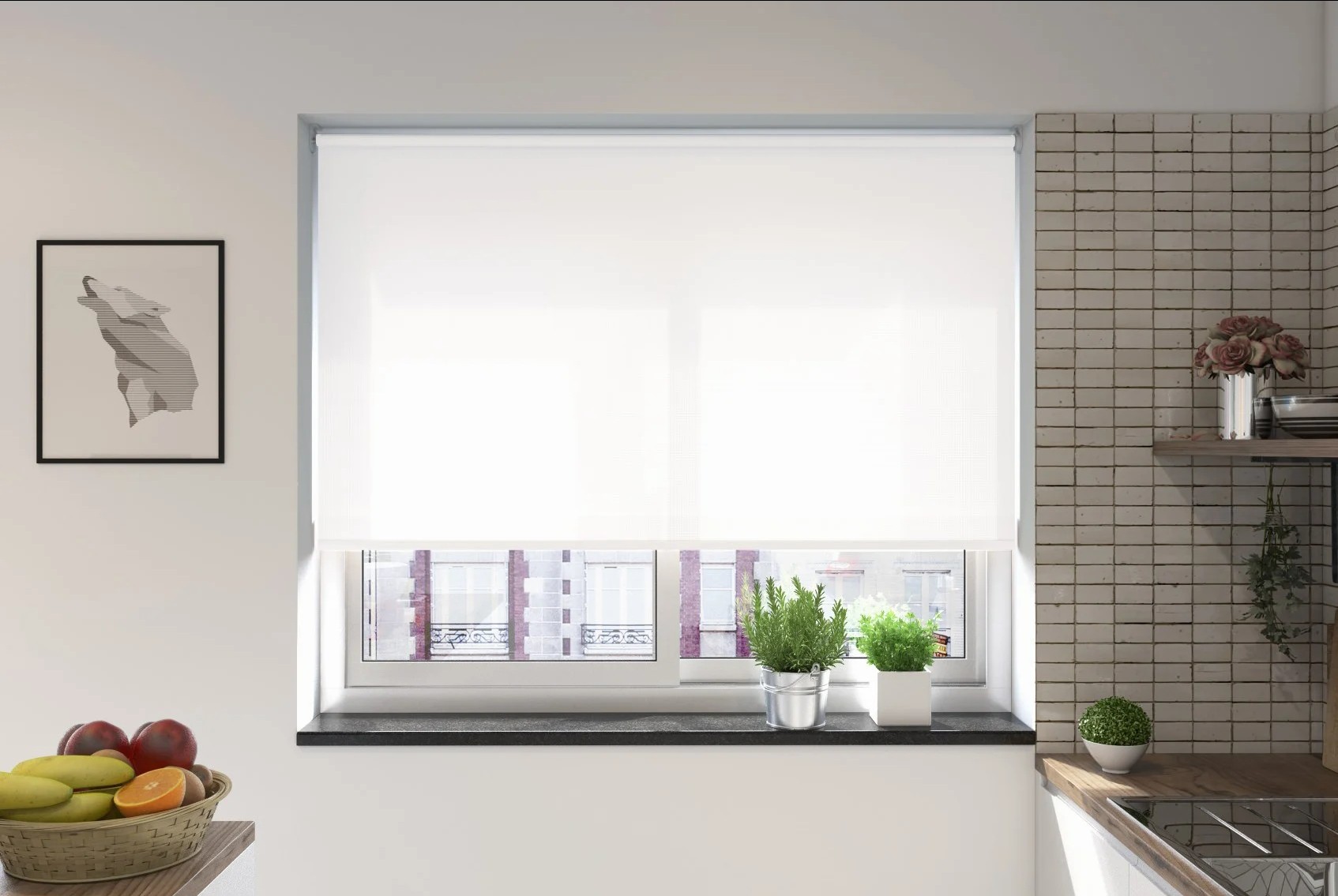
White and cream blinds are often chosen because they feel safe and versatile, but their psychological effect goes beyond simple neutrality.
Because they are relatively light in value, they tend to create lower visual weight, greater brightness and a stronger sense of openness than darker blind colours.
Why White Feels Bright and Open
White reflects a high proportion of visible light, which can help the window area feel:
- Brighter
- Cleaner
- More spacious
- Less visually heavy
- More integrated with pale walls
This is one reason white blinds are often effective in smaller rooms or spaces where the aim is to maximise a sense of openness.
White Is Not Psychologically Empty
White is often treated as if it has no psychological character, but it can still carry associations such as:
- Cleanliness
- Simplicity
- Clarity
- Minimalism
- Freshness
The final impression depends heavily on context.
A crisp white blind in a modern interior may feel clean and architectural.
The same white in a softer traditional room may feel colder or more clinical if the surrounding palette is very warm.
Cream Creates a Softer Form of Neutrality
Cream has much of the visual lightness of white, but with a warmer undertone.
That can make it feel:
- Softer
- Warmer
- More relaxed
- Less stark
Cream is therefore useful when the aim is to retain brightness without creating the sharper contrast associated with pure white.
White vs Cream: The Psychological Difference
Although both are light neutrals, they can produce different impressions.
White
Crisper, cleaner and more minimal
Cream
Softer, warmer and more traditional
The difference can become more noticeable under artificial lighting or in rooms with warm wood and natural materials.
Contrast Still Matters
A white blind against white walls may almost disappear visually.
The same blind against a dark wall can become a strong focal point.
Similarly, cream will feel more integrated in a warm neutral room than in a cool grey interior.
So even with neutral colours, perceived openness depends on contrast.
Where White and Cream Blinds Can Work Well
These colours are particularly useful where the aim is to create:
- Brightness
- Visual calm
- Greater openness
- Low visual weight
- A neutral backdrop
They can work in almost any room, but the choice between white and cream should depend on the surrounding palette and lighting.
Practical Takeaway
White and cream blinds tend to support a lighter, more open atmosphere because they create:
high lightness + low visual weight + strong reflectance + easy integration with neutral interiors
Choose white when you want a cleaner and more contemporary effect.
Choose cream when you want similar brightness with a warmer and softer psychological feel.
Grey Blinds: Calm Neutrality or Emotional Flatness?
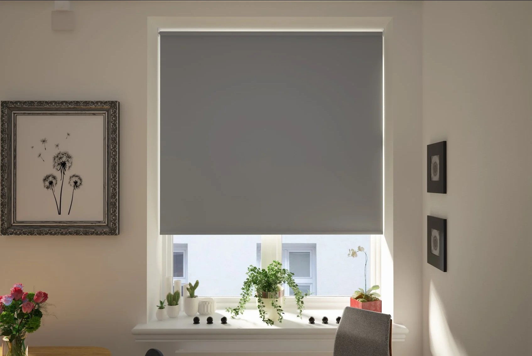
Grey is one of the most widely used blind colours because it is neutral, adaptable and easy to combine with other colours.
Psychologically, however, grey is more complex than simply being “calm”.
Research reviewed by Jonauskaite and Mohr found that grey is often associated with relatively low-arousal and sometimes more negative or emotionally neutral meanings. In interiors, this can translate into a sense of restraint, quietness and seriousness, but sometimes also flatness if the room lacks warmth or contrast.
Why Grey Can Feel Calm
Grey does not usually compete strongly for attention.
That can make it useful where the aim is to create:
- Visual calm
- Neutrality
- Restraint
- Simplicity
- A more controlled atmosphere
A soft grey blind can sit quietly within a room, especially when its lightness is similar to the surrounding walls.
Light Grey vs Dark Grey
Lightness changes the effect considerably.
Pale grey
Soft, understated and relatively open
Mid grey
Balanced, neutral and controlled
Charcoal
Heavier, more dramatic and more formal
A charcoal blind can create much more visual weight than a pale grey blind, even though both belong to the same colour family.
Warm Grey vs Cool Grey
Undertone also matters.
A warm grey with beige or taupe undertones can feel:
- Softer
- More natural
- More comfortable
A blue-based grey may feel:
- Cooler
- Cleaner
- More architectural
- More restrained
The lighting in the room can make these undertones more or less obvious.
Why Grey Can Sometimes Feel Flat
Grey has relatively weak chromatic intensity.
That makes it easy to live with, but too much grey can reduce visual energy.
If the room already contains:
- Grey walls
- Grey flooring
- Grey furniture
- Low natural light
adding another grey surface at the window may make the space feel overly uniform or subdued.
The problem is not grey itself, but a lack of variation in lightness, texture or surrounding colour.
Grey Works Well as a Background Colour
Because grey is relatively neutral, it can allow other elements to become more prominent.
A grey blind can help emphasise:
- Artwork
- Furniture
- Natural wood
- Plants
- Stronger accent colours
This can be useful when the blind should support the room rather than become its focal point.
Practical Takeaway
Grey blinds are most likely to feel calm and balanced when they are used with enough variation in:
lightness + texture + surrounding colour + natural light
For a softer atmosphere:
pale or warm grey + low contrast + natural materials
For a stronger effect:
charcoal + greater contrast + deeper surrounding tones
Grey is psychologically restrained, but whether that feels sophisticated or emotionally flat depends on the wider room.
Black Blinds: Drama, Contrast and High Visual Weight
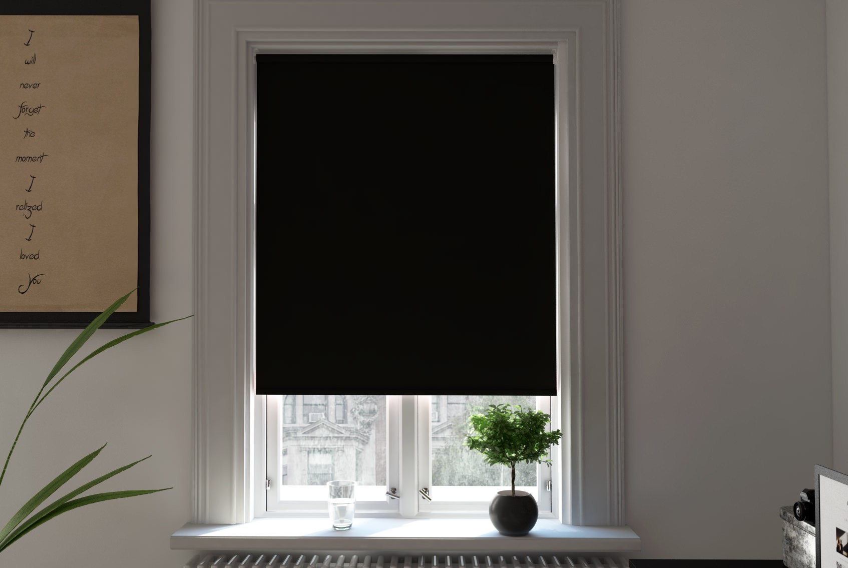
Black is one of the most visually powerful blind colours because it combines very low lightness with strong contrast potential.
Research on colour-emotion associations, including the review by Jonauskaite and Mohr, links black with more intense, serious and sometimes negative emotional meanings. In interiors, however, black can also communicate control, sophistication and deliberate contrast.
Why Black Feels Visually Heavy
Black reflects relatively little visible light compared with pale colours.
As a result, a black blind can feel:
- Strong
- Dense
- Formal
- Enclosed
- Architecturally defined
When fully lowered, it can become one of the most dominant surfaces in the room.
Black Creates Strong Contrast
Against pale walls, a black blind can produce a very pronounced visual boundary around the window.
This can make the window feel:
- More prominent
- More graphic
- More dramatic
- More structured
That effect can be useful in contemporary interiors where the window is intended to become part of the architectural design.
Black Can Feel Sophisticated or Severe
Context is especially important with black.
In one room, black blinds may feel:
- Elegant
- Minimal
- Luxurious
- Controlled
In another, they may feel:
- Heavy
- Stark
- Too dominant
- Visually oppressive
The surrounding palette, amount of daylight and size of the window all affect the result.
Window Size Matters
A small black blind may act as a neat accent.
A large black blind covering a wide window can have a much stronger psychological effect because it occupies more of the visual field.
This is especially noticeable when the blind is closed during the day and replaces a bright window with a large dark surface.
Black Does Not Automatically Mean Gloomy
A black blind in a bright room with pale walls, natural materials and strong daylight can feel crisp and deliberate rather than gloomy.
The effect becomes heavier when black is combined with:
- Low natural light
- Dark walls
- Dark flooring
- Large window areas
- Minimal colour elsewhere
Practical Takeaway
Black blinds work best when the goal is:
strong contrast + architectural definition + drama + visual weight
For a more balanced effect, black can be softened with:
- Warm wood
- Cream or off-white walls
- Natural textures
- Good daylight
- Lower-contrast surrounding colours
Black is therefore not simply a “dark” choice. It is one of the strongest ways to make the blind itself an intentional visual feature.
Why Saturation May Matter More Than the Colour Name
When people choose a blind colour, they usually focus first on the hue: blue, green, red, yellow or grey.
Psychologically, however, saturation can sometimes have a greater effect on how stimulating or dominant the blind feels than the colour name itself.
Saturation describes how vivid or muted a colour appears.
High Saturation Creates More Visual Energy
Highly saturated colours tend to feel:
- Stronger
- Brighter
- More attention-grabbing
- More stimulating
- More visually dominant
For example, a vivid cobalt blind may feel more energetic than a muted terracotta blind, even though blue is often described as calming and orange as stimulating.
That is why broad colour rules can be misleading.
Low Saturation Creates a Quieter Effect
Muted colours contain less chromatic intensity.
They often feel:
- Softer
- Calmer
- More restrained
- Easier to integrate
- Less demanding over large areas
This is particularly important with blinds because a fully lowered blind can occupy a large part of the visual field.
A colour that looks attractive on a small sample may feel much stronger when spread across a large window.
The Same Hue Can Create Opposite Impressions
Compare:
Soft sage green
Quiet, natural and understated
Vivid emerald green
Rich, energetic and visually prominent
Or:
Dusty blue
Calm and restrained
Electric blue
Bold and stimulating
The hue has not changed dramatically, but the psychological impression has.
Saturation Also Changes Contrast
Highly saturated colours often stand out more strongly against neutral surroundings.
A vivid blind against white, beige or grey walls is likely to become a focal point.
A muted version of the same colour may blend far more easily into the room.
Saturation and Lightness Work Together
Saturation should not be considered in isolation.
A colour can be:
- Light and highly saturated
- Light and muted
- Dark and highly saturated
- Dark and muted
Each combination creates a different visual effect.
For example:
A pale muted blue may feel soft and open.
A dark saturated blue may feel intense and dramatic.
What the Research Suggests
The review by Jonauskaite and Mohr reinforces an important point: colour-emotion relationships are influenced not just by hue, but by properties such as lightness and saturation.
This is why saying that one colour is “calming” or another is “energetic” is often too simplistic.
Practical Takeaway
When choosing a blind, do not ask only:
“What colour do I want?”
Also ask:
“How vivid do I want that colour to be?”
If the aim is a quieter, more restful interior, lower saturation is often the safer choice.
If the aim is to create a focal point or inject energy, higher saturation can be more effective.
Why Muted Blind Colours Are Easier to Live With
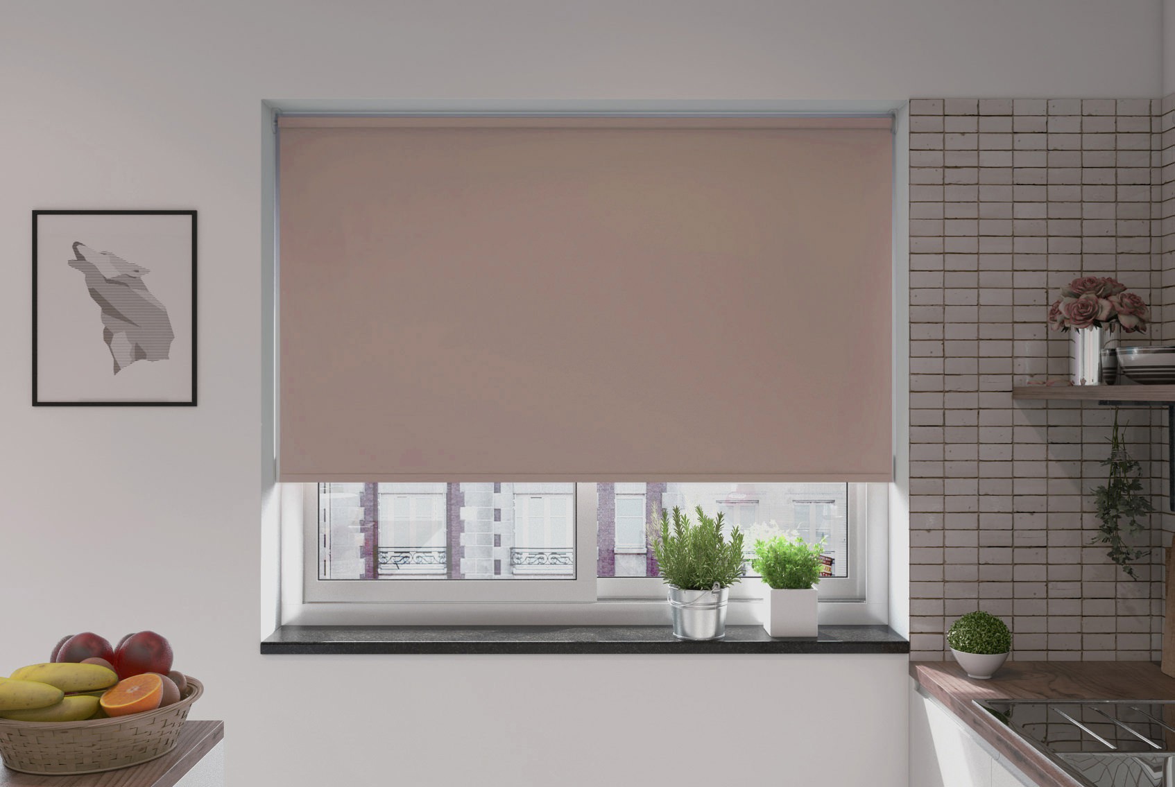
Muted colours tend to feel easier to live with because they create less visual stimulation and lower contrast than highly saturated colours.
For blinds, this matters because the colour may occupy a large area when the blind is fully lowered.
Muted Colours Demand Less Attention
A vivid blind is more likely to become a focal point.
A muted blind tends to sit more quietly within the room.
Examples include:
- Sage green
- Dusty blue
- Soft terracotta
- Warm taupe
- Muted pink
- Blue-grey
These colours still introduce personality, but without the same level of visual intensity.
They Are Less Sensitive to Changes in the Room
Highly saturated colours can become difficult to coordinate if:
- Furniture changes
- Walls are repainted
- Flooring is replaced
- Accessories are updated
Muted colours are often more adaptable because they are less dominant.
This can make them a more practical long-term choice for a fitted window treatment.
Muted Does Not Mean Boring
Lower saturation does not remove character.
A muted green can still feel natural.
A muted terracotta can still feel warm.
A muted blue can still feel calm.
The difference is that the colour expresses those qualities in a quieter way.
Muted Colours Can Reduce Visual Fatigue
In rooms where the blind is frequently closed, highly saturated colour may become visually demanding simply because of the area it covers.
Lower-saturation colours generally create a softer visual field.
That can be particularly useful in:
- Bedrooms
- Home offices
- Living rooms
- Reading spaces
- Rooms used for long periods
Lighting Changes Muted Colours More Gently
Muted colours also tend to respond more subtly to changes in daylight.
A vivid colour can appear dramatically stronger in bright sun.
A muted colour may shift in tone, but often remains comparatively restrained.
This can make the blind feel more consistent throughout the day.
Practical Takeaway
Muted blind colours are often easier to live with because they create:
lower saturation + less visual stimulation + softer contrast + greater flexibility
If you want the blind to contribute colour without dominating the room, a muted version of your preferred hue is often the safer choice.
Why Contrast Determines How Much Attention the Blind Gets
Blind colour does not attract attention because of hue alone. Contrast with the surrounding room is one of the strongest factors determining how visually prominent the blind becomes.
A colour can feel subtle in one room and dominant in another simply because the background changes.
What Contrast Means in Practice
Contrast can come from differences in:
- Lightness
- Saturation
- Hue
- Warmth or coolness
- Pattern
- Texture
For blinds, lightness contrast is often especially important.
A dark blind against a pale wall creates a strong visual boundary.
A pale blind against a similarly pale wall creates much less separation.
High Contrast Pulls Attention Towards the Window
When the blind differs strongly from its surroundings, the eye is more likely to notice it.
Examples include:
- Black blinds against white walls
- Bright yellow blinds in a grey room
- Deep green blinds against cream walls
- White blinds against dark navy walls
In each case, the blind becomes more visually salient.
This can be useful when the window treatment is intended to act as a design feature.
Low Contrast Helps the Blind Recede
If the blind is close in tone to the surrounding walls, it is more likely to blend into the room.
For example:
- Warm beige blind with cream walls
- Pale grey blind with soft grey walls
- Sage blind within a muted green scheme
- White blind against white or off-white walls
This can make the room feel visually quieter because the window introduces fewer strong boundaries.
Contrast Can Override the Usual Colour Association
This is important in colour psychology.
A pale blue blind might normally be considered calm, but if it is the only strong colour in an otherwise white room, it may still attract considerable attention.
Likewise, a dark green blind may feel less dominant if the entire room uses similarly deep colours.
This is why statements such as “blue is calming” or “black is dramatic” are incomplete without considering the surrounding palette.
Window Size Amplifies Contrast
The larger the blind, the more noticeable contrast becomes.
A strongly contrasting colour on a small window may act as a modest accent.
The same contrast across a large set of windows can dominate the room.
When choosing colour, it therefore helps to consider not just the sample itself but the total area of fabric that will be visible when the blind is closed.
Contrast Changes Throughout the Day
Daylight can also alter how much contrast you see.
A blind may appear:
- Softer in low light
- Stronger in direct sun
- Darker against a bright window
- More integrated under artificial lighting
This is another reason to assess samples in the actual room.
Practical Takeaway
If you want the blind to attract attention:
increase contrast
If you want it to sit quietly within the room:
reduce contrast
The most effective blind colour is therefore not always the colour you like most in isolation. It is the colour that creates the right degree of visual separation from the room around it.
Should Your Blind Blend In or Become a Focal Point?
One of the most useful ways to choose blind colour is to decide whether the blind should recede into the room or deliberately attract attention.
This is a more practical question than simply asking which colour is “best”.
When a Blind Should Blend In
A blind that blends with its surroundings creates lower visual contrast and usually feels calmer.
This works well when:
- The room already contains several strong design elements
- The window treatment should feel understated
- The aim is visual continuity
- The room is small and you want to reduce visual fragmentation
- The view outside should remain the main focus
In these cases, choose a blind with a similar:
- Lightness
- Undertone
- Saturation
- Colour temperature
to the surrounding walls or broader palette.
A pale warm-grey blind against similar walls, for example, is much more likely to recede than a highly contrasting dark blind.
When a Blind Should Become a Focal Point
A blind can also be used intentionally as one of the strongest elements in the room.
This may work well when:
- The room is otherwise neutral
- The window has strong architectural importance
- You want to introduce colour without repainting
- The blind includes a distinctive pattern
- The space needs more visual energy
Higher contrast makes this effect stronger.
Examples include:
- Deep green against cream
- Navy against white
- Mustard against soft grey
- Black against pale walls
- Patterned Roman blinds in an otherwise restrained room
Colour Is Only One Way to Create a Focal Point
A blind can attract attention through:
- Saturation
- Darkness
- Pattern
- Scale
- Texture
- Contrast
A highly patterned neutral blind may be more prominent than a plain bright colour.
Likewise, a very dark blind may dominate despite having no strong hue.
Think About the Blind When It Is Closed
This is especially important with blinds because the visual impact changes with position.
A bold colour may look like a small accent when the blind is raised.
When fully lowered, the same colour can occupy a large section of the room.
This means focal-point colours should be judged at full blind size, not just from a small fabric sample.
Focal Point Does Not Mean High Saturation
A blind can be distinctive without being vivid.
A muted forest green or deep aubergine may create strong visual emphasis through darkness and contrast rather than saturation.
This can produce a more sophisticated focal point than a very bright colour.
Practical Takeaway
If you want the blind to disappear visually:
lower contrast + similar lightness + similar undertone + muted colour
If you want the blind to become a feature:
greater contrast + stronger saturation or depth + deliberate visual separation
The important decision is not whether the blind colour is bold or neutral. It is whether the window should behave as a background element or a point of visual attention.
Choosing Blind Colour for Bedrooms: Lower Arousal vs Personal Preference
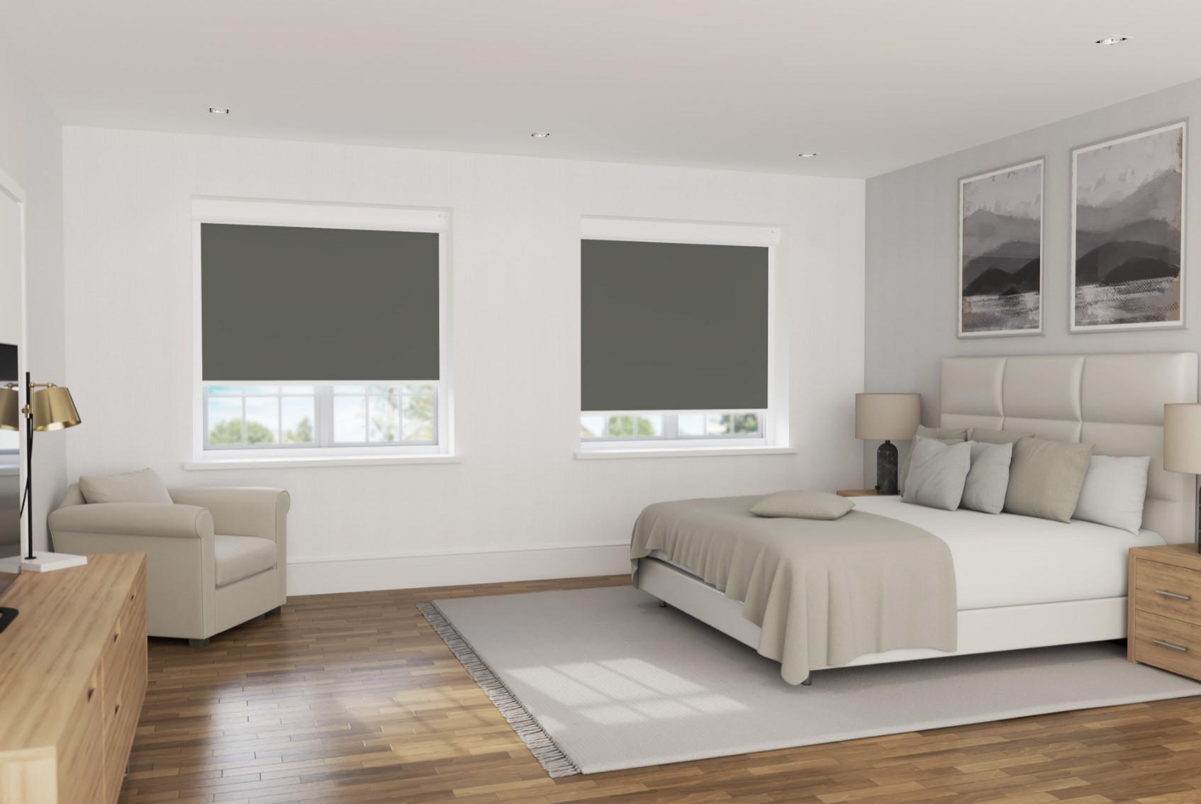
Bedrooms are one of the clearest examples of why colour psychology should not be reduced to simple rules.
If the goal is to support a restful atmosphere, lower-arousal colours are often the more suitable starting point. But personal preference still matters greatly, because a colour that feels calming to one person may feel dull or unpleasant to another.
Lower-Arousal Colours Are Often Better Suited to Bedrooms
Research on colour-emotion associations suggests that some cooler and more muted colours are more commonly linked with lower-arousal emotional states.
That can make shades such as:
- Soft blue
- Sage green
- Muted grey
- Dusty pink
- Warm cream
- Pale taupe
useful starting points for bedrooms.
The common feature is not necessarily the hue. It is often the combination of:
moderate or low saturation + softer contrast + lower visual intensity
Avoid Overstimulating the Window Area
A blind can occupy a large proportion of the visual field when closed.
Highly saturated colours, very strong contrast or bold patterns may therefore feel more stimulating than expected, especially in the evening.
For a calmer bedroom, it often helps to avoid:
- Very bright primary colours
- Extremely high contrast
- Large areas of intense saturation
- Visually aggressive patterns
That does not mean these choices are wrong. They are simply more likely to create visual energy rather than quiet.
Dark Colours Can Still Work Well
A restful bedroom does not have to be pale.
Deep navy, forest green, charcoal and other dark tones can create a more enclosed, cocooning atmosphere.
This may suit people who prefer:
- A darker environment
- Stronger visual boundaries
- A more intimate feel
- Greater visual depth
The important distinction is that dark does not automatically mean stimulating.
A dark, muted colour can still feel calmer than a bright, highly saturated one.
Personal Preference Should Not Be Ignored
One of the limitations of colour psychology is that group-level associations do not predict every individual response.
Personal experience, culture, memory and taste all influence how a colour feels.
If someone strongly dislikes blue, choosing it simply because it is commonly described as calming is unlikely to produce the desired effect.
Practical Takeaway
For bedrooms, a useful starting point is:
muted colour + moderate or low contrast + personally preferred hue + suitable light control
If the goal is calmness, focus less on finding a supposedly perfect “sleep colour” and more on reducing unnecessary visual stimulation while choosing a colour you genuinely enjoy.
Choosing Blind Colour for Home Offices: Attention vs Visual Calm
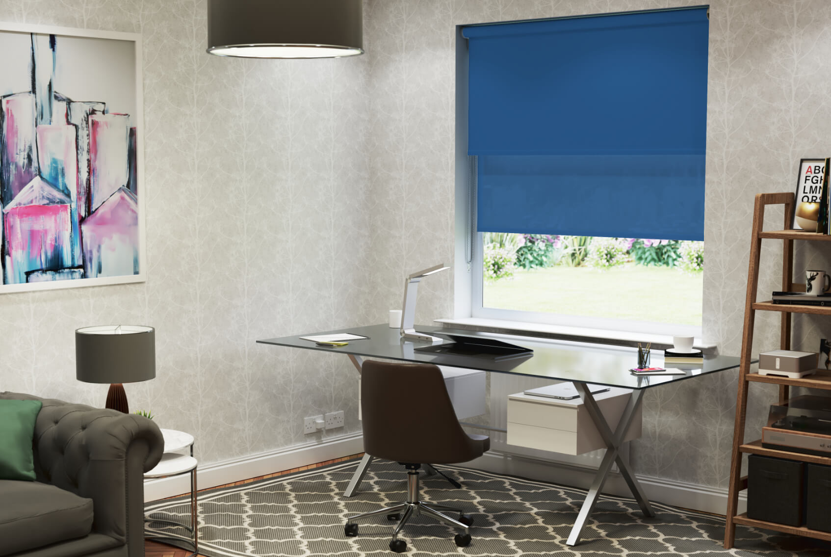
Home offices need a slightly different colour strategy from bedrooms.
The aim is usually not complete relaxation, but a balance between focus, alertness and low visual distraction. A blind that is too stimulating may compete for attention, while one that is too dull may make the room feel flat.
Muted Colours Often Work Best
For long periods of concentrated work, lower-saturation colours are often easier to live with.
Useful options include:
- Muted blue
- Sage green
- Soft grey
- Warm taupe
- Off-white
- Dusty blue-green
These colours tend to create less visual competition than highly saturated red, orange or yellow.
Blue and Green Can Support a Calmer Working Environment
Research on colour-emotion associations commonly links blue and green with lower-arousal positive states.
For a home office, that can be useful where the aim is to create a space that feels:
- Controlled
- Calm
- Orderly
- Less visually demanding
This does not mean blue or green automatically improves concentration. The evidence does not support such a simple claim.
The more defensible point is that muted cool colours are often less visually stimulating than vivid warm colours.
Too Much Contrast Can Become Distracting
If the blind sits directly within the main field of view, strong contrast can pull attention towards the window.
Examples include:
- Black blinds against white walls
- Bright yellow against grey
- Red against cream
- Vivid blue against a neutral room
That may be desirable in a creative studio, but less useful in a workspace where visual calm is the priority.
A Small Amount of Stimulation Can Still Help
Not every office needs to be neutral.
A controlled amount of stronger colour can make the room feel more energetic.
For example:
- Muted mustard
- Burnt orange
- Deep teal
- Forest green
- Soft terracotta
can introduce personality without creating the intensity of a highly saturated colour.
Consider What Is Behind the Screen
If the window sits behind or beside a computer monitor, the blind may be visible for much of the working day.
In that position, lower contrast and lower saturation can be especially useful.
If the window sits behind the user, the colour may have less direct visual influence during work.
Light Control Still Matters More Than Colour
For a home office, glare and daylight control are practical priorities.
Blind colour should therefore be considered alongside:
- Screen glare
- Window orientation
- Daylight intensity
- Blind opacity
- Ability to adjust light levels
A psychologically suitable colour will not compensate for poor glare control.
Practical Takeaway
For most home offices, a useful starting point is:
muted colour + moderate contrast + low visual distraction + effective daylight control
If the space is used for highly creative work, a stronger accent colour may be suitable.
If the priority is sustained concentration, quieter, lower-saturation colours are usually the safer choice.
Choosing Blind Colour for Living Rooms: Social and Emotional Balance
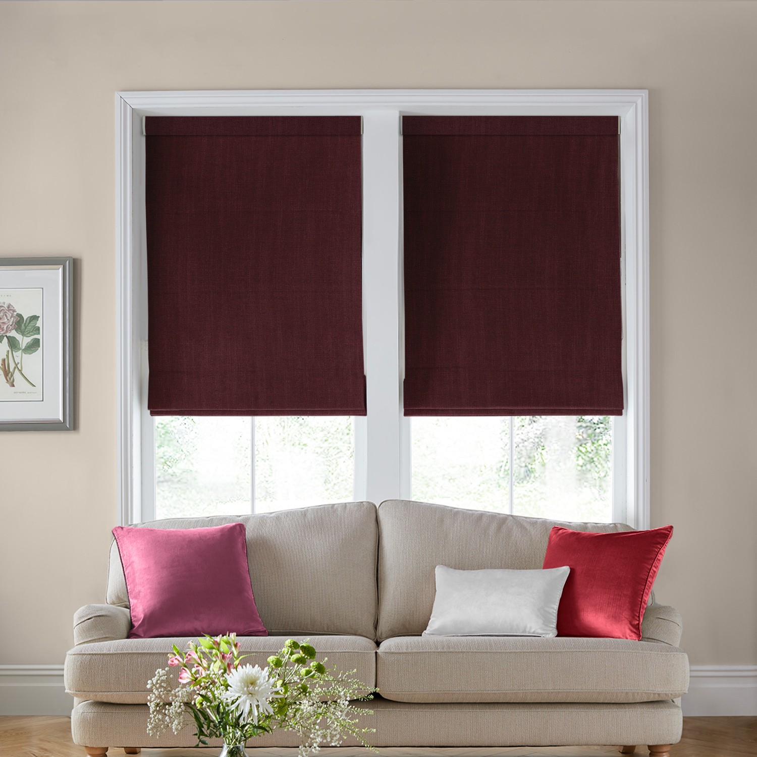
Living rooms usually need to do more than one job. They may be used for relaxing, entertaining, reading, watching television and spending time with family.
That makes blind colour less about creating one specific emotional response and more about finding a balance between comfort, sociability and visual interest.
Avoid Going Too Far in Either Direction
A very muted scheme may feel calm but potentially too restrained.
A highly saturated blind may add energy, but can also become visually dominant.
For many living rooms, the most flexible choices sit somewhere in the middle.
Examples include:
- Sage green
- Soft blue
- Warm beige
- Dusty pink
- Muted terracotta
- Deep teal
- Warm grey
These colours can add character without overwhelming the room.
Warmer Colours Can Feel More Sociable
Warm colours such as terracotta, ochre and muted orange are often associated with:
- Warmth
- Activity
- Social connection
- Informality
That can make them useful where the living room is intended to feel welcoming and lively.
The effect is usually more successful when saturation is controlled.
Cooler Colours Can Support Relaxation
Muted greens, blues and blue-greens can create a quieter atmosphere.
This can work well in living rooms used primarily for:
- Relaxation
- Reading
- Evening use
- Television
Again, the effect depends on shade.
A pale blue-grey and a vivid turquoise will not create the same level of visual stimulation.
Consider the Blind as Part of the Whole Palette
Living rooms often contain more colour than bedrooms or offices.
The blind may need to coordinate with:
- Sofa fabric
- Rugs
- Cushions
- Flooring
- Artwork
- Curtains
- Wood tones
A strong blind colour can work if the rest of the room is relatively restrained.
If several other elements already compete for attention, a quieter blind may create better visual balance.
Decide How Much Attention the Window Should Receive
In a living room with an attractive view, you may want the blind to recede.
In a room with a less interesting window, the blind itself may be used as a design feature.
This means the right colour depends partly on whether the window should act as:
background or focal point
Think About Day and Evening Use
Living rooms are often experienced under very different lighting conditions.
During the day, natural light may make the blind appear brighter and more saturated.
In the evening, artificial lighting can make the same colour feel warmer, darker or more subdued.
That makes testing the fabric under both conditions especially important.
Practical Takeaway
For most living rooms, a useful starting point is:
moderate saturation + comfortable contrast + a colour that works in both daylight and artificial light
If you want the room to feel more sociable, consider warmer or earthier tones.
If you want a more restful atmosphere, cooler and more muted colours may be more suitable.
The best living-room blind colour is usually one that supports both relaxation and social use without dominating the space.
Choosing Blind Colour for Children’s Rooms
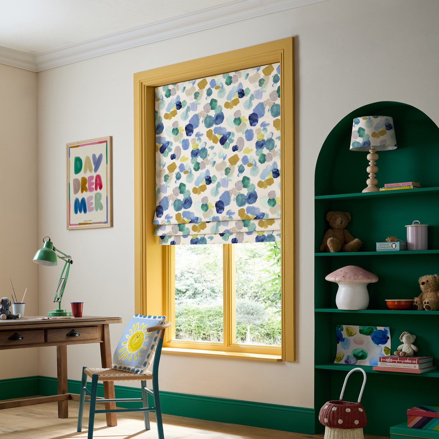
Children’s rooms are often treated as a place for bright, playful colour, but from a psychological point of view it is worth considering stimulation, age, preference and how the room is actually used.
A bedroom that is also used for play, reading and homework may need a different balance from a room used mainly for sleep.
Bright Colours Can Add Energy
Highly saturated colours such as:
- Bright yellow
- Orange
- Red
- Turquoise
- Vivid green
can feel lively and engaging.
That may suit a play-focused space, but a very strong blind colour can also become visually dominant when the blind is fully lowered.
In a bedroom, that may be more stimulation than you want close to bedtime.
Softer Colours Can Create a Better Balance
Muted or lighter colours can still feel cheerful without the same intensity.
Examples include:
- Soft green
- Pale blue
- Blush pink
- Muted yellow
- Dusty teal
- Warm cream
These can support a room that feels playful during the day but calmer in the evening.
Personal Preference Matters More With Children
Colour preferences can be strong and change quickly.
A colour that adults consider calm or stylish may not appeal to the child using the room.
Where possible, it can be useful to involve older children in the choice, especially if the blind is intended to remain in place for several years.
Avoid Over-Interpreting Colour Psychology
There is no single scientifically proven “best” colour for a child’s bedroom.
A red blind does not automatically make a child overactive, and a blue blind does not automatically make them calm.
The more reliable approach is to think about:
- Saturation
- Contrast
- Amount of colour
- Room function
- Personal preference
Think About Longevity
Because blinds are more permanent than accessories, very age-specific colours may become less appealing over time.
One practical approach is to use:
a relatively versatile blind colour + stronger colour in easily changed accessories
This allows the room to evolve without replacing the blind.
Practical Takeaway
For a child’s bedroom, a useful starting point is:
moderate saturation + personally liked colour + controlled contrast + enough flexibility to grow with the room
If the space is mainly for sleep, softer and lower-saturation colours may be more suitable.
If it is primarily a playroom, stronger colours can work well, provided the overall visual environment does not become too intense.
How Window Direction Changes Blind Colour Perception
The direction a window faces can significantly influence how a blind colour appears because different orientations receive different qualities of daylight.
This matters because colour is not perceived independently from illumination. Research into colour constancy and visual perception, including work reviewed by Witzel and Gegenfurtner, shows that the visual system adapts to changing light conditions, but surface colours can still appear noticeably different under different illumination.
North-Facing Windows
North-facing rooms often receive cooler, more diffuse daylight.
This can make some blind colours appear:
- Cooler
- Greyer
- More subdued
- Less saturated
Cool colours such as blue or blue-grey may therefore feel even cooler in a north-facing room.
Warmer shades such as cream, beige, terracotta or muted yellow can sometimes help balance that effect visually.
South-Facing Windows
South-facing rooms usually receive stronger and warmer daylight for more of the day.
This can make blind colours appear:
- Brighter
- Warmer
- More saturated
- More intense
Highly saturated colours may therefore feel stronger than expected.
Muted colours can be useful where the aim is to prevent the window area becoming too visually dominant.
East-Facing Windows
East-facing rooms receive stronger morning light.
A blind may look brighter and warmer earlier in the day, then softer and cooler later.
This can be important in:
- Bedrooms
- Kitchens
- Breakfast rooms
- Home offices used mainly in the morning
A colour that looks perfect at 9am may appear quite different by late afternoon.
West-Facing Windows
West-facing rooms receive stronger light later in the day.
Afternoon and evening sunlight can make warm colours appear particularly rich.
Shades such as:
- Terracotta
- Cream
- Mustard
- Warm beige
- Rust
may become more golden or intense.
Cooler colours may also appear warmer than they did earlier in the day.
Orientation Can Change Psychological Impression
Because light changes the apparent warmth, lightness and saturation of a blind, it can also change its psychological effect.
A muted blue that feels cool and quiet in a north-facing room may appear brighter and more energetic in strong south-facing light.
A beige blind that looks neutral in the morning may feel much warmer under evening sun.
Surroundings Matter Too
Window direction is only one factor.
The final appearance will also be affected by:
- Nearby buildings
- Trees
- Exterior surfaces
- Glazing
- Season
- Weather
- Interior wall colours
Reflected light from outside can sometimes influence the colour of the light entering the room.
Practical Takeaway
Do not choose a blind colour based only on how the sample looks in a showroom or under artificial lighting.
Test it in the actual room and consider:
window direction + time of day + natural light intensity + surrounding colours
The same blind fabric can create a noticeably different impression depending on which direction the window faces.
Why You Should Test Blind Colour at Different Times of Day
A blind colour can look surprisingly different in the morning, afternoon and evening because the intensity, direction and colour of light change throughout the day.
This is one of the most practical consequences of colour perception research.
Morning Light Can Make Colours Feel Cooler or Fresher
In many rooms, morning light can make colours appear:
- Cleaner
- Cooler
- Lighter
- Less saturated
A grey, blue or green blind may therefore feel particularly crisp early in the day.
Warm colours can also appear more restrained before stronger direct sunlight arrives.
Midday Light Can Increase Brightness
Around the middle of the day, stronger daylight can make some fabrics appear:
- Brighter
- More vivid
- Lighter
- More contrasting
This is especially relevant for highly saturated colours, which may look much stronger in intense daylight than they did on a small sample indoors.
Evening Light Can Warm the Colour
Late afternoon and evening light often shifts the appearance of colours towards warmer tones.
This can make:
- Cream feel more golden
- Beige feel warmer
- Terracotta feel richer
- Yellow feel stronger
- Some greys appear softer
The same blind that looked neutral at midday may feel noticeably warmer later in the day.
Artificial Lighting Creates Another Version of the Colour
Once natural light fades, the blind is seen under artificial light.
This can change the apparent:
- Warmth
- Saturation
- Depth
- Contrast
A colour that works perfectly in daylight may feel too yellow, too cool or too dark under the room’s evening lighting.
The Blind Should Be Tested in Its Real Position
A sample lying flat on a table does not experience light in the same way as a blind installed at the window.
Where possible, hold the sample:
- Against the glass
- Inside the recess
- Next to the surrounding wall colour
- In the position where the blind will actually sit
This provides a much more realistic impression.
Test More Than Once
A useful test is to view the sample:
- In the morning
- Around midday
- In late afternoon
- After dark under artificial lighting
- On both bright and overcast days
This is particularly important for colours with subtle undertones such as:
- Grey
- Beige
- Green
- Blue-grey
- Cream
- Taupe
Practical Takeaway
Blind colour should be treated as something dynamic rather than fixed.
The best choice is not simply the colour that looks right once.
It is the colour that continues to work as the room’s light changes throughout the day.
Does Everyone Respond to Colour the Same Way?
No. Colour psychology identifies patterns and tendencies, not universal emotional responses.
Two people can look at the same blind colour and interpret it very differently because colour perception is shaped by more than hue alone.
Personal Experience Changes Colour Meaning
Colours can become associated with:
- Memories
- Places
- Brands
- Clothing
- Schools
- Sports teams
- Cultural traditions
- Previous interiors
A colour that feels calming to one person may feel dated, unpleasant or overly familiar to another.
Culture Also Influences Colour Associations
Research reviewed by Jonauskaite and Mohr includes participants from many countries and shows that some colour-emotion associations recur across cultures, but there is also meaningful variation.
This is important because colour symbolism is not identical everywhere.
The emotional meaning of:
- White
- Red
- Black
- Purple
- Yellow
can vary depending on cultural background and context.
Age and Preference Matter
Colour preference can also change with:
- Age
- Fashion
- Life stage
- Exposure
- Personal taste
This means there is no single blind colour that will feel universally calming, luxurious or cheerful.
Context Can Override General Associations
Even widely recognised colour tendencies can change depending on the room.
A deep red blind may feel:
- Rich in a traditional dining room
- Energetic in a modern kitchen
- Overstimulating in a small bedroom
The colour has not changed, but the context has.
Learned Associations Are Powerful
Some colour responses are likely influenced by repeated exposure.
Red may be associated with warning because it is frequently used in:
- Traffic signs
- Alerts
- Errors
- Safety systems
Green may be associated with nature because of repeated exposure to vegetation and landscapes.
These learned associations can influence how colours are interpreted, but they do not create identical responses in everyone.
Why Personal Preference Should Not Be Treated as a Problem
If someone strongly prefers a particular colour, that preference is relevant.
A muted blue blind may be statistically associated with calmness, but if the person dislikes blue, that association is unlikely to be useful in practice.
The same applies in reverse.
A colour commonly described as stimulating may still feel comfortable if it has positive personal meaning.
Practical Takeaway
Colour psychology is best used as a decision-making guide, not a rulebook.
Research can help predict broad tendencies, but the final choice should also consider:
personal preference + cultural associations + room context + lighting + previous experience
The most psychologically suitable blind colour is therefore not necessarily the one research describes most positively. It is the one that works for the person, room and purpose together.
Why Personal Preference Still Matters
Colour psychology can help narrow the choice of blind colour, but it should not override personal preference.
A room is experienced repeatedly over months and years, so a colour that is theoretically suitable but personally disliked is unlikely to be a good long-term choice.
Preference Influences Emotional Response
Research on colour-emotion relationships shows broad patterns, but individual responses vary.
People differ in how positively they respond to colours such as:
- Blue
- Green
- Red
- Yellow
- Grey
- Purple
These differences can be influenced by memory, culture, familiarity and previous experience.
That means personal preference is not a distraction from colour psychology. It is part of it.
A “Calming” Colour Is Not Calming If You Dislike It
Blue is often associated with lower-arousal positive emotions.
But if someone strongly dislikes blue, choosing blue blinds simply because they are considered calming may produce the opposite result.
The same applies to neutral colours.
Grey may feel sophisticated and restful to one person but dull or lifeless to another.
Familiarity Can Affect Comfort
Colours that feel familiar can sometimes be easier to live with than colours chosen purely because they are fashionable.
This is especially relevant for blinds because they are relatively permanent compared with:
- Cushions
- Throws
- Accessories
- Artwork
A blind colour should therefore feel comfortable over time, not just impressive when first installed.
Preference Can Be Balanced With Psychological Goals
Personal preference does not mean ignoring the principles discussed in this guide.
Instead, it can be combined with them.
For example, if you love green but want a calm bedroom, you might choose:
muted sage rather than vivid emerald
If you love red but want a softer living room, you might choose:
brick red or dusty terracotta rather than bright scarlet
If you love blue but want a more dramatic interior, you might choose:
navy rather than pale blue
The preferred colour remains, but its lightness and saturation are adjusted to suit the desired atmosphere.
Trends Should Come Second
Colour trends change much faster than fitted window treatments.
A highly fashionable colour may look appealing now but become less attractive over time.
Personal preference, room architecture and existing materials are usually more useful guides than short-term trends.
Practical Takeaway
The best blind colour is rarely determined by psychology alone.
A better decision combines:
research-based tendencies + personal preference + room function + lighting + surrounding colours
Colour psychology can help explain why a shade may feel calm, energetic, warm or dramatic.
Personal preference determines whether you actually want to live with that effect.
Common Colour Psychology Myths When Choosing Blinds
Colour psychology is useful, but it is often oversimplified into fixed decorating rules.
The research does not support the idea that one colour will always create the same emotional effect in every room or for every person.
Myth 1: Blue Blinds Will Always Make a Room Feel Calm
Blue is often associated with lower-arousal positive emotions, but that does not mean every blue blind will feel calm.
A pale, muted blue may feel quiet and restrained.
A vivid electric blue may feel energetic and attention-grabbing.
The effect depends on:
- Saturation
- Lightness
- Contrast
- Lighting
- Personal preference
Myth 2: Red Blinds Are Always Too Stimulating
Red is often associated with higher arousal and attention, but not every red blind feels intense.
Muted brick red, burgundy or dusty terracotta can feel:
- Warm
- Grounded
- Rich
- Controlled
The psychological effect is very different from bright scarlet.
Myth 3: Dark Blinds Always Make a Room Feel Smaller
Dark colours can increase visual weight and create stronger boundaries, but that does not mean they automatically make a room feel cramped.
Dark blinds can also create:
- Depth
- Drama
- Sophistication
- Architectural definition
Their effect depends on contrast, room size, window size and available light.
Myth 4: White Is Psychologically Neutral
White is often treated as if it has no emotional character.
In reality, white can be associated with:
- Cleanliness
- Simplicity
- Freshness
- Minimalism
In some rooms, it may also feel stark or clinical.
So even a white blind contributes to the atmosphere.
Myth 5: Green Blinds Are Automatically Restorative
Green is strongly associated with nature, and environmental psychology has found restorative benefits from natural environments.
But that does not mean a green blind produces the same effect as exposure to nature.
A better interpretation is that green may reinforce nature-related associations, particularly when used alongside:
- Plants
- Natural materials
- Outdoor views
- Earth-toned interiors
Myth 6: Warm-Coloured Blinds Make the Room Physically Warmer
Warm colours can increase perceived warmth, but blind colour alone does not determine thermal performance.
Actual heat retention depends on factors such as:
- Blind construction
- Fabric
- Lining
- Fit
- Glazing
- Air gaps
Colour psychology and thermal performance should be treated separately.
Myth 7: There Is One Best Colour for Each Room
There is no scientifically proven best blind colour for:
- Bedrooms
- Kitchens
- Offices
- Living rooms
- Children’s rooms
Room use can guide the decision, but the final choice still depends on:
lightness + saturation + contrast + daylight + personal preference
Myth 8: Colour Psychology Can Predict Exactly How You Will Feel
This is probably the biggest misconception.
Research such as that reviewed by Elliot and Maier and Jonauskaite and Mohr identifies recurring colour-emotion relationships, but those relationships are probabilistic rather than deterministic.
Colour can influence perception and emotional interpretation, but it does not function like a switch.
Practical Takeaway
The most useful way to apply colour psychology is to avoid absolute rules.
Instead of asking:
“What colour will make this room calm?”
ask:
“What combination of hue, lightness, saturation and contrast is most likely to support the atmosphere I want in this particular room?”
That produces a much more reliable way of choosing blind colour than relying on colour myths.
The Psychology-Based Blind Colour Checklist
Choosing a blind colour becomes much easier if you work through the psychological factors in a consistent order.
Rather than starting with a colour name, start with the effect you want the room to have.
1. Decide How You Want the Room to Feel
Ask whether the room should feel more:
- Calm
- Bright
- Warm
- Energetic
- Intimate
- Spacious
- Dramatic
- Neutral
This gives you a psychological direction before you start comparing specific colours.
2. Decide Whether the Blind Should Blend In or Stand Out
If you want the blind to recede:
- Choose lower contrast
- Use similar lightness to the walls
- Consider muted colours
- Avoid very strong saturation
If you want the blind to become a focal point:
- Increase contrast
- Consider deeper or more saturated colours
- Use a stronger difference from the surrounding palette
3. Choose the Right Lightness
Lightness has a major effect on visual weight.
Lighter blinds tend to feel:
- More open
- Less heavy
- Brighter
- Less enclosed
Darker blinds tend to feel:
- More substantial
- More intimate
- More dramatic
- More architecturally defined
4. Check the Saturation
Ask how vivid you want the colour to be.
Low-saturation colours tend to feel:
- Softer
- Calmer
- More adaptable
- Less visually demanding
High-saturation colours tend to feel:
- Stronger
- More energetic
- More attention-grabbing
- More dominant
5. Consider Warm vs Cool
Warm colours can help create:
- Warmth
- Energy
- Sociability
- Intimacy
Cool colours can help create:
- Calmness
- Freshness
- Visual distance
- Lower stimulation
Neither is automatically better. The choice depends on the purpose of the room.
6. Consider the Size of the Window
A colour that feels subtle on a small sample can feel much stronger when spread across a large blind.
The larger the window, the more important it becomes to consider:
- Saturation
- Darkness
- Contrast
- Pattern
Always imagine the colour at full scale.
7. Check the Window Direction
Remember that daylight will alter how the colour appears.
Consider whether the room is:
- North-facing
- South-facing
- East-facing
- West-facing
A colour may look noticeably warmer, cooler, lighter or stronger depending on the direction of the light.
8. Test the Colour at Different Times of Day
View the sample:
- In morning light
- At midday
- In late afternoon
- Under artificial lighting
- On an overcast day
This helps reveal undertones that may not be obvious at first.
9. Consider the Room Function
Ask what the room is mainly used for.
For example:
Bedroom: lower stimulation may be more suitable.
Home office: balance focus with visual calm.
Living room: balance relaxation with sociability.
Children’s room: consider stimulation, flexibility and personal preference.
10. Factor in Personal Preference
Do not choose a colour purely because colour psychology suggests it should work.
If you strongly dislike the colour, it is unlikely to feel psychologically suitable in practice.
Final Check
Before ordering, ask:
Does this blind colour create the atmosphere I want when it is fully lowered, in the actual lighting conditions of the room, and is it a colour I will still enjoy living with over time?
That question is more useful than trying to identify a single psychologically “perfect” blind colour.
Blind Colour Psychology at a Glance
The psychology of blind colour is easier to understand when the main variables are considered together rather than in isolation.
| Blind Colour / Character | Common Psychological Associations | Visual Effect | Best Suited To |
|---|---|---|---|
| Pale blue | Calm, cool, restrained | Light and visually recessive | Bedrooms, offices, quiet living spaces |
| Navy | Formal, controlled, substantial | Darker and more enclosed | Bedrooms, living rooms, dramatic interiors |
| Sage green | Natural, balanced, restorative associations | Soft and low in visual intensity | Bedrooms, living rooms, home offices |
| Emerald / forest green | Rich, confident, dramatic | Stronger visual weight | Feature windows, living rooms |
| Soft yellow | Warm, cheerful, positive | Bright and uplifting | Kitchens, breakfast rooms, informal spaces |
| Mustard / ochre | Warm, grounded, expressive | More substantial than pale yellow | Living rooms, dining areas |
| Terracotta / burnt orange | Warm, sociable, earthy | Intimate and visually warm | Living rooms, dining rooms |
| Red | Energetic, attention-grabbing, high arousal | Strong and dominant | Feature windows, expressive interiors |
| Blush / dusty pink | Soft, positive, warm | Gentle and relatively low in visual weight | Bedrooms, living rooms |
| Purple / plum | Creative, luxurious, individual | Rich and expressive | Feature windows, sophisticated interiors |
| White | Clean, bright, simple | Open and low in visual weight | Small rooms, modern interiors |
| Cream | Warm, soft, neutral | Bright but less stark than white | Traditional and warm-neutral interiors |
| Pale grey | Calm, neutral, controlled | Quiet and understated | Offices, bedrooms, contemporary spaces |
| Charcoal | Serious, formal, dramatic | Heavy and architecturally defined | Modern and high-contrast interiors |
| Black | Strong, dramatic, sophisticated | Maximum visual weight and contrast | Statement windows, architectural schemes |
The Most Important Variables
The table above gives broad tendencies, but four factors usually matter more than the colour name alone.
Lightness influences how heavy or open the blind feels.
Saturation influences how stimulating and attention-grabbing the colour becomes.
Contrast determines how strongly the blind stands out from its surroundings.
Lighting changes how the colour is perceived throughout the day.
A Simple Way to Think About It
If you want a blind to feel:
Calmer:
Choose lower saturation, softer contrast and personally preferred cool or neutral colours.
Brighter and more open:
Choose higher lightness and lower contrast with surrounding walls.
Warmer and more sociable:
Consider muted warm colours such as terracotta, ochre or warm beige.
More dramatic:
Use deeper colours, stronger contrast or higher saturation.
More understated:
Match the blind more closely to the surrounding wall colour and keep saturation low.
Practical Takeaway
Colour psychology is not about finding one universally correct blind colour.
The most useful approach is to combine:
hue + lightness + saturation + contrast + daylight + room function + personal preference
That combination gives a much more reliable prediction of how the blind will actually feel in the room than the colour name alone.
Final Verdict: Choose the Psychological Effect Before the Colour Name
The most useful way to choose a blind colour is not to start with:
“Should I choose blue, green, grey or beige?”
Start with:
“How do I want this room to feel?”
That question leads to a much more reliable decision.
If You Want a Calmer Room
Look for:
- Lower saturation
- Softer contrast
- Muted cool or neutral colours
- Moderate or high lightness
- Personally preferred shades
Examples might include sage, dusty blue, pale grey or soft cream.
If You Want a Warmer Room
Consider:
- Warm hues
- Earthier undertones
- Moderate saturation
- Colours such as terracotta, ochre, warm beige or muted orange
Remember that this changes perceived warmth, not physical temperature.
If You Want a More Open Room
Prioritise:
- Higher lightness
- Lower contrast
- Pale colours
- Similarity between the blind and surrounding walls
The effect is usually strongest when the blind does not create a hard visual boundary around the window.
If You Want More Drama
Use:
- Greater contrast
- Deeper colours
- Higher visual weight
- Stronger saturation where appropriate
Navy, forest green, charcoal, plum or black can all create a more deliberate focal point.
If You Want the Blind to Disappear
Choose a colour that is close to the surrounding room in:
- Lightness
- Undertone
- Saturation
- Colour temperature
The aim is visual continuity rather than emphasis.
Think Beyond Hue
The science of colour perception and colour-emotion associations points to the same conclusion:
hue alone is not enough.
The final psychological impression depends on:
hue + lightness + saturation + contrast + daylight + room function + personal preference
That combination matters far more than any simple rule such as “blue is calming” or “yellow is cheerful”.
Final Takeaway
Colour psychology can help make blind selection more deliberate, but it should not be treated as a formula.
The best blind colour is the one that creates the visual and emotional effect you want in that specific room, under that room’s actual lighting conditions, and in a shade you genuinely enjoy living with.
Choose the psychological effect first.
Then choose the colour.
Scientific Resources & Further Reading
This article draws on established research in colour psychology, colour-emotion associations, visual perception and environmental psychology. The following independent academic sources provide further reading on the research discussed above.
Colour Psychology and Human Behaviour
Elliot, A. J. & Maier, M. A. (2014)
Color Psychology: Effects of Perceiving Color on Psychological Functioning in Humans
Annual Review of Psychology, 65, 95–120.
Colour and Emotional Associations
Jonauskaite, D. & Mohr, C. (2025)
Do We Feel Colours? A Systematic Review of 128 Years of Psychological Research Linking Colours and Emotions
Psychonomic Bulletin & Review, 32, 1457–1486.
Colour Perception, Objects and Changing Light
Witzel, C. & Gegenfurtner, K. R. (2018)
Color Perception: Objects, Constancy, and Categories
Annual Review of Vision Science, 4, 475–499.
Natural Environments and Attention Restoration
Ohly, H. et al. (2016)
Attention Restoration Theory: A Systematic Review of the Attention Restoration Potential of Exposure to Natural Environments
Journal of Toxicology and Environmental Health, Part B.
Note: Colour psychology describes tendencies and associations rather than guaranteed emotional responses. Individual preference, cultural background, lighting, saturation, lightness and the surrounding interior can all influence how a colour is perceived.